is a blog about design, technology and culture written by Khoi Vinh, and has been more or less continuously published since December 2000 in New York City. Khoi is currently Principal Designer at Adobe. Previously, Khoi was co-founder and CEO of Mixel (acquired in 2013), Design Director of The New York Times Online, and co-founder of the design studio Behavior, LLC. He is the author of “How They Got There: Interviews with Digital Designers About Their Careers”and “Ordering Disorder: Grid Principles for Web Design,” and was named one of Fast Company’s “fifty most influential designers in America.” Khoi lives in Crown Heights, Brooklyn with his wife and three children.
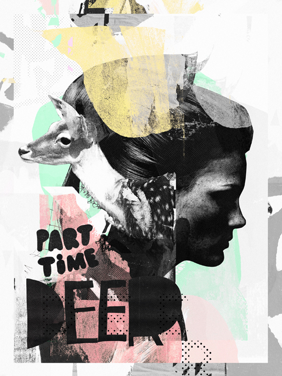
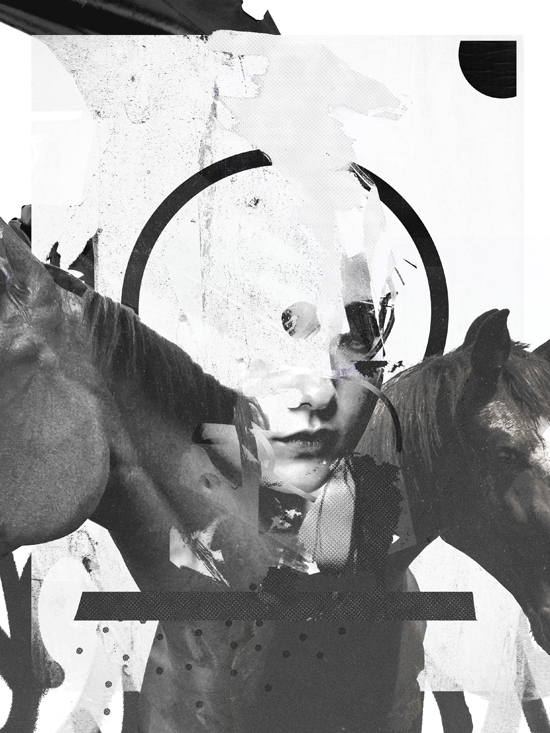
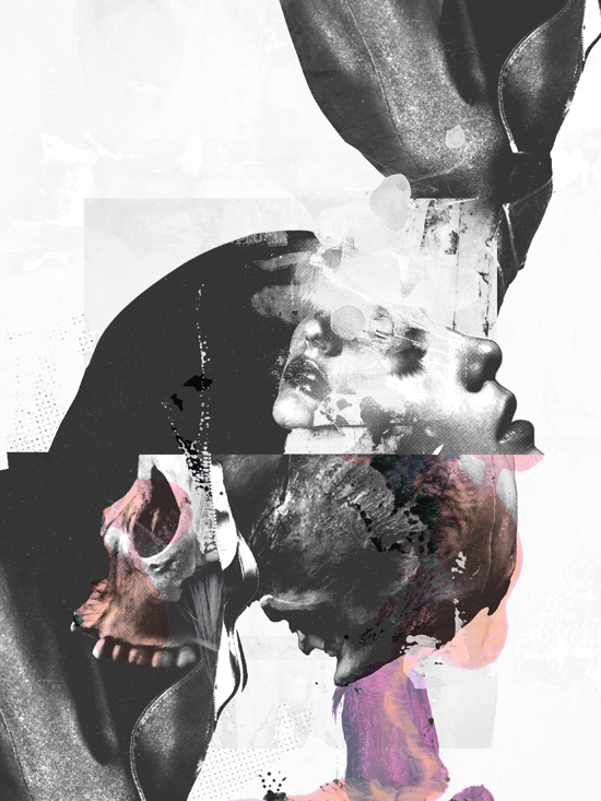
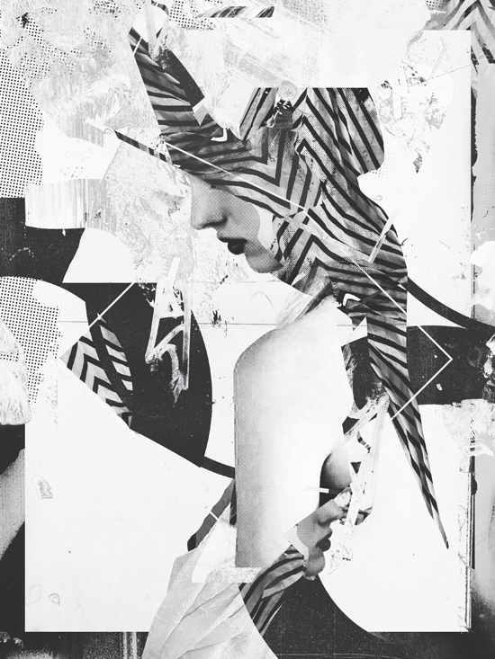
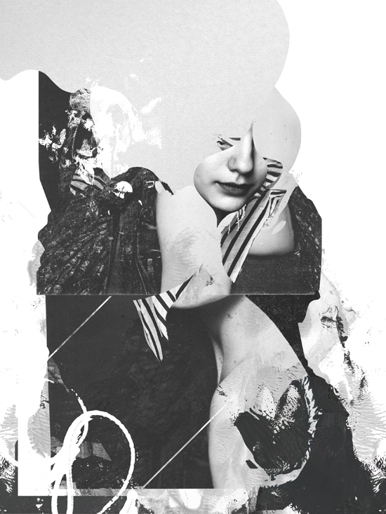
Self-taught artist Raphaël Vicenzi has produced an impressive body of illustration work, frequently for the fashion industry, but I’m partial to the mixed media collages he creates for himself. They’re chaotic yet elegant, favor a black and white color palette, and can be highly abstract, though they rarely lose sight of a figurative center entirely.
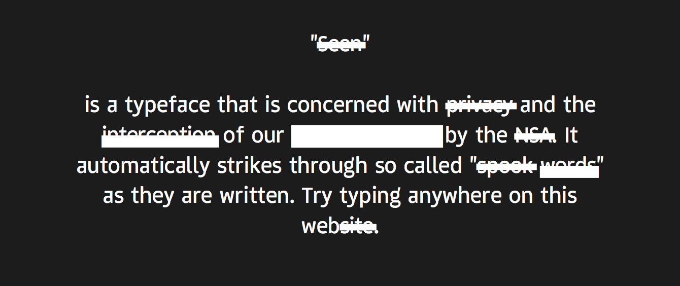
Seen is a novelty typeface with an agenda: as you type, it automatically redacts terms that the NSA might consider threats to security, e.g., privacy, communications, etc. It’s a commentary on the surveillance state, just in case you didn’t catch that.
You can try the font in your browser or download it for free at projectseen.com.
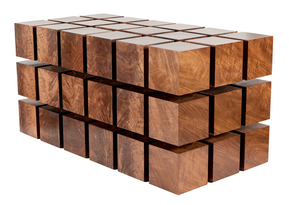
Brooklyn-based decor studio RockPaperRobot specializes in incredibly clever furniture designs that seem to defy, or at least challenge, the laws of physics. Their Ollie Chair is a fully functional seat that collapses into a washboard-like plane in an instant, and their Brag Table looks like a massive diamond balancing on its smallest point, and yet it’s perfectly stable. Perhaps their most ingenious product is the Float Table, which looks sort of like a gargantuan Rubik’s Cube where each component is floating, separated from the others as if by magic. The company describes it as:
…a matrix of ‘magnetized’ wooden cubes that levitate with respect to one another. The repelling cubes are held in equilibrium by a system of tensile steel cables. It’s classical physics applied to modern design. Each handcrafted table is precisely tuned to seem rigid and stable, yet a touch reveals the secret to Float’s dynamic character.
So much interesting stuff is happening in design tools that I’m going to start aggregating links here on a weekly basis. This is as much for my benefit as anybody’s, as I find the act of collecting and reposting the news helps me actually better understand the new developments. Here are a few to start.
InVision, the wildly popular prototyping app, shipped support for direct posting to design sharing site Dribbble with just a few clicks. blog.invisionapp.com.
Github’s Atom, a modern, hackable text editor, is now out of beta. The promo video, which is a spoof of short industrial films from the late 1960s and 1970s, is pretty amusing (see below). blog.atom.io
Prototyping tool Framer has released Layer Inspector, a new feature that allows closer examination of a Framer prototype’s components. blog.framerjs.com.
Webydo is a new browser-based application for creating “pixel-perfect, responsive web sites…without code.” A cursory look shows that it’s beautifully designed, with slick demonstration videos. webydo.com
Sketch Data Populator is a new plugin for Sketch that automatically, er, populates data inside your Sketch mockups. Unfortunately, if you have say a hundred rows in your database that you want to visualize then you’ll need to manually create one hundred copies of your interface in order for that to work. Still, when I tweeted about this plugin, the response was pretty enthusiastic. Grab it at github.com, and read about how the team at Depop used it in this Medium post.
Macworld has a review of the image editor-like web design application Macaw (version 1.5.15). From the review: “I intended to test Macaw by building a small site with it. But after tearing down and rebuilding the same page four times, I threw in the towel.” Still, they awarded it 3-1/2 “mice”—my impression is that they rarely award less than three, so take that for what it’s worth. macworld.com.
Meanwhile, the Macaw team seems to be rebooting its efforts. They’ve just announced their next project, “Scarlet,” which they refer to as a “The live design environment.” Sign up for news about its pending beta release at scarlet.macaw.co.
And here’s that Atom video that will surely make you feel proud of yourself for living in the year 2015.
If I missed something, or you have some thoughts on how I can do this better, please let me know via the comment form below.
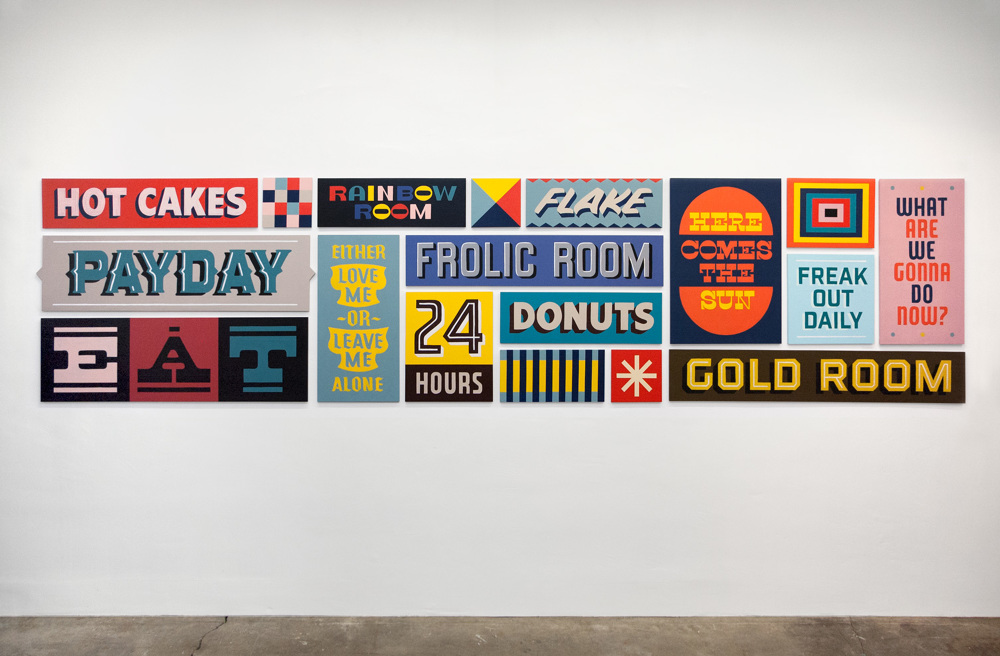
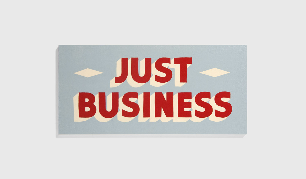
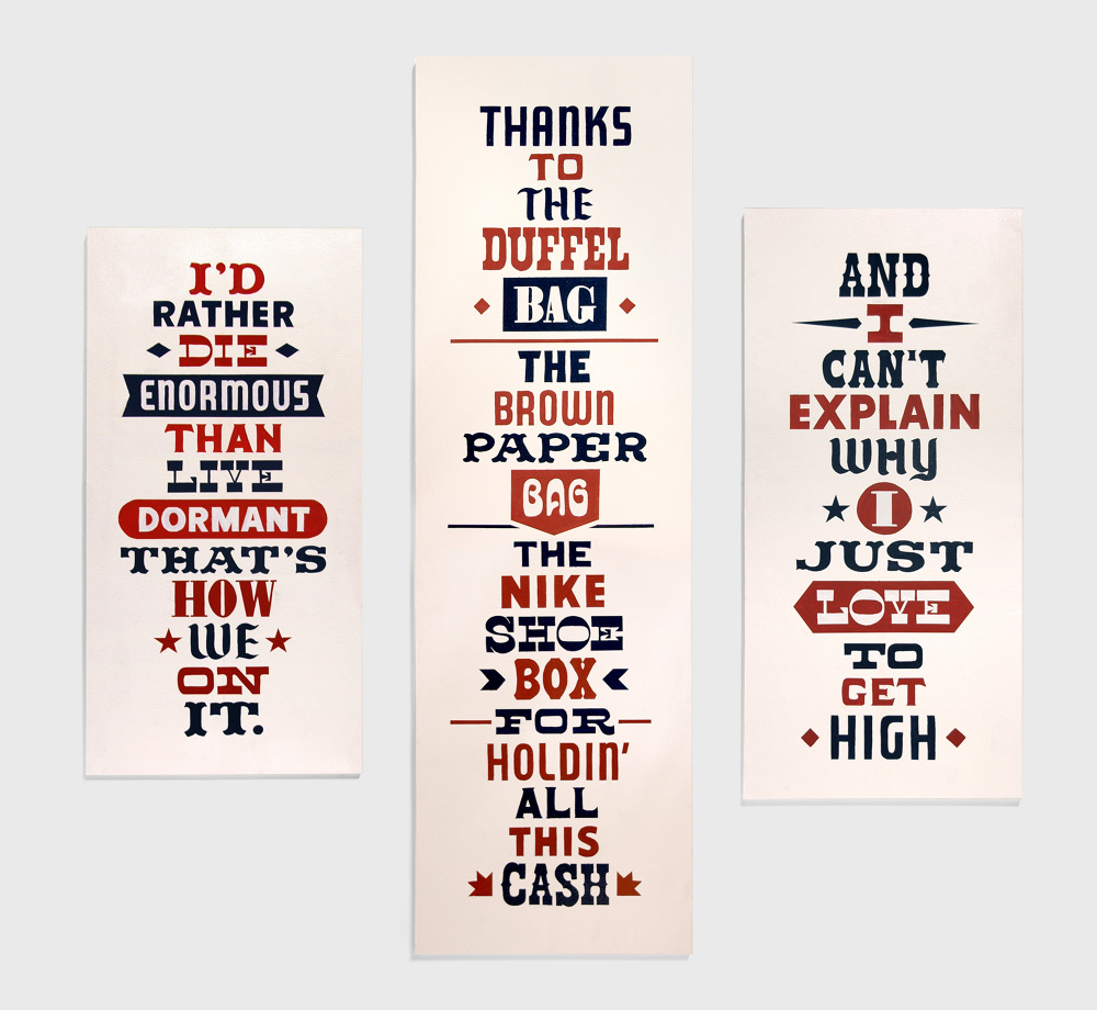
Designer Keith Scharwath has a sideline in unabashedly retro, warmly rendered typographic paintings—he refers to them modestly as hand-painted signs. His works quote snippets of the American vernacular—action-oriented sentence fragments like “Here comes success” and “Just business”—and his typography evokes the detached, consumerist irony of Pop Art. Gorgeous stuff.
A few of his original works are available for sale, and more samples are on view, at scharwath.com.
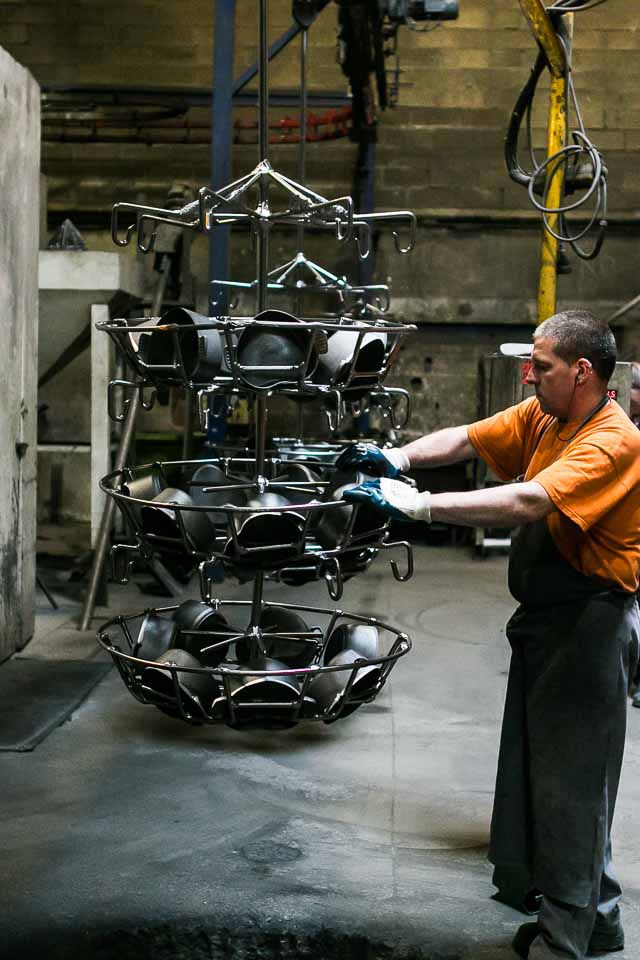
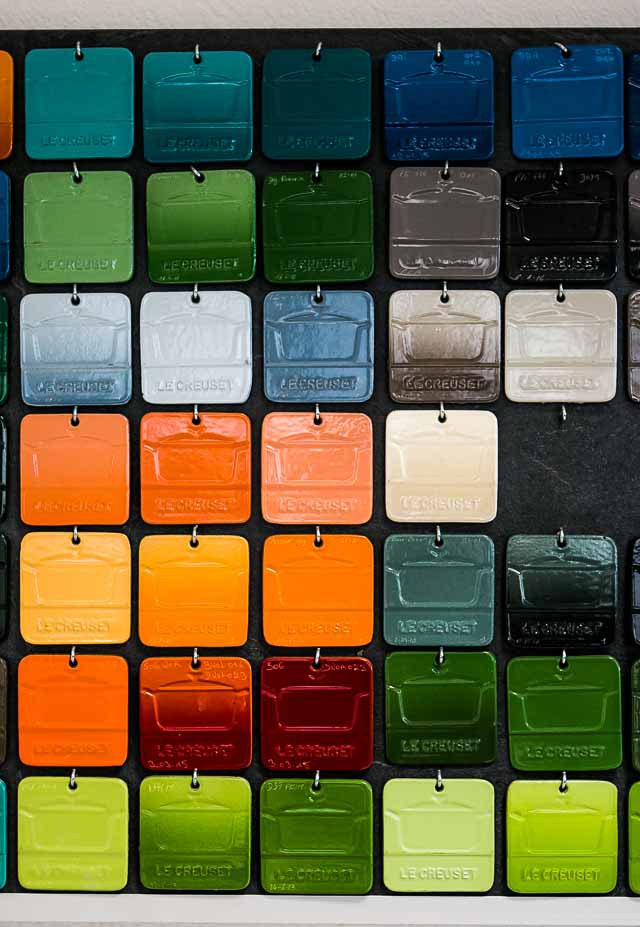
I’m not much of a cook or a foodie, but I have a peculiar fascination with cast iron cookware. Both the craft of forging these crude yet elegant tools and the way that they get more beautiful with age and repeated use are sources of wonder to me. They’re the exact inverse of digital hardware, which starts decaying the moment you break it out of its box.
Chef David Lebovitz had a chance to visit the French factory where the storied le Creuset line of cast iron cookware is made. In this blog post, he follows the whole manufacturing process, from hot metal to color enameling. It’s a completely engrossing read if you’re fascinated by craft.
Symbols are important, especially visual symbols; I’d be the last person to deny that. However, in the wake of Dylann Roof’s monstrous killing of nine African-American members of the Emanuel A.M.E. Church in Charleston, SC, one symbol is dominating the discourse more perhaps than it should. There is a robust debate going on currently about the propriety of the Confederate flag, that antiquated, offensive standard of the antebellum south, and whether or not it will be possible to remove it from South Carolina’s State House grounds.
This is not an unworthy discussion—it would be a triumph for basic human decency if we banished the Confederate flag, to be sure—but for me, it’s all a tremendous and even cynical distraction from the real issue, which is guns. The column inches devoted to “the Southern cross” in the days since Dylan Roof’s heinous crime are much more copious than those devoted to the most urgent, most pressing dimension of the whole tragedy: the lack of sane gun control policy in the United States of America.
We may be able to get rid of this flag, but what good will that do us when another deranged shooter claims lives in New England, the Midwest, the Northwest, or anywhere else outside of the South? It would be a wonderful miracle if that somehow never happened again, but is anyone willing to bet that banishing the Confederate flag is really going to do anything to curb this seemingly relentless tide of shootings? It is a noxious and hateful banner, but in contrast, our current gun control policy—and the repeated public tragedies that policy engenders—is pure insanity. This is one instance where the importance of symbols seems highly overrated, and a regrettable diversion from the difficult reckoning that those lost lives really call for.
In the interest of a less morose approach to this argument, let me leave you with this brilliant, fifteen-minute standup routine by comedian Jim Jefferies, who articulates a damning and, thankfully, hilarious case against the American regard for guns. Laugh at it even as you may be crying inside.
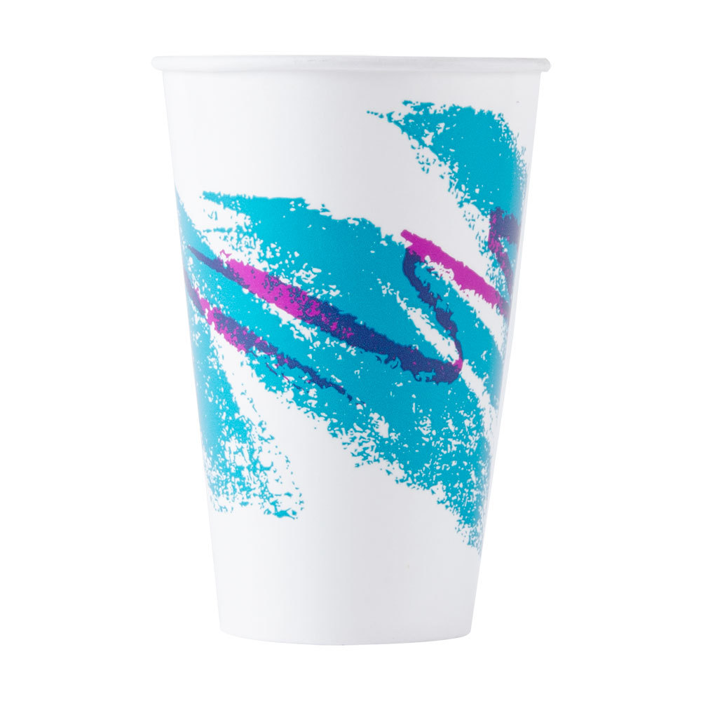
The design for these ubiquitous yet largely unnoticed paper cups from the 1990s has attained cult status from a very, very small subset of the American public with the time to think about these things. About two weeks ago one of these people kicked off a search for its designer on Reddit, and Thomas Gounley, a reporter from the Springfield, MO-based News-Leader, decided to pursue the story.
Gounley managed to identify its creator as one Gina Ekiss, a staff artist in the Springfield, Missouri Art Department at cup manufacturer Sweetheart in the early 1990s; Ekiss’s design won an internal competition for new stock graphics, and the rest is barely-remembered history. After tracking her to her home in Aurora, MO, Ekiss graciously and charmingly sat with him to answer the questions the Internet just couldn’t get along without knowing.
Ekiss said she earned a set salary at the time—about $35,000—and there was no bonus for having her design selected. No royalties either, since the company took ownership of the pattern. She worked at Sweetheart until 2002, she said, when the company’s art department was transferred to Baltimore. She wanted to stay in the area. When she left, Ekiss said she was told by Sweetheart that Jazz was the company’s top-grossing stock design in history, dating all the way back to the Lily Tulip days.
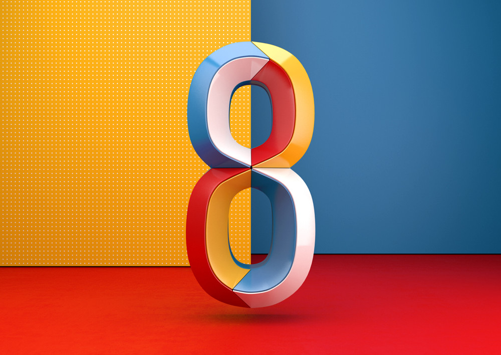
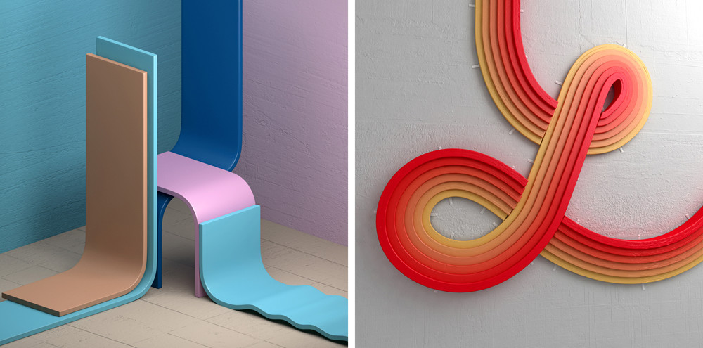
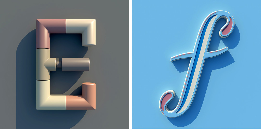
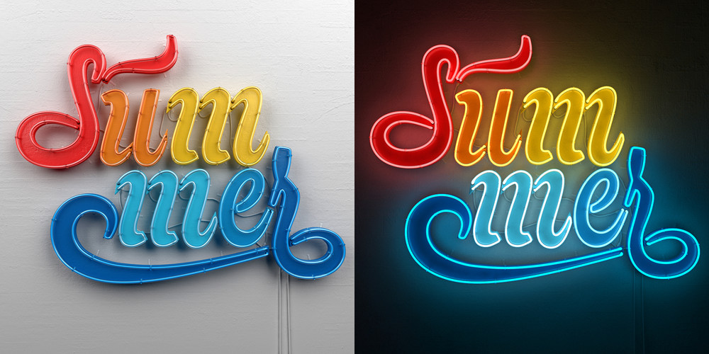
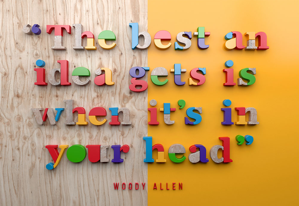
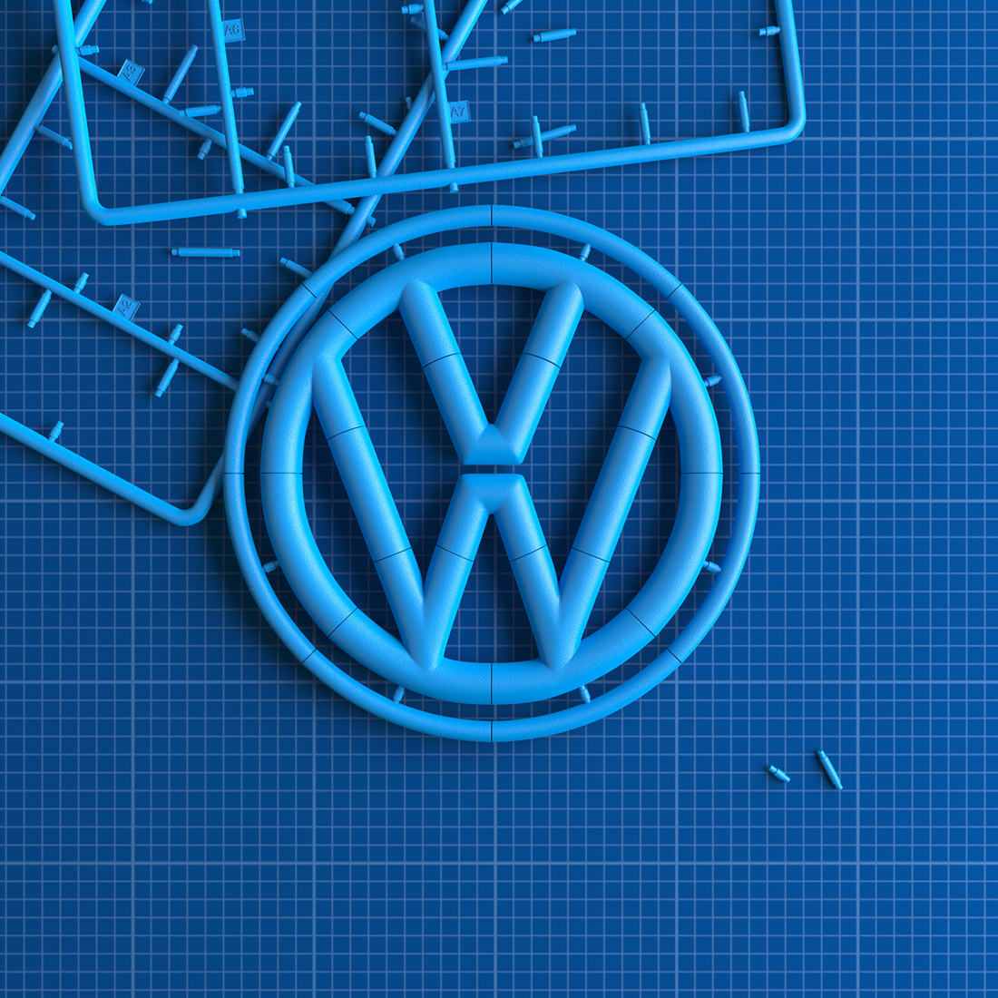
Alejandro López Becerro, a designer based in Madrid, works under the name Muokkaa Studio and specializes in three-dimensional typography and illustration. His alluringly rendered letterforms are bright and unceasingly playful—he doesn’t just add depth to the shape of a character; he constructs it out of unexpected parts and in surprising ways.
I think it’s interesting to appreciate the aesthetic quality of this work—which follows the natural laws of light but is so preternaturally detailed that it would be wrong to call it photographic—and consider it as an alternative to the flat design trend of the past several years. I can easily imagine an operating system that looks like one of López Becerro’s renderings.