Discovering Spotify’s Discover Weekly

Spotify’s Discover Weekly

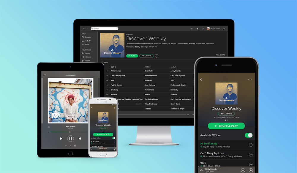
This Wired article looks at Spotify’s attempts at generating “perfect playlists” to suit its customers’ various moods and life moments. It includes a look at the music service’s new Discover Weekly feature, an algorithmically generated playlist tailored for each user that’s refreshed every Monday.

Combined with what the company calls your ‘taste profile,’ an internally kept list of traits and types of music you tend to enjoy, Spotify can automatically refine and perfect recommendations just for you. When you open the app, you’ll see different playlist choices than I do; those playlists themselves could even be customized just for you. That’s where Discover Weekly comes from: It’s your taste profile, brought to life in two dozen or so songs each week.

I have never found these types of playlists to be remotely satisfactory, whether they were created by man or machine. But I was shocked by my experience with the first playlist that Discover Weekly generated for me this week.

It’s twenty-nine songs long, about two hours worth of music, and I would estimate that I found about eighty percent of that to be really enjoyable, tracks that made me curious about the albums they came from and the artists that recorded them. And that’s the other thing; I consider myself to be a moderately advanced consumer of independent music; I actively seek out new acts all the time and try to stay on top of up-and-coming bands. But Discover Weekly included a healthy percentage of acts that I hadn’t even heard of before, most of which I’m now very curious about.

I can’t say enough about how pleasantly surprising this playlist is; after listening to it repeatedly since trying it out for the first time yesterday, it’s harder and harder to believe that it wasn’t compiled for me by a real person—someone with a vast knowledge of music and who also happened to know my music preferences intimately. If a friend had made this exact playlist for me, that person would be just about the coolest person I know.

Discover Weekly is probably the most potent example yet of the significant competitive edge that Spotify gained when it acquired The Echo Nest last year. That service describes itself as a “music intelligence company;” The Wired article explains it this way:

The Echo Nest’s job within Spotify is to endlessly categorize and organize tracks. The team applies a huge number of attributes to every single song: Is it happy or sad? Is it guitar-driven? Are the vocals spoken or sung? Is it mellow, aggressive, or dancy? On and on the list goes. Meanwhile, the software is also scanning blogs and social networks—ten million posts a day, Lucchese says—to see the words people use to talk about music.

If this is just the beginning of what Spotify and The Echo Nest can do together, our collective expectations for how music discovery should work could change dramatically in the next few years. It could soon become inconceivable that you would ever be presented with a music library or source that doesn’t feel like it was somehow tailored expressly for you. It’s fine that today’s streaming services can boast catalogs of thirty million-plus songs, but that may soon matter little. Would you prefer a huge warehouse full of music that’s mostly irrelevant to you, or a record shop in which everything on the shelves suits your taste? The former is what we have today; the latter is where we might be heading.

What’s more, this kind of taste acuity could be a silver bullet in resolving the continual tension between streaming services and musicians, especially lesser known artists whose income potential has been dramatically reduced in this new paradigm. The Spotify team seems to weight these Echo Nest-driven playlists in favor of acts that its users aren’t familiar with; if they succeed, they could be sending significant play traffic to new contenders. It’s probably far too soon to say how viable this is, but there does seem to be the glimmer of something potentially market-changing in the intelligence and relative indifference to popularity of these recommendations.

Finally, it’s worth noting that Spotify and The Echo Nest have been compiling my “taste profile” for only a few years, and yet the result is a truly remarkable understanding of what I like. By contrast iTunes has over a decade’s worth of my listening habits, and yet as I wrote in this post when Apple Music launched, Apple seems to have very little understanding of my tastes at all. More and more, Apple Music is looking like a disappointment.

+

Job Spotlight: ESPN

ESPN

Designer John Korpics was a hero of mine early in my career, when I was focusing on print design. Korpics was at Entertainment Weekly at the time, where he created some of the most vivid editorial design I had seen; it was brash, elegant and continually inventive. He later went on to amazing runs at InStyle, Esquire and Fortune, winning scores of design and publishing awards along the way. For the past several years he has been running design at ESPN—first in print, and now across its digital properties too. Earlier this year he and his team launched a major redesign of ESPN.com, a key pillar in their plan to modernize the digital experience for sports fans. I recently talked to Korpics about his quest to hire a Senior Product Designer to lead their mobile apps.

What does the Senior Product Designer for Mobile do?

This person will lead the product design and UX for ESPN.com and the ESPN app—roughly eight to ten folks. The complete product design team is about twenty-five people, which doesn’t include front end dev, or web and native dev.

What’s special about this job?

Over the next two years we will be greatly expanding the personalization experience throughout all of our digital properties; surfacing content, scores and alerts around teams; commingling automated, social and curated content in a smart way for small screens; creating more effective, seamless and fun on-boarding flows; and in general making content relevant to the fan appear in smart intuitive ways wherever they are.

The biggest challenge is probably understanding the role and value of design and UX within our very complex ecosystem of content, video, advertising, scores, live events, social, fan behavior, device use cases for sports, marketing, and much much more. I’ve been here four years and I still have a lot to learn!

What kind of designer will thrive in this role?

This is a leadership position, and we are looking for people who have experience leading teams, collaborating across product, technology and content, and driving ideas. We love talented, smart people with smart ideas, but you also need to be able to build trust and effect change. Its a very entrepreneurial company, and we tend to reward people who thrive in that type of environment. It also doesn’t hurt if you like sports. Just saying, we are the Worldwide Leader after all.

So how much do you have to love sports to do this job?

I assume most designers have at least a passing interest in the subject they are designing for, so yes, at least on some level, it helps to like sports, but you don’t have to be a sports junkie, and in some cases it can actually be an advantage when you don’t know something, because you may bring a fresh perspective to solving the problem.

At the end of the day, nobody knows everything there is to know about sports, and it’s not hard to find an endless supply of experts here who are more than happy to share what they know. When I first arrived at ESPN, I had big gaps in my understanding of college football, college basketball, and soccer. I’m still completely clueless about cricket, but those are all just opportunities to learn, which never gets old.

ESPN is located two hours north of New York, in Bristol, CT, which is a bit too far to make for a practical commute. How do you make it worthwhile to candidates to consider moving there?

Work-wise, we involve you at every level of the product design process, and we give you exposure to partners and leaders at every level of the company. We build products as teams, and everyone has a voice in the work the team does. We also care a great deal about quality of life, making sure people have time to spend with families or simply outside of the office. We offer competitive compensation packages, and big discounts to all Disney parks!

Disney (ESPN’s parent) offers relocation support, and we are also within commuting distance of places like Northern Westchester, NY, where I live, so you don’t always have to move to central Connecticut to work here. Other than that, we offer a state-of-the-art daycare on campus, lots of ways to be involved with our communities and outreach programs, and of course, lots of intramural sports leagues!

If you’re interested in this opportunity, read more at Authentic Jobs.

This is the fourth in my occasional series spotlighting interesting job openings for designers. See also my interviews with The Coral Project, Digg and Toca Boca.

+

Designers and Books Fair 2015

Designers and Books Fair 2015

Coming this fall, 2-4 October, to New York City: the 2015 Designers and Books Fair. This event includes publishers and booksellers from the U.S. and Europe displaying and selling new titles as well as notable, hard-to-find titles, all related to architecture, experience design, fashion, graphic design, industrial and product design, interior design, landscape architecture, web design, and urban design. Also:

A full schedule of programming on October 3 and 4 will be presented in the 270-seat auditorium immediately adjacent to the exhibition hall. One of the highlights will be the official launch of the reprint of ‘Ladislav Sutnar: Visual Design in Action,’ published by Lars Müller, which will include a talk by the book’s editors, Reto Caduff and Steven Heller, and an exclusive opportunity to buy copies of the book in case you missed your chance to back the Kickstarter project that brought this reprint to life.

More information will be available at designersandbooks.com, though that site hasn’t been updated yet (hey, these are book people). In the meantime you can see the email announcement.

+

Azel Phara Video by Bif

Jules Janaud and Fabrice Le Nezet, who work together as directing team bif, created this music video for French electronic musician Azel Phara. It combines motion capture and procedural animation to create a strikingly realistic world composed solely of simple geometric shapes—the vast majority of which are circles. The effect is pretty remarkable.

See more of their work at wearebif.com.

+

Design Tools News No. 3

I’m still on vacation through the end of this week, and haven’t been paying very close attention to what’s happening out there. Nevertheless, plenty of design tool news still found its way across my desk.

  • Design hand-off tool Zeplin is out of beta. Their official launch apparently refreshes the user interface and requires some transition in projects, and they’ve posted a guide for beta users.
  • Smarticons is a periodically updated icon set hosted on the web, and they’ve upgraded to version 2.0. They’ve also released an OS X menu widget that lets you search their icons and instantly place them inside any of the major graphics programs, e.g., Photoshop, Illustrator, Sketch, etc. It doesn’t sound revolutionary but I think it’s great and I wish all of my icon packs could work with it. More at smarticons.co.
  • Affinity has officially released version 1.0 its Affinity Photo software, a rival to Adobe’s Photoshop—primarily for retouching. It retails for just US$50 but is on sale for US$40 through 23 July. The photography site Fstoppers has a good overview here.
  • Monodraw is an OS X tool for making diagrams, layouts, flow charts and visually representing algorithms, data structures, binary formats—all with ASCII. Why would you want to do this, other than that you might be a total nerd? The company explains “because it’s all just text, it can be easily embedded almost anywhere.” Okay. More at monodraw.helftone.com.
  • Fileloupe is a powerful file viewer for OS X. It seems intended to work as a more robust replacement for the Mac’s Preview and QuickTime apps. More at fileloupe.com.
  • Adobe Illustrator 2015, released just a few weeks ago, has been updated to address a number of bugs. Read the changelog.

In case you missed it, read my last roundup of design tool news here. And if you have anything you think is worth sharing, please send it my way via the form at the bottom of this post.

+

On Vacation with an Unlocked iPhone

On Vacation with an Unlocked iPhone

We’re on vacation in France this week and next, visiting family, and it’s the first time I’ve traveled abroad with an unlocked iPhone. Quelle différence, as they say.

Two years ago I resolved to stop buying phones on contract from wireless carriers; the short term pain of buying a new iPhone at the much higher, full retail price is far outweighed by the fact that, when all is said and done with a contract, unsubsidized phones are much cheaper. What’s more, there’s a tremendous satisfaction—and greater conveniences and savings—in owning an unlocked phone. Traveling bears this out.

When we landed in Paris, I popped out the SIM card on my phone and bought a new one from a bookshop at the airport for a measly €5. That got me enough minutes and text messages to help us navigate to where we’re staying this week in Lyon.

(Tip: bring along the SIM card removal tool that shipped with your iPhone. In a pinch, you can also use a souvenir pin to pop out the SIM card tray.)

The next day I went to a Bouygues Telecom office and bought new SIM cards for my wife and me; for just €50 each (or about US$55 with current exchange rates) we now each have working local phone numbers, unlimited text and talk, and 2GB of data to last us through our vacation. AT&T would have charged us US$60 just for the right to be charged US$0.50 per minute to talk, to receive SMS at some unspecified per-message cost I couldn’t determine from their site, and to use a paltry 300MB of data. There’s just no comparison.

The only hitch I experienced was that it took about two days for each of the new phone numbers to register with Apple’s iMessage service, which I find to be indispensable not just for free messaging but also for FaceTime. For the first day or so we repeatedly saw errors activating iMessage until at some point it just started working. Not entirely elegant, but that’s Apple cloud services for you.

Now we’re all set for everything that a phone comes in handy for while traveling—not just text and talk, but maps, local search, taxi hailing etc. The best part of it is that we’re doing all of this using our own phones, and AT&T can’t do a thing about it.

Eiffel Tower icon by Olivier Guin from the Noun Project.

+

Design Tools News No. 2

After I wrote my first design tools news roundup last week I had a momentary bout of panic. Even though it seems like there’s a lot of news in this arena, maybe in truth there isn’t really all that much happening each week? As it turns out, there was no reason to worry. As I suspected, lots of impassioned teams out there are doing lots of interesting things, enough to generate plenty of news. Here are just the items that crossed my desk this past week.

  • Pixel Winch is a screen measurement app that combines aspects of an image editor with a modal interface, for quick access and high precision.
  • Blocs, the elegant website design app for OS X, has just released its version 1.4.0. Improvements include “a complete redesign to colour management, access to the native Mac colour picker tool, bootstrap panels, HTML lists, icons in buttons, nested layouts, preview in browser support”—color features sound so much more exciting with those extra u’s. The full changelog is at blocsapp.com.
  • Last week I wrote about Sketch Data Populator. The creators of the plugin, Precious Forever, shared this video with me, which previews some of the improvements they’re working on. It shows the plugin cycling through data in a single artboard with just a command-key shortcut, as well as populating many individual artboards with data all at once, instantly. Pretty exciting stuff and definitely worth a look.
  • Prott, the mobile rapid prototyping app, has just launched an Android version. More at blog.prottapp.com.
  • Atomic, the browser-based interaction prototyping tool, dropped a sneak peek of a new timeline animation feature at dribbble.com.
  • PaintCode, a vector drawing app that turns your drawings into Objective-C, Swift or C# drawing code in real time, has just released a beta of its new Telekinesis utility. Telekinesis (great name) allows you to change the design of your app in PaintCode while the app is running on a real device. More at paintcodeapp.com.
  • Icons8, the web-hosted icon pack featuring over 14,000 icons, has just added icons in the Windows 10 style. They’ve also written this “Unofficial Style Guide to Windows 10 Icons,” which I’m sure most people reading this will find handy if they ever need to design for Windows 10. Hey, it might happen!
  • Finally, the 2015 Net Awards are open for voting through 13 July. The nominees for App of the Year read like a roll call for some of the most exciting new design tools out there. Go for your favorite—especially if it’s the one I worked on: Adobe Comp CC!

Catch up on last week’s roundup here, and let me know if I missed anything—or what you think about these news roundups—in the form at the bottom of this post.

+

Meet Apple Music

I upgraded my iPhone and my Mac tonight so that I can run the new Apple Music service. Setting aside for now the fact that with this major upgrade iTunes and the iOS Music app have have both reached new levels in tortuously convoluted user experiences, here are some of the things I encountered. First, this:

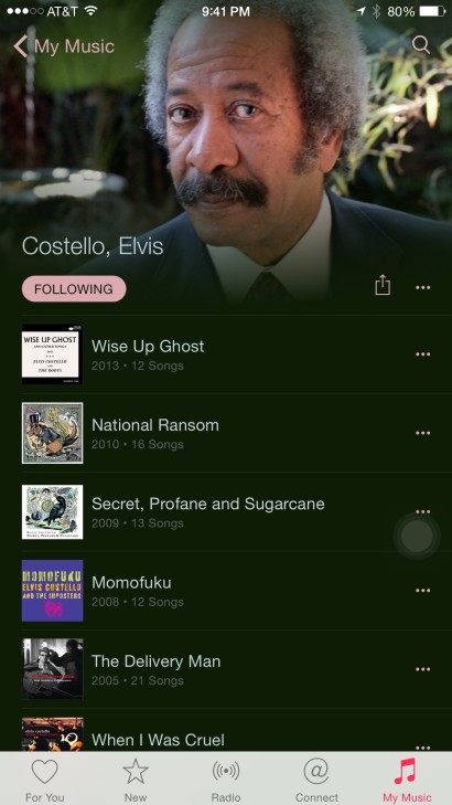
Elvis Costello on Apple Music

That’s Allen Toussaint, in case you aren’t familiar; not Elvis Costello. Toussaint did record an album with Elvis Costello some years back, but they’re different people. Jeebus, even a Bing search for Elvis Costello turns up the right photos.

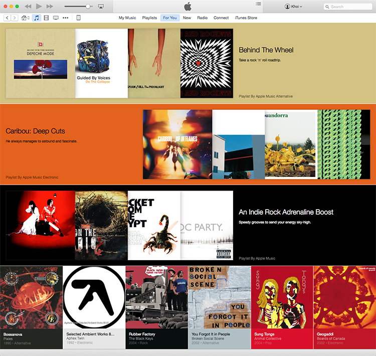
Second, here are the playlists that Apple Music made for me based on the interests I signaled during the service’s onboarding process, where you click on a really showy, confusing and not particularly comprehensive series of bubbles to indicate what genres and artists you like. The results are pretty terrible.

Apple Music Playlists

The playlists include a whole bunch of stuff I can’t stand, along with a smattering of albums from acts that I’m okay with but not particularly passionate about, and one so-so album from a band I quite like but rarely listen to. Nothing from my current heavy rotation of artists appears here, and nothing new or surprising that I’d never encountered before does, either. Overall, the selection lacks any real surprise or inspiration.

When I complained about this on Twitter some people seemed to think that it was unrealistic for me to expect Apple Music to come up with great recommendations on the first try, contending that it has too little data to go on now, and that the recommendations would improve given more of my time and usage.

That response completely bewildered me because it entirely ignores the facts. Apple does, in fact, have all the data that they need to make great recommendations to me. I’ve been using their iTunes Match service for two years, which stores all of my iTunes library’s metadata in the cloud. Moreover, I’ve been using iTunes for almost a decade and a half now, migrating the same music library from computer to computer and device to device. Few other services have as much data on my media consumption habits as Apple does—not Netflix, not Amazon, not Google. Plus, Apple is the most successful technology company in human history. When you combine those factors, shouldn’t it be realistic to expect more from Apple than what is basically the same out-of-the-box experience that the original Beats app offered?

I’m passionate about Apple and heavily invested in their ecosystem, but this kind of willful denial of the very high expectations we all have for this company drives me bats.

+

Job Spotlight: The Coral Project

The Coral Project

Despite its name, The Coral Project is not focused on marine biology. Rather, it’s a collaboration between Mozilla, The Washington Post, and The New York Times, and it’s funded by a grant from the John S. and James L. Knight Foundation. Its ambitious and worthy goal is to “improve communities on news sites through open-source software”—basically to elevate public discourse via great design and technology. The team is hiring a UX strategist and I talked to its head of design, Sarah Sampsel, about that opportunity. Sampsel is Director of Digital Strategy & Design at The Post, but she has been a part of the Coral leadership team since last year, when it won its grant from the Knight Foundation.

What’s the idea behind the Coral Project?

We really believe the experience of commenting on a news story is broken. The conversations are fragmented, often noisy, and they’re spread out across the web. Tacking on a comments thread to the end of a story is just scratching the surface of what we should be doing to allow readers to play a bigger part in the conversation.

Readers should be able to participate in and contribute to productive discussions about current events in more meaningful ways. They should be empowered to manage their own identities across the sites they participate in and have access to data that will help them understand who’s interacting with the content they create.

On the flip side, we want publishers to have the tools to better understand their contributors and control the level of discourse on their sites.

What makes this a great opportunity for a designer?

At this point, the Coral Project is a blank canvas. It’s an amazing opportunity for a designer to come in and help shape the vision of what we ultimately create. There are so many directions something like this could take and at this point we need to establish a process for generating user-centric ideas.

Can you describe at a lower level what you think the work will look like?

Coral will be a platform, not unlike WordPress (though of course we’re not trying to re-create WordPress). We’re designing open source software that has to be incredibly flexible, that has to scale across many organizations.

That means we’ll need to create administrative and account management solutions for both publishers and users. We’ll need standardized solutions for commenting, soliciting user contributions, displaying text, videos, photos, etc.—and this is where it gets interesting. The consumer-facing side, the tools and solutions we offer, that’s all ripe for disruption. We have a chance to come up with new ideas, components and opportunities for users.

What kind of designer will thrive in this job?

The major requirements are a passion for journalism and a drive to understand and develop communities online—how they work, how they’re evolving, how they fit into the news and journalistic space.

It’s an ambitious project, so we’re looking for a candidate who would be a very strong advocate for the user. A hands-on product designer who also has lots of experience conducting research and user testing to inform and validate decision-making. A person who is self-motivated, deeply interested in designing tools and platforms, and genuinely curious about solving problems for online communities.

It really is a unique opportunity to fix the community and commenting issues that plague all media organizations. The partners are Mozilla, The New York Times and The Washington Post, so it’s an opportunity to reach millions of users.

If you’re interested in this opportunity, read more at Authentic Jobs.

This is the third of my occasional series spotlighting interesting job openings for designers. See also my interviews with Digg and Toca Boca.

+