is a blog about design, technology and culture written by Khoi Vinh, and has been more or less continuously published since December 2000 in New York City. Khoi is currently Principal Designer at Adobe. Previously, Khoi was co-founder and CEO of Mixel (acquired in 2013), Design Director of The New York Times Online, and co-founder of the design studio Behavior, LLC. He is the author of “How They Got There: Interviews with Digital Designers About Their Careers”and “Ordering Disorder: Grid Principles for Web Design,” and was named one of Fast Company’s “fifty most influential designers in America.” Khoi lives in Crown Heights, Brooklyn with his wife and three children.
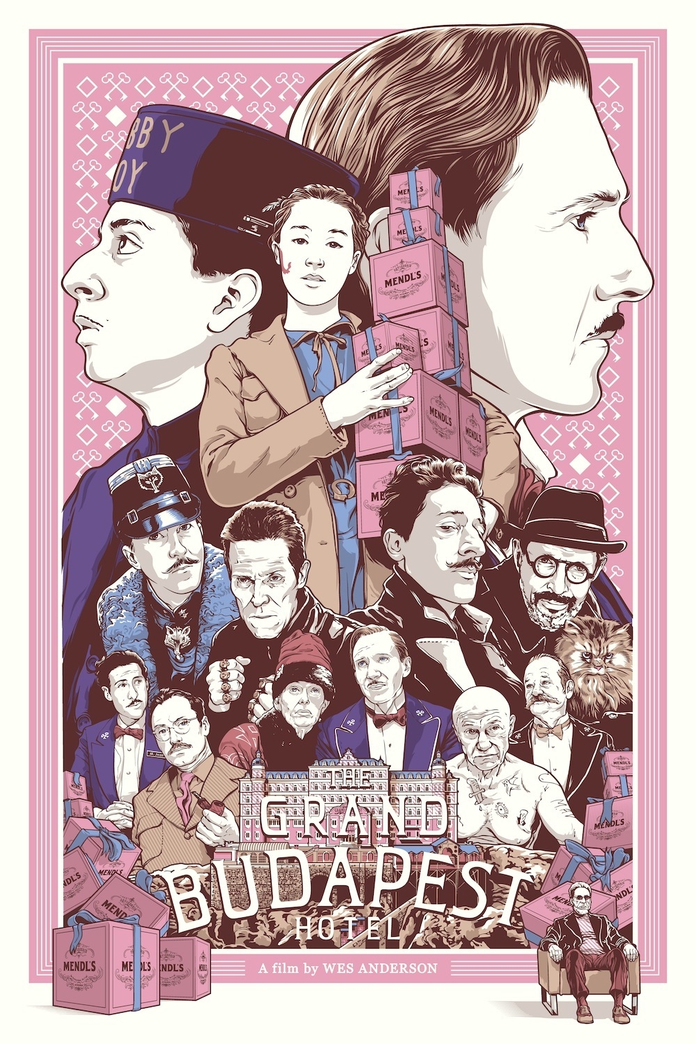
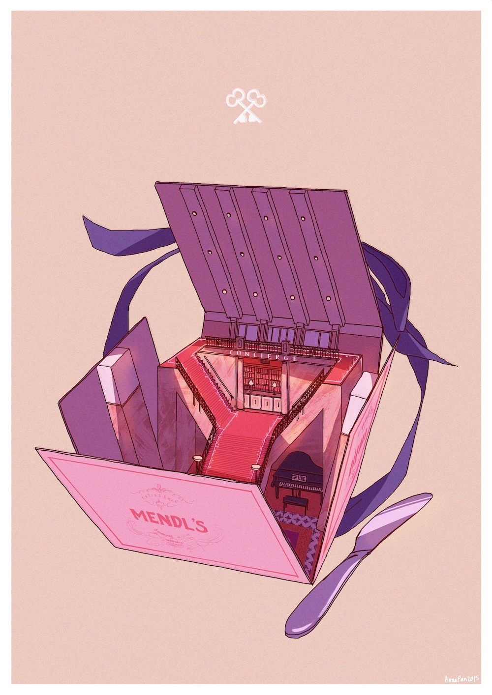
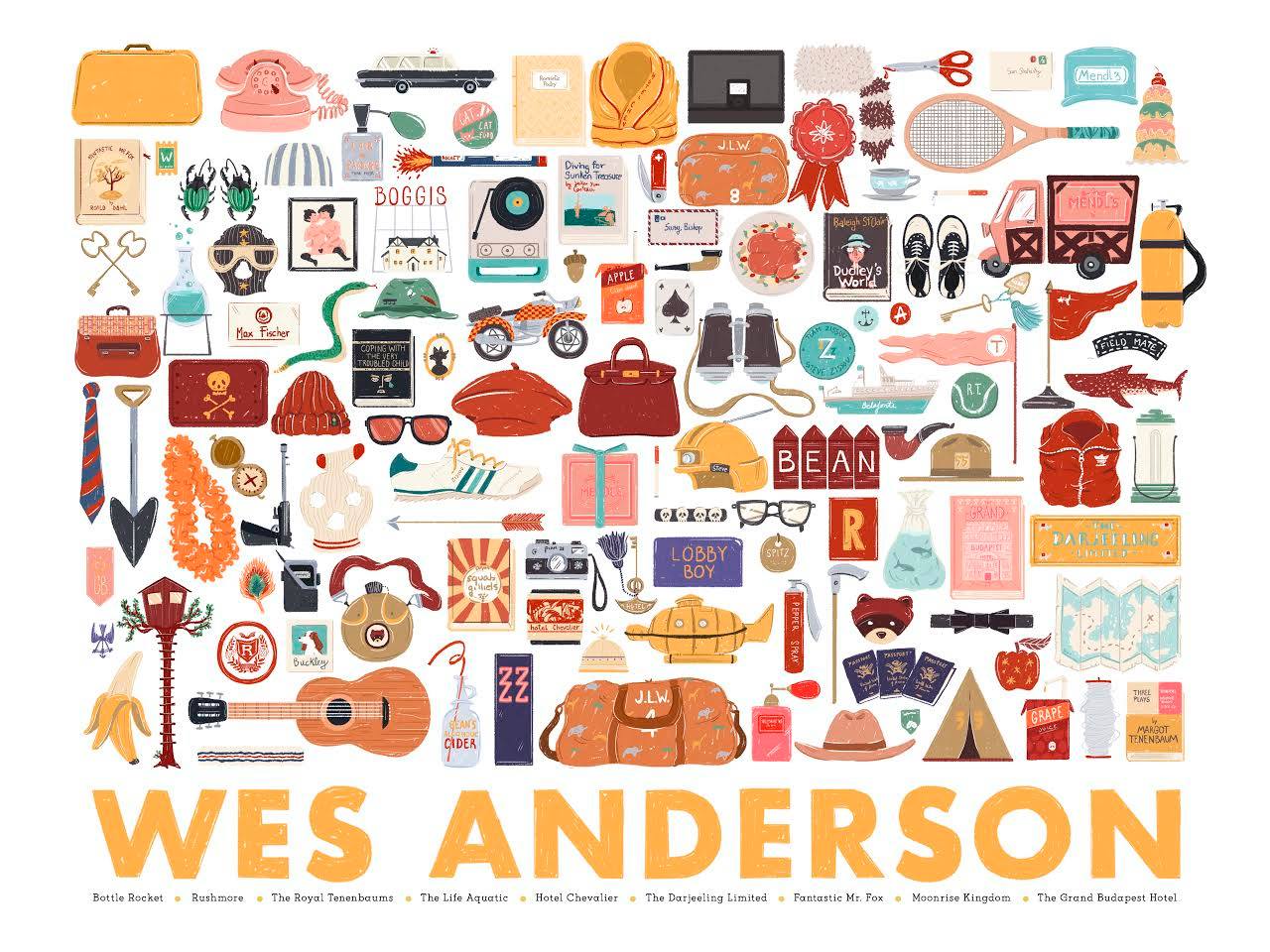
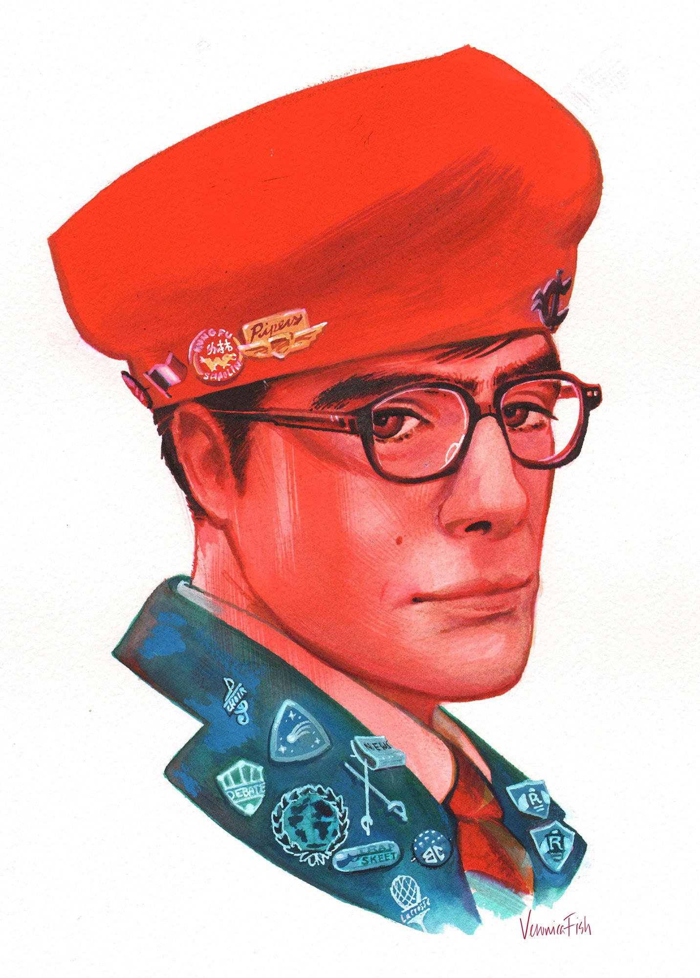
This weekend at the Joseph Gross Gallery in New York City: the sixth in an apparently annual series of art exhibitions in tribute to director Wes Anderson. The show’s subtitle is “Bad Dads”:
Comprised of original painting and sculpture as well as a multitude of limited edition prints, ‘Bad Dads VI’ is a wide-ranging display of artistry from all over the world. Exhibiting a host of different styles and talents, each artist approaches their work with the same meticulous detail that Anderson approaches his. Drawing upon the stylized world that Anderson has set forth, each artist was free to choose their own film for subject matter, resulting in a spectacular range of character portraits, highly detailed environments and iconic themes and motifs, prominent in each of Anderson’s films.
Three years ago, before his most recent film, I wrote about Anderson’s previous release, “Moonrise Kingdom” in this blog post. In it, I lamented how paper thin its characters were, and I worried that Anderson had lost his way:
[‘Moonrise Kingdom’ is] ninety-four minutes of starvation if you’re hungry for any kind of substantial character development. The protagonists (and by the end, nearly everyone is a protagonist, undermining any real dramatic tension the plot had going for it) are little more than inventories of their scripted eccentricities…
This is perhaps how we should think of Anderson’s films from here on out: technical marvels engineered to show off endless quirk. That’s a legitimate credential; it’s just not the one I would have hoped for right after I saw [his breakthrough film] ‘Rushmore.’
I still can’t be bothered with “Moonrise Kingdom,” but I was pleasantly surprised by Anderson’s return to form with last year’s “The Grand Budapest Hotel.” Where the former seemed to lack for even one fully rendered character, the latter is full of an almost electric comedic energy courtesy of the amazing Ralph Fiennes’s warm portrayal of M. Gustave, a creation worthy of “Rushmore”’s Max Fischer. “Grand Budapest” is as wonderful, thoughtful and rewarding film as “Moonrise” (and before it, “The Darjeeling Limited”) were not. I’ve watched it twice and I look forward to watching it again.
This infographic from The British Film Institute is a handy, thorough overview of the basic tenets of film noir, a style of post-War American filmmaking that is referred to often but frequently misunderstood. I’m linking to it (after the jump) because, well, I love film noir, but also because it’s such an influential concept that shows up repeatedly in the movies and television and media that we watch, and understanding its fundamentals helps us appreciate the vocabulary that the style uses to signal its intentions.
The graphic is also a really good introduction, for those who aren’t familiar with the genre, to a host of the very best movies ever made; at the bottom there’s a section that charts the “most noir” of all the movies that can be classified as film noir. The winner is, unsurprisingly, director Billy Wilder’s 1944 movie “Double Indemnity.” That masterpiece is a must watch if you haven’t seen it already; if you have and you enjoyed it, there’s a score of similar richly rewarding works in the film noir canon that awaits you.
Today is a day that I never thought would come: the cult classic film “Wet Hot American Summer” is now a Netflix original show (and the reviews are great). When it debuted in 2001 the movie sank nearly without a trace, and what many of my peers and I thought was a masterful showcase for some of the sharpest comedy and comedians of our time seemed to have been rejected by the larger world.
Now, a decade and a half later, it’s astonishing to see how many of the movie’s cast members—all of whom have returned for the series—have achieved mainstream stardom. Moreover, its shocking to find that the movie’s very particular, wildly absurdist, brazenly unfunny brand of funny has achieved widespread cultural acceptance. That’s something I never imagined could happen, and even if it did, I could never, not in a million years, have guessed that popular regard for the film could reach such a critical mass that a television adaptation would result. And yet here we are. Let this be a lesson to the cynical: anything is possible.
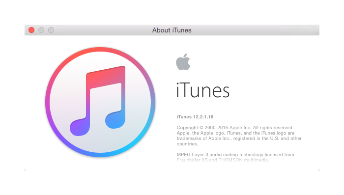
For longer than most I was an apologist for Apple’s iTunes software. It did the job for me, even in all its convoluted mess. But the most recent versions, especially since the introduction of the woeful Apple Music, are too much to excuse. It’s now almost impossible to refute the charge that iTunes is riddled with user interface design problems—this article at The Atlantic does a decent job of enumerating many of them.
More than a textbook case in how not to design usable software though, iTunes has for me come to represent all the things that Apple is doing wrong, even as the company’s profits continue to snowball. On just one level, the application is an executional mess that speaks to the company’s worrying inattention to detail. iTunes is slow and bloated; it’s a terrible, poky, unreliable network client; it’s embedded into the operating system and yet works well with few other apps; its management of iOS devices (for those who don’t use iCloud) is painfully inelegant. And if all that weren’t enough, it just looks incredibly ugly.
That last bit sounds superficial but it hints at how Apple’s stewardship of iTunes is worse even than just an extended series of poorly executed features. You could argue that the most serious crime that Apple continually commits with every new release of iTunes lies in the software’s missed opportunities. iTunes doesn’t have to be any of these things that it is; it doesn’t even have to be a version of what it is right now that works a little better. Instead it could be beautiful.
iTunes (and its counterparts on iOS) should be a sterling exemplar of bold, ambitious software. It should be a lightning fast, empowering tool for managing one’s media and devices, and a fluid, engaging bridge to the media that Apple sells. iTunes should also be best-of-class in integrating cloud services into native software. It should combine all of the copious metadata that veteran users have accrued from years and years of use with the creativity that big data can unleash (and none of it has to compromise privacy).
Apple is doing wonderful things, no doubt, but it falls down much more often than can be reasonably expected from a company that has achieved such lofty heights. How much can one expect from the most profitable company in history? It’s certainly not asking too much for iTunes, which is in so many ways the front door for the Apple ecosystem, to be less of a shabby gateway and more of a grand entrance.
The IKO is intended to be “a bridge between a playful experience and an everyday functional prosthetic system.” Basically it’s an artificial arm designed for kids that works with LEGO bricks. It was designed by Carlos Arturo Torres during a six-month internship at LEGO’s Future Lab, a research and development group. The IKO’s socket houses a battery that can be recharged in a docking station, and the highly articulating hand incorporates LEGO-compatible tubes and studs, the elements that interlock bricks together. This allows the child not only to play more fluidly—LEGOs work much better with two hands—but also to attach all sorts of LEGO constructions to his or her arm. It’s wonderful.
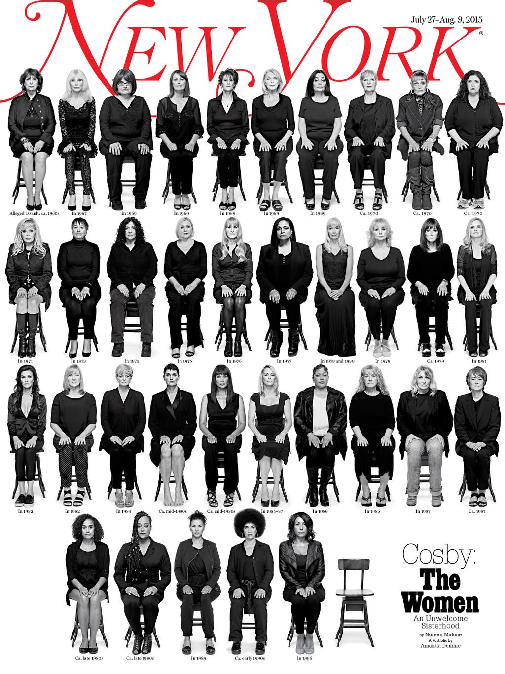
This week’s issue of New York features what will likely be considered the most significant magazine cover of the year. It depicts thirty-five women speaking out about their claims of assault against comedian Bill Cosby, all photographed in stark, uncompromising black and white. The simply arranged composition is a powerful form of visual accounting; it builds its case person by person, row by row, until the sheer volume becomes almost too much to bear. While I knew that Cosby had many accusers I didn’t realize that there were at least thirty-five of them, and seeing them gathered together made me shudder. As art direction, it would be a triumph if the subject matter weren’t so horrifying.
Though I’ve been trying not to make these roundups of design tool-related news too complicated (something I do with just about every project; such is the wont of fussy designers), this latest edition is pretty hefty. So I’ve decided to parse out the stories into loose categories, at least for this week. First up: some big news for indie design tools companies.
Ambitious design collaboration company InVision recently closed a big US$45 million series C funding round. This is a pretty meaningful moment for this new generation of design tools; an independent player is barreling towards a massive valuation. InVision could be the next Adobe, a design-based company with a multi-billion dollar market cap. Here is the press release, and there’s more in the write-up at techcrunch.com
Prototyping app Pixate and its team have been acquired by Google. Pixate is the most used of the various interactive prototyping apps in our toolbox at Wildcard, and so the news is bittersweet for me; I thought they had a bright future on their own, but I’m optimistic that Google will do some interesting things with them in the near future. Read the announcement at pixate.com.
Design hand-off tool Zeplin, which recently just came out of beta, announced that it has joined prestigious startup accelerator Y Combinator. The Zeplin team is already in the current class, apparently, though I couldn’t find any details about the timing.
Now for some news about some actual design tools.
Digital agency Huge has debuted Style Guide, a tool that aims to make creating and maintaining style guides much simpler. They’ve released documentation and a public repo here, where you can also try an online demo.
Principle is a new OS X app “that helps user interface designers create interactive and animated designs.” It’s in private beta—I haven’t been able to try it out yet. principleformac.com.
RightFont is a new font management utility for OS X and it’s out in beta. It claims to “integrate with Adobe Creative Cloud & Sketch 3,” which I first took to mean that it could co-mingle your local fonts with Adobe’s Typekit fonts—which would have been awesome—but it doesn’t look like that’s actually the case. Oh well. rightfontapp.com.
Panic’s mobile text editor Diet Coda has been updated and is now called Coda for iOS 2. If you use this, I mean if you really use this, I’d like to hear more. panic.com.
Sketch Data Populator, the plugin that lets you use live data inside your Sketch layouts, keeps getting better (or at least they keep emailing me, so I keep writing about it). The latest version allows you to select an element, create a grid of duplicates with it and then populate each cell in the grid with data, all in one action. That addresses the main critique I had of the plugin some weeks back. Grab it at github.com.
Similarly, designer Elliott Jackson (of RealMac Software) has released Ditto, a tool that lets you make Photoshop layouts more dynamic. Ditto “allows the use of variables for things like colours, text, font sizes and perhaps most powerfully of all: visibility.” You can download—and donate—at casualnotebook.com.
InVision has added an overlays feature that claims to let users “get more realistic-looking prototypes without adding any extra time to your normal prototyping process.” blog.invisionapp.com.
Finally, two very worthwhile articles written by designers.
Designer Linda Dong wrote a superb overview of iAd Producer, which I didn’t even know existed because well it’s called “iAd Producer.” She walks you through using it as a surprisingly capable prototyping tool, sort of like a more robust, UI-focused variant of Keynote. This is highly recommended. Read it at lindadong.com.
Designer Benjamin Berger believes that “there is still [a class of design tool] missing between Sketch and Zeplin.” This is his exhaustive outline of what that might be; he calls it a “scalable” design tool. Published over at medium.com.
Also, read my last installment in Design Tool News here, and let me know if you see something interesting via the form below.
How has one of those “listicles” rounding up sixteen animated logos. In and of itself that’s nothing special, but it’s rare to see this many animated logos in one place and to see the animators credited. Animation is going to become increasingly important to all kinds of design (despite the advice of some) so we should start paying attention to who is doing the animating. See the full list at howdesign.com.
Monotype commissioned design studio Field to create a series of experiments that use digital technology to play with typographic forms. The results are beautiful, though claiming that they’re a “reinvention” of type is perhaps a bit much. The Field team is less than shy about comparing this work to art, but what I see instead is rudimentary R&D for advertising grammar; as visually stunning as the work is, it seems fundamentally geared towards figuring out new ways to make products look desirable. Nice work if you can get it, I guess. More at field.io.