is a blog about design, technology and culture written by Khoi Vinh, and has been more or less continuously published since December 2000 in New York City. Khoi is currently Principal Designer at Adobe. Previously, Khoi was co-founder and CEO of Mixel (acquired in 2013), Design Director of The New York Times Online, and co-founder of the design studio Behavior, LLC. He is the author of “How They Got There: Interviews with Digital Designers About Their Careers”and “Ordering Disorder: Grid Principles for Web Design,” and was named one of Fast Company’s “fifty most influential designers in America.” Khoi lives in Crown Heights, Brooklyn with his wife and three children.
This looks phenomenal: a feature-length documentary about the origin of seminal satirical magazine The National Lampoon, which changed the way America thought about humor in the 1970s and 1980s. I was a bit too young to enjoy (or understand) The Lampoon in its heyday, but its effects on the culture at large were not difficult to grasp: the founding cast of “Saturday Night Live” was built on Lampoon veterans, and it influenced at least two generations of culture makers. I haven’t seen this documentary yet, but as I understand it, it gives Lampoon’s key art director Michael Gross his due, too. Gross was responsible for the magazine’s signature, Madison-avenue style aesthetic; often the magazine looked as professional as the straight culture it was satirizing, which made it even more effective.
The movie is out in theaters in late September. Read a review of the “Drunk Stoned Brilliant Dead” at hollywoodreporter.com.
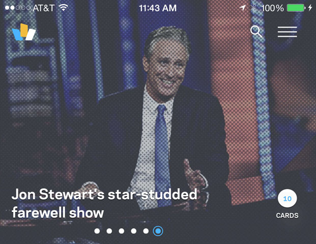
After over six months of incredibly hard work, I’m so proud to say that today we’re releasing a brand new, completely redesigned version of Wildcard for iPhone. You can download it free right now. We’ve narrowed its focus to news and media, and my colleagues and I put a ton of time and energy into creating what we think is the best news experience in the App Store. It uses the card concept that is at the heart of everything we do at Wildcard, combined with a crackerjack editorial team that we assembled over the past six months, to create a remarkably efficient way to scan the latest news and dive into each story’s details as much or as little as you’d like—all in one place.
We also spent enormous amounts of energy creating a beautifully designed showcase for what cards can do. Here are some of my favorite details from Wildcard 2.0.
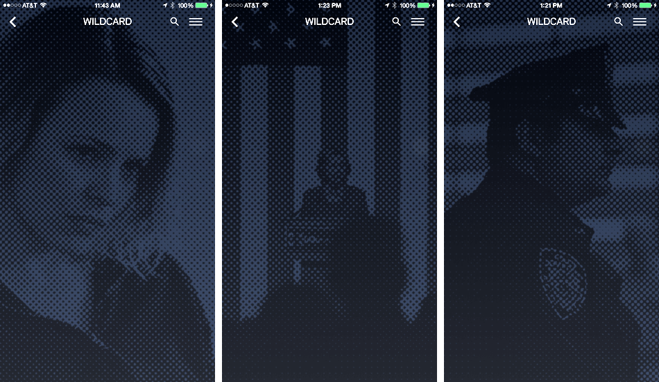
Halftones Instead of Blurs
Like it says in the title of this post: blurring is the Auto-Tune of UI design. That is, it creates a pleasant enough effect, but it’s heavily overused (to put it politely). We set out to create an alternative and, given our new focus on news, decided to borrow from the print world by using a halftone effect that emulates the way photographs appear in newspapers. You’ll see it in full color in the headlines we have at the top of the app’s home screen and in monotone throughout the rest of the app. This video shows it in action, but because halftones by design tend to look seamless at smaller sizes, you should watch it full screen to see the full effect.
Unfortunately there’s no halftone function built into iOS, so we had to roll our own: each time an editor selects a photograph to use in our content management system, it is automatically processed on a custom image server that produces a halftone counterpart. Here’s a few examples.
That halftone version, which is a fairly lightweight, translucent PNG, gets downloaded to the iOS client on the fly; each time a user opens up one of our collections of cards (look for cards with circled numbers in the top right corner), the thumbnail image enlarges and is replaced by the halftone, which serves as the backdrop for that view of the collection.
Cards Are Independent of One Another and Behave Accordingly
We’ve spent a lot of time thinking about what it means for something to be a card, particularly what “physical” properties it should have. At the risk of skeuomorphism, we decided that for us one of the foundational ideas is that cards should scroll independently.
In typical scrolling views, like the Contacts app on your iPhone or even Twitter, the constituent parts of the stream all scroll together, in lock step. That makes sense because in those cases the streams are really lists; in Wildcard our stream is composed of individual cards, with each card a representation of some other form of information.
It probably would have been fine to have them all scroll in lock step like traditional streams do, but we wanted to imbue each with independent motion in order to emphasize their card-ness, as it were. If you watch this video, you’ll see how, even though they all move together, they sometimes lag one another and space opens up between them. It’s not so much a single view that you’re scrolling here as it is a series of cards.
Reading Content in Web Views Can Be Better
Embedded web views are the bane of news apps. Wildcard 2.0 has a speedy, elegant Reader-like view (we call it View as Card) but we want publishers to get their page views too. So we decided to default to an embedded web browser—but we worked hard to make it the slickest one out there.
Instead of clearing away the summary card altogether, as most do, our web view loads just beneath the card when you tap on “Read More.” This lets you keep your context until the page itself is fully loaded and ready; when it is, the card quietly transitions away. When you exit the view, the card stream comes back onto the stage, right where you left off. Being able to maintain the user’s sense of place really mitigates the interruptive nature that native apps’ web views suffer from.
Cards Carry Their Own Actions
In Wildcard 2.0 every card has its own properties that allow common actions—sharing that card and saving it to our in-app My Cards file are both available now, with more to come soon. These are activated by pressing and holding (we’re ready for Force Touch when it comes to iPhone), but power users can also press, hold and drag the card to the action they desire.
It took many, many iterations to refine this interaction; at various points in development it was either too difficult or too easy to trigger this state. We thought about creating different affordances for novices and experts, but with tons of testing, we were able to come up with a single method that could scale between them.
Splitting the Difference Between Apple’s Brand and Wildcard’s
Part of the challenge for every designer of a new iOS product is how much to adhere to Apple’s design guidelines and how much to stray from them. Our approach was to respect the spirit of the law rather than the letter of the law, so to speak, and you can see that throughout the app: the user interface elements are familiar, but not perfectly consistent with the operating system.
We veered a little further when it came time to design our home page at trywildcard.com though. Apple is pretty clear about using its App Store badge and iPhone visual assets as is, but we decided to push the envelope a bit.
On the left side of the page, we’re rotating in and out a series of news images (updated every few days and treated with our halftone effect). As the colors change there, we’re making corresponding visual changes in the App Store badge and the highlights of the iPhone. The color shifts in the phone’s photographic details in particular are subtle, but the effect visually unifies the page. This is done with just two images; the standard phone image overlaid with a translucent PNG that contains just the darkest parts of the phone image (separated out in Photoshop) and colored with CSS.
Those are just some of the many details we really sweated over while designing this app. It was hard work but also incredibly fun; at the beginning of the project we were lucky enough to get broad agreement from the team that this new version should really be a design showcase. You don’t get that kind of opportunity every day, nor do you get to work with a talented team that fully commits itself to doing that.
I went to see “Mission: Impossible–Rogue Nation” over the weekend. It’s the fifth installment in a franchise that’s nearly twenty years old and yet I was shocked by how improbably good it is; it may be the best one of the lot.
This video by Sean Witzke for Grantland (part of their recent Tom Cruise Week) makes a case that at least part of this series’ surprising longevity is owed to its unique conception as a kind of auteurist playground. Over five installments, these movies have been helmed by five different directors, each of whom brought his own distinctive vision to bear, and largely to good effect. Few characters and even fewer plotlines persist from sequel to sequel, and so much emphasis is given to each director’s own stylistic voice that the five films barely seem connected to one another.
What unites them all is Cruise himself—not just his centrality as the principal character, but also his sensibilities as producer. Though few would call him an auteur, Cruise has created a unique franchise in which his charismatic center of gravity allows the fictional world around him to be continually re-imagined by others who are more commonly acknowledged as film visionaries. In an age when studios are desperate to create “universes” of shared actions and consequences, the “Mission: Impossible” films stand out for being episodic in the loosest sense—more like an anthology than the bombastically scaled serials currently in favor.
It’s also notable how the series’ gender politics have evolved in unexpected and strange ways. On the one hand, the only characters who make it from sequel to sequel are men; each new movie discards the female characters from the previous one entirely.
In and of itself that’s disappointing but not unprecedented; the James Bond series takes almost exactly the same tack. But in 007’s world, that’s largely done so that Bond can move on to new and different romantic interests. By contrast, Cruise’s Ethan Hunt may have started with some nominal Lothario-like qualities at the beginning of the series, but as the franchise wore on, the scripts became less and less interested in not just romance, but the notion of Cruise as a sexual being.
After trying to marry off Hunt in the third installment and then quickly discarding that conceit altogether, Cruise’s character now seems not at all capable of any meaningful human intimacy. He barely acknowledges the sexuality of his female co-star in the fourth installment, and while his character makes a significant emotional connection with (the amazing) Rebecca Ferguson in “Rogue Nation,” its culmination is no more intense than a hug. Seriously; a hug. Not only that but—spoiler alert—the plot conspires such that Ferguson does most of the rescuing in the film, rather than vice versa.
There’s a lot that you can read into the subtext there, especially if you factor in the many rumors about Cruise’s personal life into the on-screen content. But what’s interesting to me is how the “Mission: Impossible” series has unexpectedly turned into the very best kind of genre film. On it surface, it has a formulaic approach to good guys, bad guys, girls with guns, and MacGuffins, but as you look deeper, you see not only real auteurs at work but lots of interesting ideas, both intentional and unintentional.
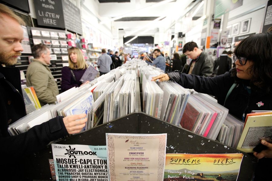
This Stereogum article looks at the less well publicized drawbacks of the putative resurgence in vinyl sales of the past several years. In short, with few factories able to actually produce vinyl, the limited production capacity can make it very difficult to actually ship discs. This is not much of a problem for larger labels that sell the format (The Beatles’ “Abbey Road” is a best-seller on LP) than it is for the folks for whom vinyl should really be a benefit: small, independent labels, for whom production times can run as long as six months, dangerously tying up their already constrained capital.
I’ve long been skeptical of vinyl’s second act. In spite of the surprising growth in sales figures for the format over the past few years, it has rarely had the feeling of an authentic revival—more like the feeling of a bubble among people who are desperate to buy authenticity, artificially inflated by those who profit from selling it. Stereogum quote’s indie musician Kip Berman’s incisive comments on that specific quality:
The vinyl revival is brought to you by the same industry that wanted everyone to buy their record collections AGAIN on CD/tape.
That seems about right to me. You know what also sounds about right? The fact that vinyl doesn’t sound better than digital music.
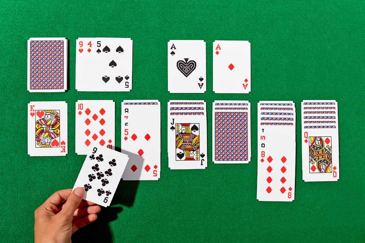
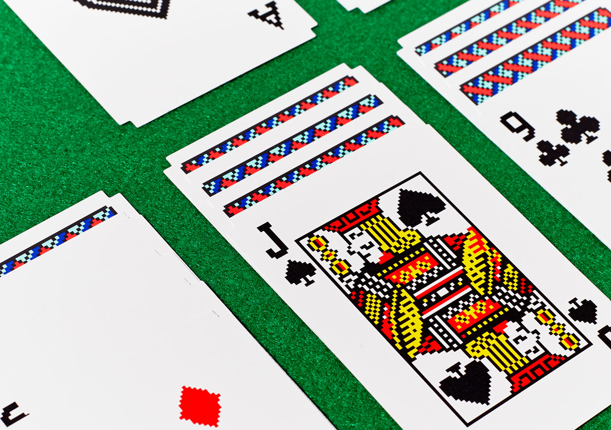
In 1990, designer Susan Kare, who created the original fonts, icons and graphics for the Macintosh, designed the artwork for Microsoft’s version of Solitaire that shipped with millions of copies of Windows 3.0. Now Areaware, purveyors of hipster tchotchkes, have produced, in collaboration with Kare, a real playing card deck modeled after her Solitaire designs. The printed fronts and backs of the cards feature pixelated card designs and the corners even feature “chunky” die-cutting.
Carbon3D’s premise is the question “What if 3D printing was 100X faster?” Just two years old, the company has already raised over US$50 million in funding towards its goal of modernizing on-demand manufacturing through “transformational advances in 3D hardware, software, and resins.” Their belief is that what we call 3D printing today is actually a misnomer for what is in actuality “2D printing, over and over again”—inkjet printing, basically.
This TED talk from Carbon3D CEO Joseph M. DeSimone, a chemist and material scientist, shows this concept in action, live on stage. DeSimone talks about how his team was inspired by the T-1000 from “Terminator 2” to essentially “grow” printed objects from a puddle of source material. It’s quite amazing to see how he’s able to fabricate an object that is impossible to print with current 3D printing technology, and even impossible to create with traditional injection-molded processes, in less time than it takes for him to finish his ten-minute speech.
Design is a central part of the company’s plan to get fulfill this mission, and Carbon3D is hiring its first designer now. I talked to Carbon3D’s Nathalie Pretzer about the opportunity.
What makes this job unique?
We’re ramping up our organization to introduce our first product to market later this year, and the scope for design is huge! As the first hire on our design team, the right candidate will be spearheading all of our design efforts from product interfaces, to marketing materials, and interior design. We are looking for a UI designer to be a key stakeholder in the definition of the overall customer experience—how they use our products inside and outside the software—leveraging his/her ability to translate ideas about experience into meaningful UI concepts.
What special skills or unusual experience are you looking for in a candidate?
You should be driven by a high level of craft in visual design—you may have 3D modeling and motion design chops—along with the ability to create interaction models. I wouldn’t describe this as unusual but it’s certainly hard to find. You’ll get to stretch your design skills as you assist with video, photography, environmental design and ecommerce.
What’s the role of design at the company now?
You’d be the first hire on our design team. Design is integral to how we think about marketing and product. There is still plenty of room to define and represent design practices in our process.
The right candidate will play a major role in demonstrating the power of design to impact experience. He or she will work very closely with the software engineering team and head of marketing. We are a highly cross-functional group—you’ll get the chance to work with our hardware, software, materials science, marketing, sales and print studio teams.
What’s the first big challenge?
Launch our product! The designer will partner with the head of marketing and the engineering team to build world class web-based and printer-based interfaces while providing design guidance/feedback to agencies across marketing projects.
If you’re interested in this opportunity, read more at Authentic Jobs.
This is the fifth in my occasional series spotlighting interesting job openings for designers. See also my interviews with ESPN, The Coral Project, Digg and Toca Boca.
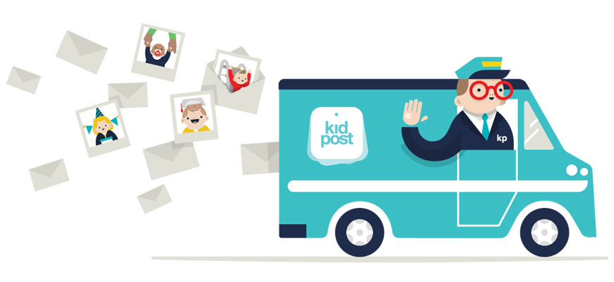
I’m very happy to announce that Kidpost, the service some friends and I are building to make it easier for parents to share their kid photos with tech-challenged friends and family, is rolling out a major upgrade today. This new version sports a sleeker, cleaner design, but more importantly, it lets you send your first Kidpost in just a minute or two. Give it a try now at kidpost.net.
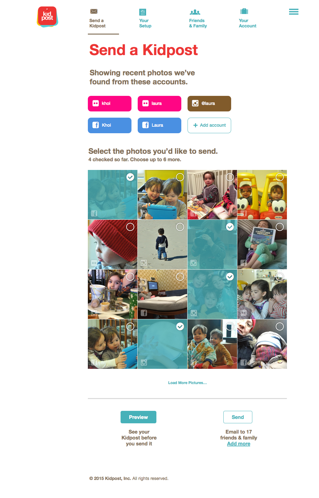
Before this, Kidpost worked solely via hashtags. Parents would post photos of their kids to Instagram, Facebook, Flickr and/or Twitter with the hashtag #kidpost (or a user-defined custom hashtag) and the service would automatically send those photos out to their friends and family. It worked great as a very lightweight, easy method of making sure what parents post to social media also makes it into the email inboxes of their loved ones.
In fact, we’re not changing how that works at all (it’s still our favorite way to send Kidposts). What we’re adding is the ability to also send Kidposts without hashtags, which is faster and more immediate—especially for new users. With this update, once you create a Kidpost account we immediately show you thumbnails of your recently posted photos. That looks like this:
All you have to do is select the ones that you want to send out, and Kidpost does the rest. Of course, as always, you get to decide who gets these emails—no one sees them unless they’re on your list of friends and family, and you can add and remove people at any time.
Kidpost has been a labor of love for us, and we’re so grateful to the many folks who have been using it as we’ve been evolving it over the past year and a half. We’re also incredibly gratified by the many, many times we’ve heard our users tell us, “My family loves Kidpost! They can’t get enough!” If you have kids and you’ve got tech-challenged friends and family, or just folks whom you know would love to get the kid pictures you share on Instagram, etc., please give it a try—and tell a friend!
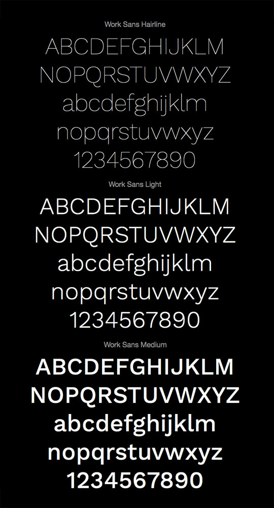
This 2014 typeface designed by Wei Huang is a contemporary grotesque that comes in ten screen-optimized weights, ranging from Hairline all the way through Black. It looks fairly versatile even if it currently lacks italic styles. Work Sans is released under the SIL Open Font License which basically means it’s free for personal and professional use. Even better, Work Sans is now hosted by Google Fonts—Jeremiah Shoaf of Typewolf says, “Prepare to see it everywhere.”
Oregon’s George Fox University IT department took three dozen iMac boxes and turned them into a human-sized wheel, then made this charming video demonstrating it in action. Silly but fun.
A quiet week or so in design tools news, but still plenty to note, including the beta of a new UI design app for iPad. See, that’s how far this market has come—we’re so spoiled by new contenders in this space that we find it unremarkable that “only one” new app was announced!
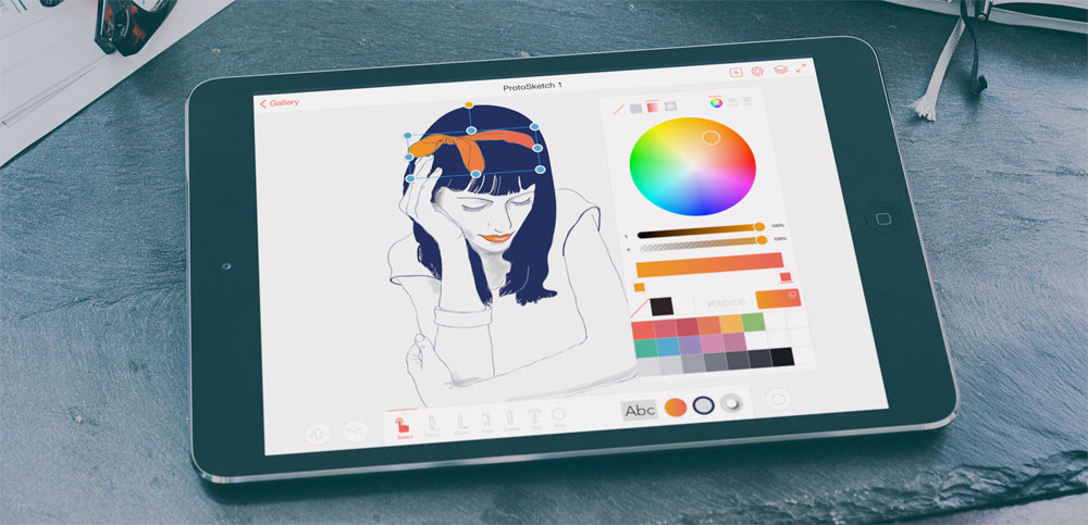
ProtoSketch is a new vector graphics application for iPad (an OS X version is also in the works). It classifies itself among full-fledged drawing apps like Adobe Illustrator and Corel Draw, claims to be suitable for web and app design, icon design, print design and vector illustrations, but specializes in user interface and user experience design. You can see a working prototype in action in the video below. If the team can pull this off on an iPad, I’ll be very impressed; creativity software on tablets and phones is of particular interest to me. The app is currently in private beta; I haven’t been able to get my hands on it yet. protosketch.co.
Amber Bravo of Google Design moderated a fascinating roundtable with Matias Duarte, Paul Colton (Pixate) and Max Wiesel (Relative Wave, makers of Form) on “How a new generation of prototyping tools at Google will help designers build better software.” Bravo has also posted this appendix of sorts to the conversation. The big takeaway here is that Google is gearing up to make a splash in the design tools space.
Prototyp is a browser-based app that lets you create interactive prototypes quickly. It’s built on Framer.js, so knowledge of JavaScript or CoffeeScript is required. prototyp.in.