is a blog about design, technology and culture written by Khoi Vinh, and has been more or less continuously published since December 2000 in New York City. Khoi is currently Principal Designer at Adobe. Previously, Khoi was co-founder and CEO of Mixel (acquired in 2013), Design Director of The New York Times Online, and co-founder of the design studio Behavior, LLC. He is the author of “How They Got There: Interviews with Digital Designers About Their Careers”and “Ordering Disorder: Grid Principles for Web Design,” and was named one of Fast Company’s “fifty most influential designers in America.” Khoi lives in Crown Heights, Brooklyn with his wife and three children.
Way back in early June I put together a survey on Typeform all about design tools. The questions asked about the preferred software that designers are using today for tasks like brainstorming, wireframing, user interface design, prototyping and more.
The survey was open to the public for nine days, and in all I got just over 4,000 people from all over the world to take it—a pretty wonderful response, especially since I had started the whole thing as a bit of a lark.
In fact, my original plan was to share the survey results as a simple blog post. But as I began to see the volume of responses, and the intense interest in the results from many people, I realized that I could do something a bit more elaborate and illuminating with the data I was collecting.
So I called my friends at Hyperakt, a design studio in Brooklyn, NY who have done lots of projects in which they extract interesting stories from raw data. I asked them if they would like to take a crack at doing the same for this survey; that is, would they distill the data into actual findings, and also, while they’re at it, take artistic license to design a beautiful presentation out of the results?
The result is what you see today at tools.subtraction.com, where you can you explore each of the categories that the survey asked about through Hyperakt’s wonderfully produced information graphics. I could’t be happier with the outcome; even though the survey is very unscientific, I think it offers a very revealing look at what’s happening in this quickly changing, highly volatile, golden age for design software.
My many, many thanks to the Hyperakt team including Deroy Peraza, Jason Lynch, Eric Wang, Radhika Unnikrishnan and Wen Ping Huang, all of whom put so much exquisite effort into every tiny detail of these findings. Also tremendous thanks to Typeform and its co-founder David Okuniev; their brilliantly elegant survey software was essential in making all of this happen.
Finally, if you find these results interesting please sign up at the site to be notified about next year’s survey as well. Yes, I plan on making this an annual event if for no other reason than, based on what we’ve seen in the design tools market recently, the best is still ahead of us.
Update: Here are some links to coverage of the survey findings:
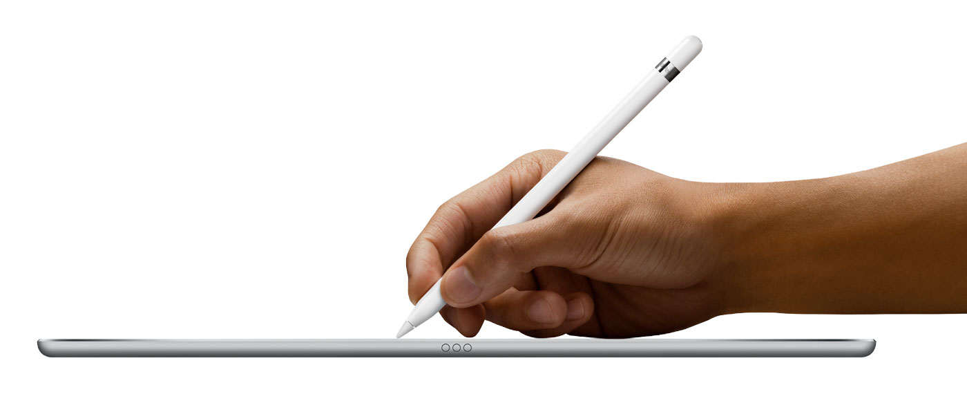
The headline items from the iPad segment of today’s Apple Special Event were hardware: the company announced a new, integrated keyboard, the first ever Apple-sanctioned stylus, and of course the long-rumored, ginormous iPad Pro. Alongside the impending iPad-specific software improvements coming in iOS 9, we now have what basically constitutes Apple’s response to the downward trajectory of iPad sales.
Will it be enough? I certainly hope so, but what’s also interesting is the extent to which Apple is leaning on its developer community to help sort out the iPad’s near term future via software innovation. Both Microsoft and Adobe made central appearances during this morning’s iPad segment. A few people have remarked how old school it seems to have two icons of the old wave of computing trying to map out the future of what Tim Cook described on stage today as Apple’s “clearest expression of our vision of personal computing.”
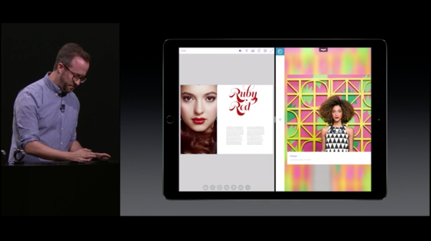
Microsoft spent its time showing off how well its mobile version of Office works with the new hardware, which seemed fine to me. Of course, as of three weeks ago, I’m now naturally biased towards Adobe’s contribution to the event. The company is doing some really significant work in bringing viable creativity solutions to mobile devices, and that was on display in a vivid way today when my colleague Eric Snowden, who leads design for Adobe’s mobile apps, took the stage.
Eric demonstrated a key piece of technology that has been cooking at Adobe for some time: round-trip capability for the company’s burgeoning suite of mobile software—we call it “360º workflows.” In his demo, Eric used Adobe Comp CC, the layout app that I created with Adobe (before I joined the company), to quickly mock up a layout with text and images. Comp CC is a useful hub of sorts in these workflows because it deals in assets of many different kinds. With a few taps, he placed a photo into Comp CC, then “sent” that photo to the newly announced Photoshop Fix app, made some edits, and then had those changes instantly reflected back in the original layout. It’s now significantly easier than ever before to work with assets that need to be handled by multiple mobile apps.
What’s even more interesting is that Apple is allowing Adobe to create its own foundation for this inter-operability; though it takes advantage of iOS 9’s split screen features, the round-tripping itself is based on an infrastructure that is deeply integrated with Adobe’s Creative Cloud ecosystem. Right now this feature is available primarily to Adobe’s first-party apps, but the hope is that soon many more developers will be working with Adobe’s Creative SDK and thereby benefiting from these innovations.
All told, we now have iPad-specific features in the operating system, new iPad-only hardware peripherals, a new, significantly larger iPad and, with Adobe’s software, a very adroit integration of all of the above into a robust workflow. For my money, it all makes for a pretty compelling argument for the iPad as a work device. It may not convince everyone just yet that an iPad Pro can satisfactorily replace a MacBook—that’s still a steep hill that will require lots more work to surmount—but the potential is there, and clearly within reach.
Hobeaux (pronounced ho-BO, emphasis on the second syllable) is a modern update of the historically scorned typeface Hobo. Its creator, type designer James T. Edmondson, writes:
It was striking to me that even though few consider it a favorite, Hobo has somehow survived every technological leap in type. It started in metal, maintained popularity in the photo typesetting era, was digitized in the 80s, and now comes pre-installed on almost every personal computer—an amazing feat considering its name is derived from the fact that no one wanted to care for it in the first place.
Lest you think this is an elaborate joke—why would someone feel the need to rehabilitate Hobo?!—the price will clue you in on just how serious Edmondson is. Or maybe it’s just part of the joke. I honestly can’t tell.
Filmmaker Dan Bell shoots surreptitious videos of dying or abandoned shopping malls. They make for fascinating, car crash-level spectacles that you can’t turn away from—they’re unflinching portraits of the American consumer wasteland, you might say. The one embedded above is particularly creepy; Bell and a friend walk through the corridors of Frederick Towne Mall in Frederick, MD, where the lights are still on low and a haunting Muzak-like soundtrack is piped throughout. It has all the makings of a horror movie, though the climax is not particularly dramatic.
I actually happened across Bell’s videos when someone shared a similar video with me made by someone else: this drone-powered fly-through of the decimated White Flint Mall in Kensington, MD. For some reason the owner of that video does not allow it to be embedded; you can watch it directly at YouTube, and it’s fascinating. Alternatively, the video below is a walkthrough—foot-powered, not drone-powered—of the same mall before a lot of the demolition work was done.
Both of these structures were not far from where I grew up, and it does seem as if the Washington, DC/Maryland/Virginia area is suffering from a spate of foundering shopping malls. But the White Flint Mall holds particular resonance for me because it’s actually a mall from my youth. It wasn’t the nearest one to my house, but I still remember going there countless times with family and friends. The outside is still recognizable but the inside—fully gutted, debris strewn about, wires and cables hanging everywhere—is like an alien planet. I didn’t expect this to make me feel as sad as it did about losing my childhood.
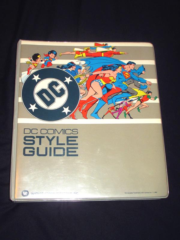
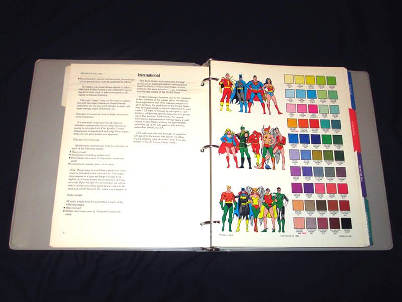
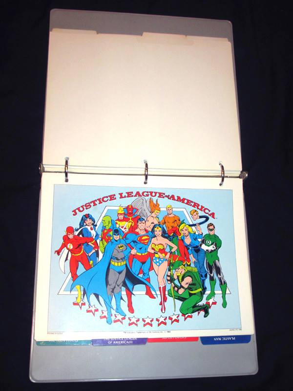
A treasure trove for comics nerds of my generation: this style guide was produced by DC Comics over thirty years ago for licensees of their many iconic characters. I remember many of the images from seeing them on beach blankets, tee-shirts and other items over the years. The majority of the art in the guide was illustrated by artist José Luis Garcia-Lopez. Where comic book artists as a whole have traditionally been quite expressive and interpretive, Garcia-Lopez’s clean, strong line was able to forge a reasonably canonical notion of what these characters “really” looked like.
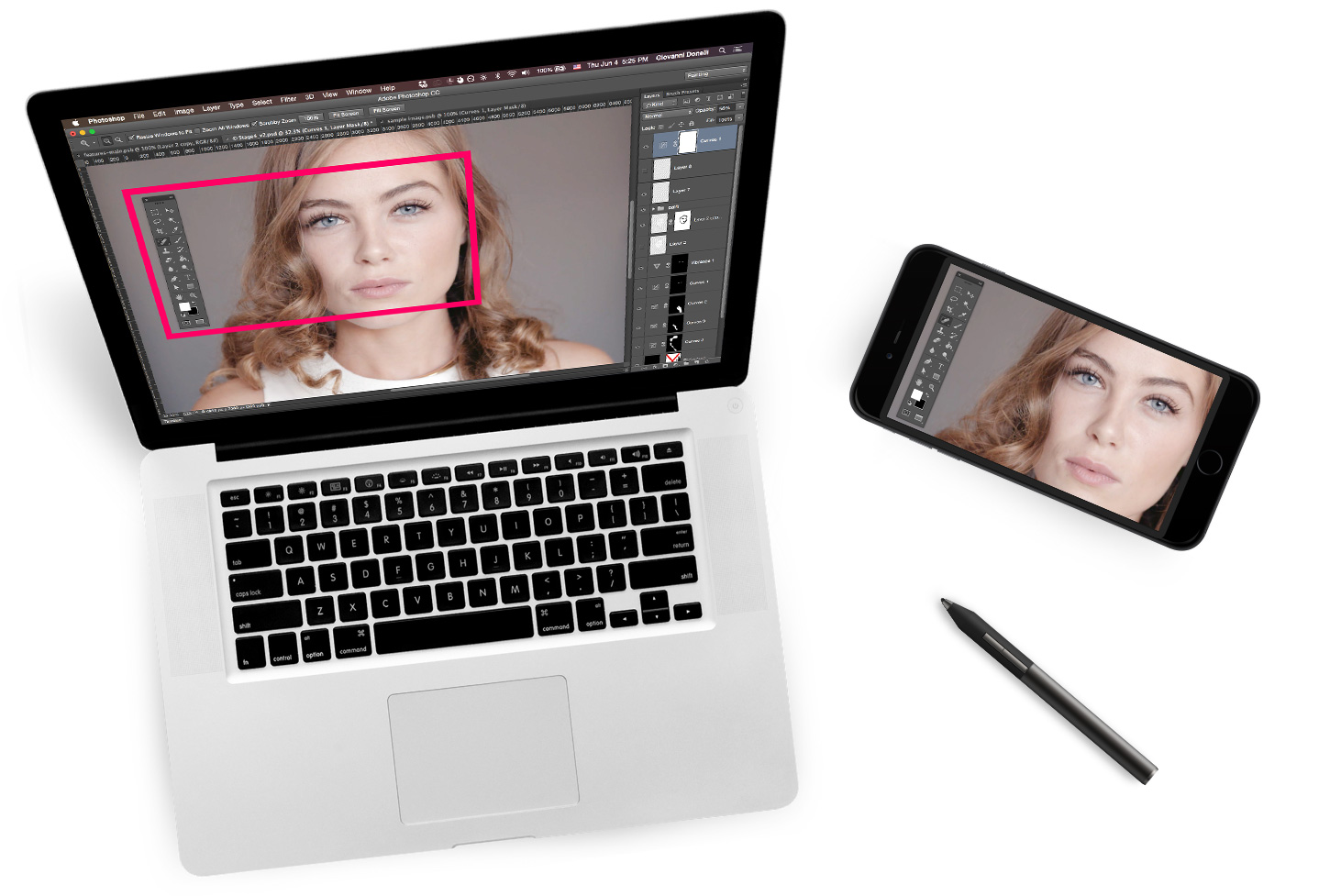
Like many apps that debuted on the iPad (no matter how compelling), the remarkable Astropad has apparently felt compelled to release an iPhone version—it’s available now. This new release allows your phone to act as a WACOM-style graphics tablet, just as its predecessor did with the iPad. Once connected to your desktop computer via wifi or USB cable (supporting both methods is itself a canny move), your iOS device serves as a high quality, low compression input peripheral that can drive any of your preferred graphics programs. You can even use a stylus of your own choosing to achieve beautiful, natural, pen-based gestures.
Notwithstanding this further confirmation that the iPad market is in the doldrums, I was disappointed to see that Apple apparently passed on showcasing Astropad as an innovative example of software unique to its tablet. It’s not hard to imagine the powerful television commercial that could have been: picture a sprightly artist painting a vivid landscape with an Astropad-powered iPad and a laptop running Photoshop, Pixelmator, or any other graphics program. That said, if you become enamored of using Astropad as a graphics tablet on your phone, it’s hard to imagine you wouldn’t like it more given the relatively copious screen size of an iPad, so maybe this will function as a gateway drug of sorts.
If there’s one reason why the category of design tools feels so rich with possibility right now it’s because UX prototyping software is in a truly germinal stage. So much about how prototyping should be done remains open to interpretation; no one has yet figured out a a set of best practices that can be unequivocally declared “the best.” This is very different from more mature categories of software like, say, spreadsheets or blogging systems where even the most innovative contenders tend to be essentially the same as the incumbents.
With every new entrant in the category we, as users, as designers, are treated to novel attempts at establishing new, or at least variant, ways of doing things—vocabularies and syntaxes, essentially, that try to capture the flurry of motion in procedural form. The central contribution that each new UX prototyping tool tries to make is to establish a workable system for describing how interface elements move, transform, signal intentions, react to user inputs. Taken as a group, the contenders of the past several years are notable for their disparate approaches; some are simple adaptations of familiar tools like presentation software; others are ersatz development environments; still others let you play the role of a switchboard operator in an old timey movie, wiring things together incomprehensibly.
What they have in common is that they all feel, to varying degrees, as limiting as they are empowering. Each one must formulate its own specific equilibrium between the competing priorties of speed and ease-of-use, on the one hand, and power and control, on the other.
What makes this process of figuring out best practices particularly difficult is that we as users and customers think we’re all waiting for that idealized app that can finally balance the two ideas perfectly, like a seesaw with identically weighted children on either end, but that’s not quite the case.
In reality, we’re all engaged in a conversation with the makers of these apps, learning from one another what it means to give preference to one or the other side, feeling out the respective drawbacks of favoring intuitiveness or fidelity. Each new app builds on what we learned from the last, as ideas bounce between developers, mutating and molting along the way. Similarly, as users keep trying new ways of doing things, common knowledge accrues, feeding continually escalating expectations. If we step back, it becomes obvious that what we’re looking for isn’t the perfect balance at all, but rather the right kind of imbalance, a balance that is likely not knowable without a lot of trial and error.
When we eventually achieve a workable notion of “best practices” they will almost certainly tilt more towards one side of the fulcrum, maybe dramatically so, rather than leveling steadily. We may never get the ability to prototype anything that we can dream without having to hack some heap of counter-intuitive code, and we may never be able to sufficiently empower the greatest number of creative UX thinkers without sacrificing the ability to tweak every parameter.
Put another way, will the winner of this category—“The Photoshop of prototyping”—look more like InVision or more like Origami? The first comes from the camp of decidedly simple but frequently infuriating precursors like Keynote and the masochistic joy of editing a document on your phone, and the latter literally hails from the brain trust that brought us such complex wonders as Asana and figuring out your privacy settings within an omnipotent social network.
Luckily for us, the need for an answer is not yet pressing. Prototyping as a craft, or even as a subset of the craft of user experience design, is still young enough that it would be premature for us to try and settle a winner in the short term. This somewhat awkward, highly formative stage in which we basically get a brand new prototyping app every month or so is actually one of those rare necessities that feels like a luxury. All these independent attempts at figuring out how this new discipline should work are good for our craft, not to mention tons of fun, and there’s no reason it has to end soon. Barring a butterfly flapping its wings the wrong way on a trading floor in China, it may in fact turn out to be a good long time until we need to declare a winner at all in this space. To be sure, a winner will be crowned eventually—that’s capitalism, folks—but until then, it’s a wonderful time to be a designer.
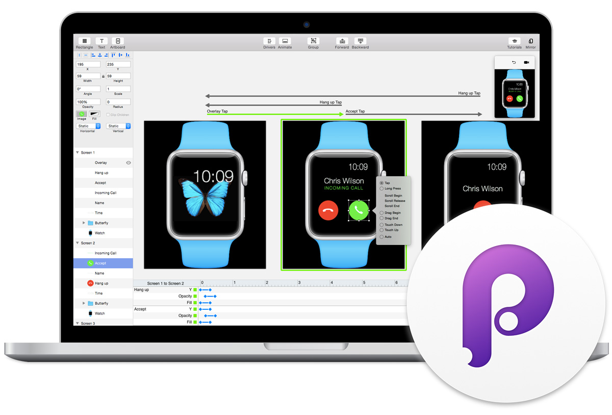
The steady stream of new UX prototyping software continues. Last week saw the widely praised release of Principle, an OS X app that allows users to design and animate anything from multi-screen flows to individual interactions and behaviors. It’s the brainchild of Daniel Hooper, a former Apple engineer who worked on core photography apps for iOS and OS X. Hooper left the Bay Area in 2014 and moved home to Atlanta, where he was able to focus on creating Principle as a small, independent concern. I asked him a few questions about the launch over email.
Q. How did Principle start?
I left Apple a little over two years ago and spent a month or so thinking about what I wanted to do next—a prototyping tool was at the perfect intersection of my skill set, interests, and market need. I hired contractors for bits and pieces, but most of the work was done alone. Creative tools are a big project, so I’ll be growing the team now that Principle has launched.
Q. How does Principle fit into a designer’s toolbox? What does it replace, and what does it complement?
Principle is primarily a tool to help designers think about and try ideas. You never know if you’re onto something until you see it. Once you do have something you like, it’s easy to explain the idea by sharing the Principle file.
As for what it might replace or complement: that’s a tough question because designers come from many disciplines—each of which has different approaches for animation and interaction. People have described Principle as: “An easier After Effects!,” “Keynote for designers!,” “Quartz Composer without the mind-blow!” So the way Principle fits into your toolbox largely depends on your background.
Q. Is the product that shipped the product you imagined at the outset?
Definitely not. When Principle started, it was an iPad app for visual programming. I thought it would be nice for designers to design touch interfaces on a touch screen, and that complex behavior was what designers really wanted to do, if only there was an interface for it. User studies proved me wrong.
Q. What kind of user research?
I did quite a few interviews with designers in the Atlanta area. What turned out to be most helpful was to have them talk me through some of their recent work—you start to see how their tools affect what kind of work they produced. After development started, I would meet with designers every one to two weeks and silently watch them use Principle. This was painful, but it was a priceless reality check for all my designs. These user studies are the single biggest reason why Principle turned out the way it did.
Q. When you look at the market for design tools and all of the activity in it lately, all of the new indie products, what do you find notable and how do you think the market will evolve?
Technically, I expect tools will move away from web technologies—they were a convenient shortcut to get off the ground, but as more people begin prototyping and more complex things get built, the web’s limitations will start to show. If you want to see the future of software, and design, read research papers from the 1960s-70s.
I’m interested in tools that try a new approach—there have been a lot of scripting and “noodle” prototyping tools, but I think those are a poor match for the way designers think. Some argue that these tools have no limits. I disagree. They limit the way you think to that of a computer.
Q. What’s ahead for Principle?
There is a lot planned: refinements like you might expect, but a lot of totally new things too. I don’t want to ruin the surprise, but I believe that the most exciting days for Principle are ahead.
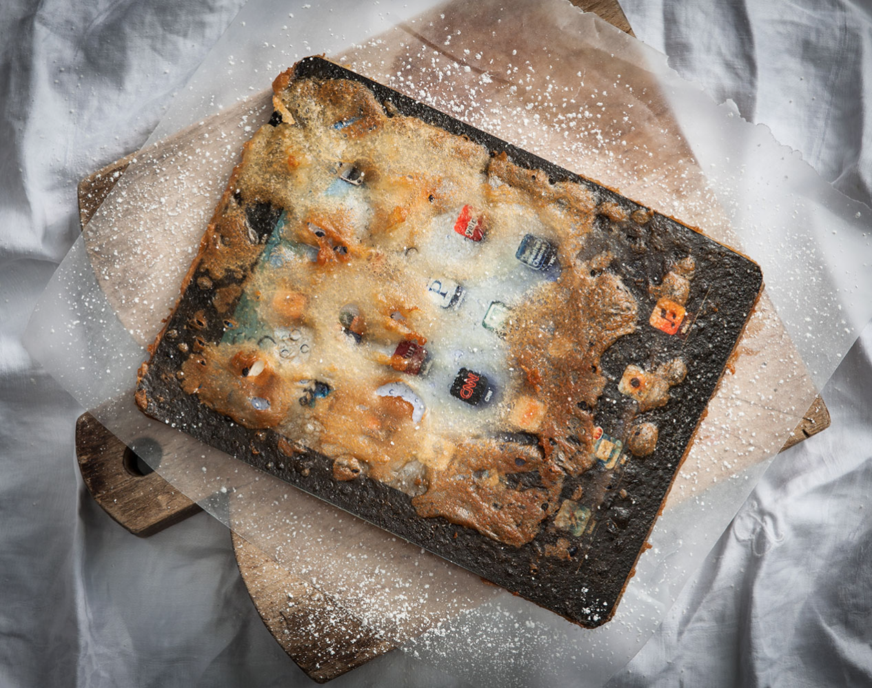
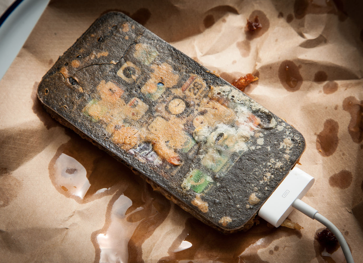
Photographer Henry Hargreaves has a great sense of humor about technology—and a very canny understanding of the role that it plays in our lives. He writes:
Electronics have become almost a holy device, the way a new Apple device sends people out of their minds. But as soon as the next model comes out the last is immediately forgotten. This is a commentary about the similarities between tech culture and fast food. Quickly devoured and then discarded because of our appetite for the newest product.
I’ve been writing so much about how the market for design tools has been changing in fascinating, vibrant ways that I’ve felt a little left out of the action. It’s not a stretch to say that there’s never been a better time to make software for people like us, and it’s only going to get more interesting in the months and years ahead.
Rather than let this golden age pass me by, I’ve decided to take action: I’m thrilled to announce that effective immediately I’m joining the team at Adobe, based at their brand new, growing space at Fifth Avenue and 15th Street in New York City. I’ll be working with Behance co-founder and Adobe VP of Products for Mobile and Community Scott Belsky on a number of new software initiatives for designers—which are going to be awesome.
Of course, this comes on the heels of launching the brand new version of Wildcard (go download it!) just a few weeks ago. The timing seems incongruous, I know, but it’s actually perfect.
From Wildcard…
Though I’m incredibly proud of the app, for me the best thing about my experience at Wildcard has been its team—particularly my incredibly fruitful collaboration with Steve Meszaros, my colleague in design there for nearly two years. He’s an amazing craftsperson and a brilliant creative mind, and he deserves as much credit as anybody for the wonderful reception that Wildcard’s design and user experience have received.
This summer, as we neared the app’s launch, it became more and more apparent that Steve was ready for the next stage of his career. When I discussed this with Jordan Cooper, Wildcard’s co-founder and CEO, we realized that this was an opportunity for a transition that could benefit everyone: Steve could take over the day-to-day design operations and I could move to a less intensive, more strategic role.
It’s a change that actually brings me full circle with Wildcard. Two years ago, I started working with Jordan and his co-founders Doug Petkanics and Eric Tang as an advisor, stopping by periodically to consult on how to build out the design discipline at the company. It was never my intention to get more involved than that, but when I saw the kind of company that they were building, and I got to know the team that they were assembling, it struck me as an opportunity not to be missed. I still very much feel that way, so I’m very happy that I’ve found a new arrangement that lets me stay involved. Wildcard has a very bright future and I’ll still be a part of it.
…To Adobe
Now I’m turning my focus to the enormous opportunities that lie ahead in creativity software. When I first started thinking about making this move, I talked to three companies with whom I’m friendly: there was Adobe, there was a startup with several significant rounds of funding, and there was another late-stage tech giant. I could tell from the outside that they were all doing really interesting things in this space; as I talked with them further and they selectively revealed details of their plans for the next few years, it became even harder to decide among them—there are some really exciting products in store for all of us, as designers, if these plans bear fruit.
In the end, though, Adobe was the choice that made the most sense for me. I’ve had a wonderful, ongoing collaboration with the folks there (see Adobe Comp CC!) for nearly two years, especially Scott and his crackerjack team of truly committed designers and engineers. In spite of my criticisms of Adobe’s past strategies, what I’ve seen throughout that relationship has been a new kind of company emerging from the old one. This new Adobe is one that is more designer-focused than ever before, that values openness and engagement with the community more than ever before, and that has managed to fundamentally restructure how it defines success.
That last point is a crucial one. Thanks to its frankly amazing transition away from boxed software and towards cloud services, Adobe is no longer incentivized to simply get designers to buy Photoshop, InDesign, After Effects, etc. In this new world, Adobe’s success is now predicated on whether they can materially contribute to a better creative ecosystem for everyone—consumers, users, designers and third-party software publishers alike. Put another way: the design tools market is no longer a zero-sum game for Adobe, and competitors don’t have to lose in order for Adobe to win. That vision looks exactly like the one that I aspire to for the market; one in which software giants, indie developers and everyone in between are all able to make the creative ecosystem better in their own ways.
I’ll be joining this campaign as both a designer and as a member of the community. There are some truly impressive projects happening at Adobe right now, and I hope to play bit parts in bringing some of them to life. And there are also some huge opportunities to create new software and work with third-party developers who are solving real problems for designers, and I’ll be rolling up my sleeves to make contributions there, too. Relatively little of this is mapped out with certainty, and in fact, lots of it is uncharted territory, which is even more exciting to me. In fact, later today I’ll be hopping on a plane to visit Adobe’s San Francisco headquarters for the first time, to start figuring out how to make all of this happen. Wish me luck.