is a blog about design, technology and culture written by Khoi Vinh, and has been more or less continuously published since December 2000 in New York City. Khoi is currently Principal Designer at Adobe. Previously, Khoi was co-founder and CEO of Mixel (acquired in 2013), Design Director of The New York Times Online, and co-founder of the design studio Behavior, LLC. He is the author of “How They Got There: Interviews with Digital Designers About Their Careers”and “Ordering Disorder: Grid Principles for Web Design,” and was named one of Fast Company’s “fifty most influential designers in America.” Khoi lives in Crown Heights, Brooklyn with his wife and three children.
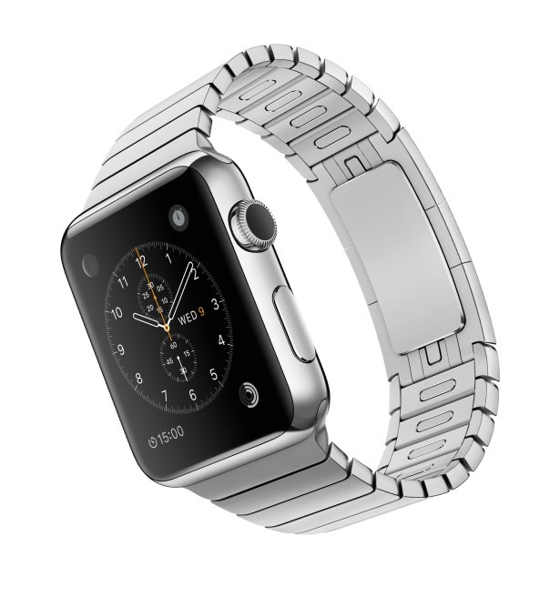
I’d like to own an Apple Watch. Or rather, I really want to want an Apple Watch. On several occasions I’ve stopped in at my local Apple Store to look at the various models and try them on, but I can never muster up the will to actually make the purchase.
Part of the reason why is because I never fell out of the habit of wearing a traditional watch on a daily basis. I own a simple, inexpensive, military-style analog watch with a canvas strap that almost wholly satisfies my expectations for a device worn on the wrist. It tells the time and date and needs almost no maintenance.
By contrast, not long ago when I borrowed an Apple Watch from the office for an extended test run, I was immediately flummoxed by having yet another digital device to mind. On several occasions I was caught unawares when I forgot to charge the Apple Watch in a timely manner, or when I tried to use it and realized I was out of range of my phone, which I’d left on my desk on the other side of the office. Charging a watch and keeping it within range of my phone aren’t really outsize maintenance demands, it’s true. But they did stop me cold and rendered the Apple Watch useless in those moments, and they’re at least an order of magnitude more demanding than my analog watch—which, again, requires that I do nothing for it to work.
Of course, this kind of overhead is part and parcel of adopting new technology. I keep that in mind each time I look at an Apple Watch in the store, and also try to remember that wearables are the future and that, as a designer, it’s almost my duty to bear these mild burdens in the interest of furthering my own craft. Plus, I have to admit, Apple makes wonderful products, and I want to own them.
However, what really stops me from buying one, the hump that I just can’t get over, is that the Apple Watch is rectangular and not round. Without a question, that is the thing that I have the hardest time abiding.
It’s just my personal preference that a watch should be round. A rectangular watch implies a definitive top, bottom, left and right, and also that the wearer should obey that orientation when looking at it. But a circle is much more forgiving; it can be read clearly from nearly any angle and it looks “right” regardless of what position your wrist is in. There’s an unquantifiable, harmonious connection to the body in a circular watch face; it’s the shape that’s most complementary to being human.
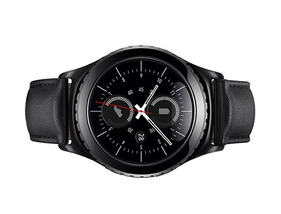
To be clear, a circle is not nearly as utilitarian a shape when it comes to a digital display. This is Apple’s reasoning for why its smartwatch is rectangular, and it’s a plausible argument. Samsung’s recently announced Gear S2 (below) is a very convincing marriage of a traditional circular watch form and a smartwatch, but it remains to be seen whether it’s actually useful at all, much less whether it’s a better product than the Apple Watch.
This is the tension that vexes me about the Apple Watch, though—the trade-off between wearing something useful and wearing something that looks and feels good. Last year, before Apple announced its smartwatch, I wrote in this blog post about the challenges of creating an entirely different product that by definition would be more fashion accessory than gadget. I described how fashionable goods are designed from the outside in—first comes how they look, and then comes how they work—rather than the way tech products have always been designed: from the inside out.
When technology companies look at goods that are built from the outside in, they generally see irrationality and inefficiency, a broken market just waiting to be corrected and ‘disrupted.’ They believe that they can engineer so much value into these items that people will be swayed to buy goods built from the inside out, that the promise that drives hardware and software—‘adopt this and benefit from its utility’—will convince people to upend their sartorial habits.
Apple got a lot of this challenge right by putting far more care, craftsmanship and good aesthetic judgment into the Apple Watch than any other wearable before it and since. The fit and finish of the hardware is amazing, and the wide range of high quality bands and styles largely satisfies what I described as the problem of creating variablity at scale—giving consumers enough options so that they could feel that each watch was their own.
But for me the decision to make a rectangular watch was just the wrong one. Even though Apple did so many things right with its watch, it still falls into the same trap that so many tech companies have fallen into before: the Watch is concerned more with tech than fashion, even if, in balancing these two during the design process, the former only just barely edges out the latter. I’m not sure what the prospects are for modifying WatchOS to work within a circular face, but I suspect I still won’t be able to bring myself to buy an Apple Watch until that happens.
If you saw the Subtraction.com Design Tools Survey that I released several weeks ago, then you may have noticed the wonderful information and visual design produced by my friends at Hyperakt, an exceedingly smart and talented studio based in Brooklyn, NY. As I mentioned, I personally did zero percent of the design; I merely handed the survey results to the Hyperakt team and they had at it, turning out a terrifically lucid, visually engrossing presentation of the findings that makes the data so much more meaningful than it would have been otherwise.
Founded by Julia Zeltser and Deroy Peraza, Hyperakt prides itself on being more than “just” expert visual communicators; they also aim to make design a force for positive change. As it happens, the studio is hiring a new Senior UI and UX Designer—the first time they’re going outside of their own ranks to fill such a role. I took the opportunity to ask Zeltser about the position and about how the company distinguishes itself from other studios.
What’s unique about Hyperakt’s mission?
Hyperakt is built on the idea of creating meaningful design for the common good. We concentrate on helping change-makers tell their stories through compelling narratives and making complex information more accessible on and offline. We hope to attract people who share our belief that, through well-crafted design and communications, we can bring awareness to issues and help organizations to improve people’s lives.
Can you talk about an example of that kind of “meaningful design for the common good”?
Sure. We recently worked with BRIGHT, a brand new non-profit organization that trains and places leaders to head high-poverty schools across Ohio. They were looking to recruit aspiring school principals from education and nontraditional backgrounds—business, military, philanthropy, and nonprofits.
We developed an inspirational brand identity and extended it to an accessible web site focused on attracting new applicants. The outcome was that BRIGHT was able to fully secure their necessary funding, and they received 300% more highly qualified applicants than they originally expected. We like hearing from clients when they say, “We surpassed our own expectations!”
What part will the senior designer you’re hiring play in the company?
In the past, this role was filled with members who grew into the position as the company evolved. That meant that our senior UX/UI staff were interdisciplinary designers, trained in communication design, branding, print, and data visualizations.
Today, we’re looking for someone who is not only a seasoned design ninja but also a systems thinker, compassionate leader, inspiring mentor and a cheerleader for the team. This is a leadership role. The projects we work on are more robust and require more systems-oriented design and management. As the design team grows, we need better systems and structures while pushing the boundaries of design.
How closely will this person work with you and your co-founder, Deroy Peraza?
Deroy and I are actively involved with all projects at Hyperakt. We provide creative direction very much in collaboration with our team and ensure consistent, high-quality output. We’re more involved at the beginning of the project, and then step back to let our designers have a bit more freedom to create and take ownership over the work.
It sounds like you need someone who has already had lots of valuable working experience. How would you expect this person can grow at Hyperakt?
We ask the applicants for this position come to us with three to five years of experience creating digital experiences. He/she will be entering the agency at a senior position. They might not have been leading a team elsewhere, but they need to have the qualities of a natural born leader. After a few years, this role can evolve into a UX/UI director. But that maxes out the vertical growth at Hyperakt.
There are lots of other opportunities for personal growth that go beyond client projects though. Hyperakt Labs is our vehicle for self-initiated projects and it lets us expand the boundaries of design and push our UX/UI craft. Many of the Labs projects require learning new skills, far beyond design: various business models, topics, and technologies. The Design Tools Survey that we did with you, for instance, was a great opportunity for our team to really stretch ourselves creatively. And our On the Grid project, a neighborhood guide curated by designers around the world, is loads of fun. So we think there’s lots of room for individual ingenuity and collective creativity, whether it’s for client work or our Labs projects.
If you’re interested in this opportunity, read more at Authentic Jobs.
This is the latest in my occasional series spotlighting interesting job openings for designers. Also see my interviews with Carbon 3D, ESPN, The Coral Project, Digg and Toca Boca.
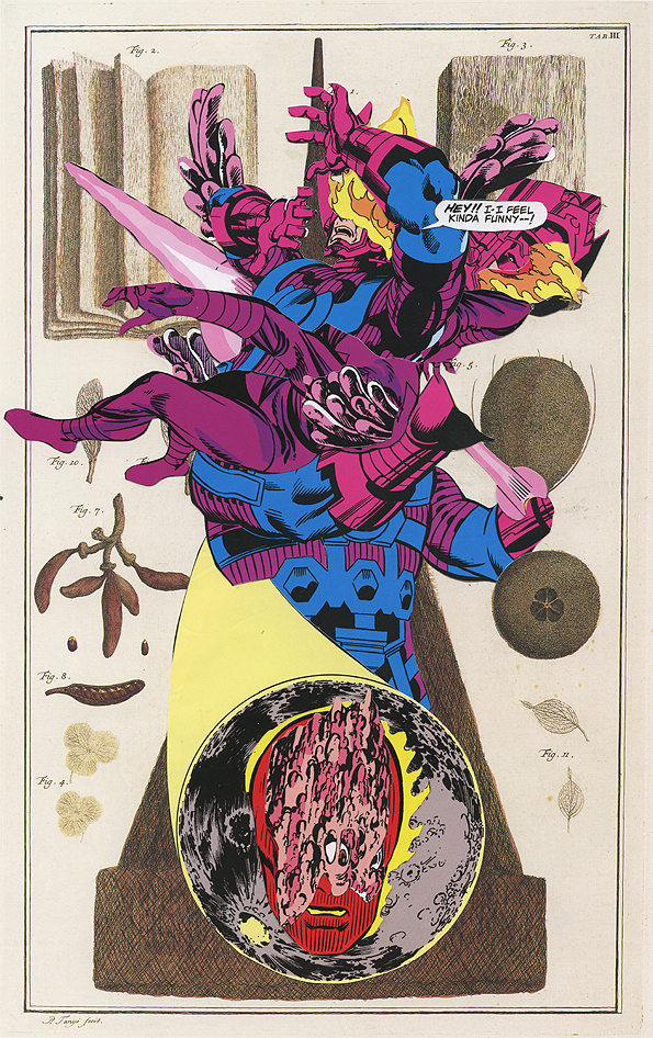
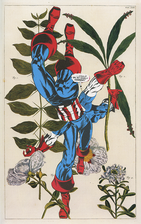
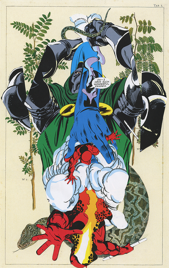
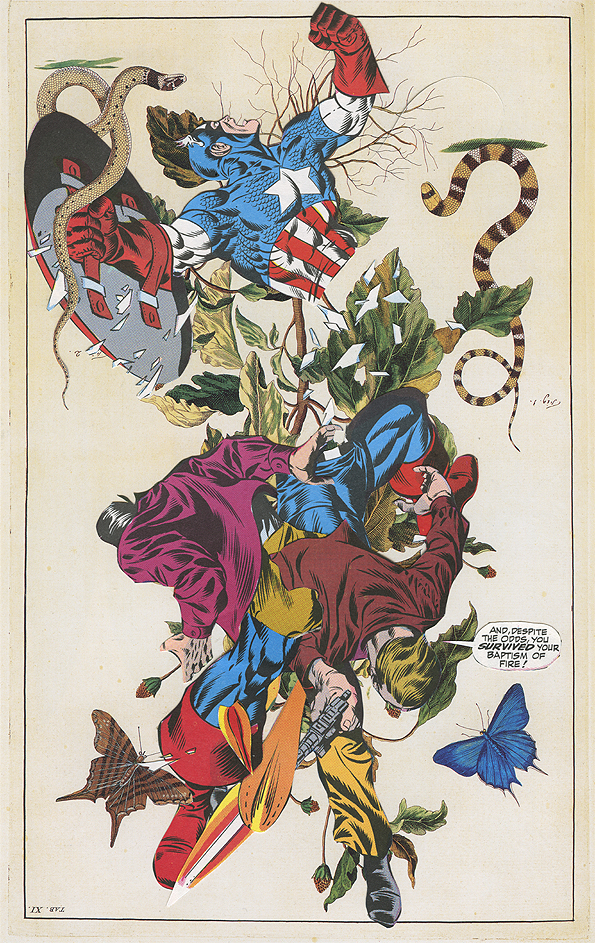
Norwegian artist Ashkan Honarvar produced this visually arresting series of works that mashes up vintage floral drawings with the violent forms of Marvel Comics characters, abstractedly recomposed so that they’re simply thrusts of graphic energy. The two visual styles are unexpectedly complementary; both are elaborately detailed with ink, and the super-hero imagery is taken from older comic books and have an almost quaint, retro quality that’s embellished by the floral renderings. Occasionally, a stray word balloon will find its way in there, like non sequitur garnishing. Terrific stuff.
More from this series at behance.net. Honarvar is a prolific collage artist and has many more examples of his stellar work at ashkanhonarvar.com
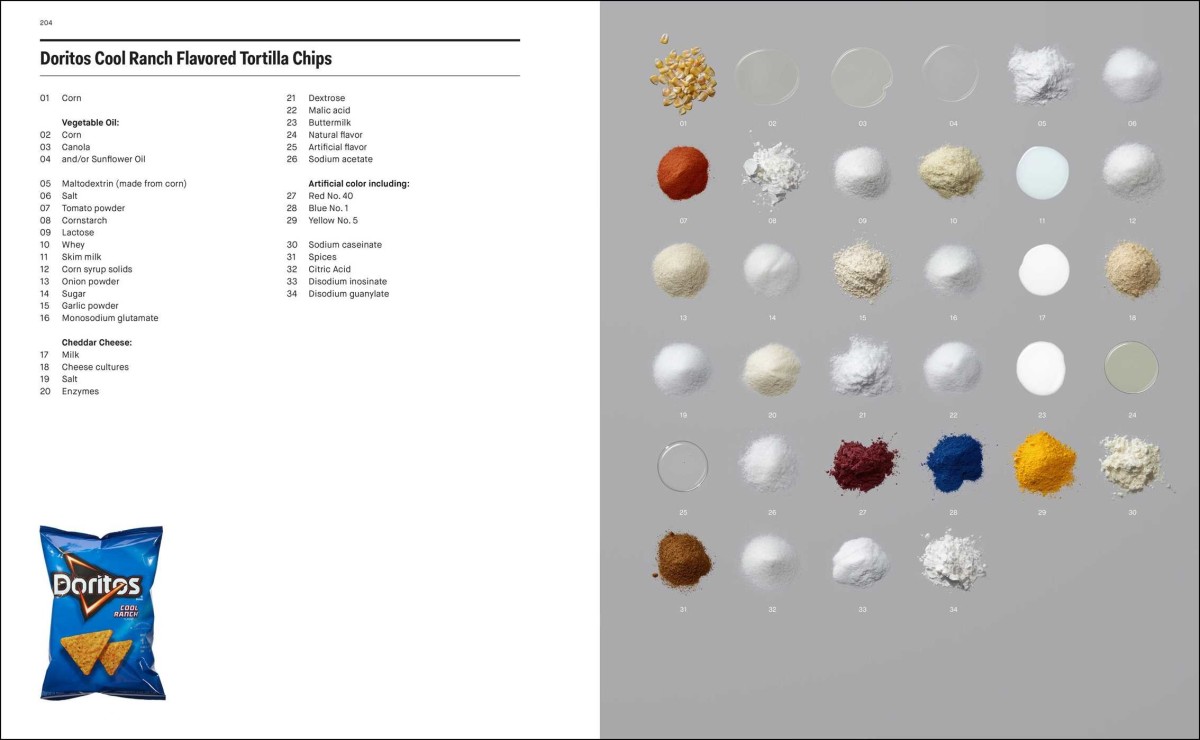
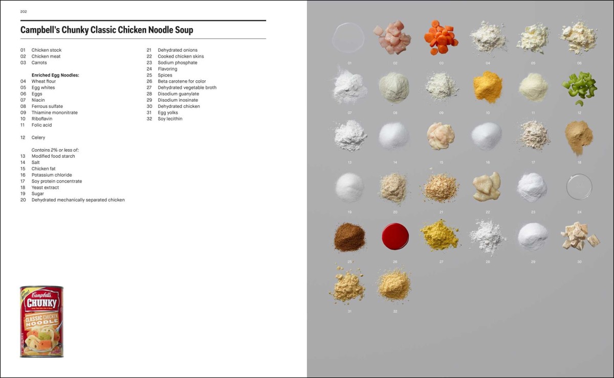
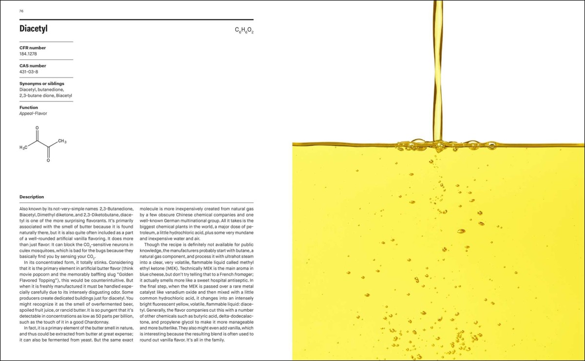
…an unprecedented visual exploration of what is really inside our food, setting the record straight on the controversial and fascinating science of chemical and synthetic additives in processed food—from Twinkies and McNuggets to organic protein bars and healthy shakes.
Eschliman effectively deconstructs familiar foods, both those that unabashedly fall into the “junk” column as well as those that purport to be healthy, and photographs their constituent ingredients in an exquisitely clean, elegant style. In fact, these are some of the loveliest shots of chemical products you’ll ever see; the sample page spreads look like a cross between a chemistry text book and a J. Crew catalog.
I’ve been kind of neutral on all of the hubbub around Apple’s new ad blocking technology in iOS 9. But then just this morning I tried to read this New York Times article on my iPad—not just any article, but one that’s specifically about reactions to Apple’s introduction of ad blocking in iOS 9.
In maybe the sweetest bit of irony that ad blocking advocates could ever hope for, the article itself, as it was served to me, was so beset by a crippling ad position across the top of the page that I could not scroll it. You’ll see in the video above that as I try to move down the page, the Salesforce banner consistently and infuriatingly forces it back to the top, over and over again. At about twenty seconds in I try to minimize the ad, hoping that would help. Nope.
This advertisement literally makes it impossible for me to read about blocking advertisements. Perfect.
You can read an extensive review of iOS 9 over at Ars Technica that gives you tremendous insight into every nook and cranny of the operating system. Or you can read a single, half-baked comment about iOS 9 that I wrote right here. Is it really a choice? Here goes.
I wasn’t particularly excited about Apple’s decision to displace Helvetica Neue with San Francisco, the company’s new bespoke typeface, in this latest version of the operating system. When I installed the beta for iOS 9, seeing it everywhere felt somehow wrong, like I was holding an Android device instead. It’s no secret that I’m a deeply committed Helvetica partisan, so it was painful, in fact, to see it replaced.
But over the past weeks I’ve grown accustomed to San Francisco’s slightly more uniform characters and mildly boxier curves. The strangeness has dissipated—the new fonts seem now totally fine to me. I’m still not convinced that it’s a better solution than Helvetica Neue, but San Francisco pulls off a neat trick of being both more utilitarian and more casual at once. And I’ve started to feel an affection for it that I’ve never felt for Google’s Roboto fonts, which I regard to be its closest counterparts. Both type families are very good answers to the problem of maximizing legibility and brand distinctiveness on mobile platforms; for me, San Francisco is the more successful of the two.
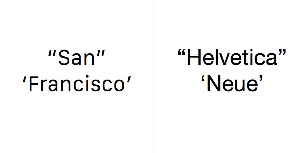
There’s one small detail that irritates me, though. Well, a few small details: the character designs for San Francisco’s opening and closing quotes are barely distinguishable from one another. The opening forms are heavier at the bottom and the closing forms are heavier at the top, but the difference is hard to detect, and both are essentially the same slanted lines. Of course, having such similar shapes for these glyphs can be a valid aesthetic choice for certain typefaces intended for certain kinds of usages. It just seems odd to me that San Francisco, which was custom designed for maximum legibility on digital devices, made this particular choice.
Comparing its quotes alongside Helvetica Neue’s quotes, I can’t help but feel that this was a misfire. Aesthetically, San Francisco’s quotes do look sharper, it’s true, but they feel colder and less thoughtful to me. Helvetica Neue’s quotes, I think it’s safe to say, are far more legible and for me much more elegant.
Of course, most things look better in Helvetica Neue to me anyway, so take that for what it’s worth.
Illustrator Scott Park pays tribute to the delightfully insane vehicle designs from this past summer’s “Mad Max: Fury Road.” Look, just see this movie if you haven’t already, okay? Currently available via iTunes and at your local Red Box or whatever. No excuses!
The poster is available for purchase at society6.com.
Last Thursday, after Apple’s announcement of the new iPad Pro and the subsequent on stage demos from Microsoft and Adobe, technologist Ben Thompson wrote this post about the challenges in sustaining the iPad as a platform. He makes the salient point that making iPad a more robust development environment, which is essentially what I have been arguing for, is not in and of itself enough:
…Cook’s conclusion that Apple could best improve the iPad by making a new product isn’t quite right: Apple could best improve the iPad by making it a better platform for developers. Specifically, being a great platform for developers is about more than having a well-developed SDK, or an App Store: what is most important is ensuring that said developers have access to sustainable business models that justify building the sort of complicated apps that transform the iPad’s glass into something indispensable.
Thompson also gives a mildly backhanded compliment to Adobe later on in the same article:
Over the last several years both Microsoft and Adobe have altered their business models away from packaged software towards subscription pricing; while their users may have grumbled, they also had no choice given their dependence on the two software giants’ products. And, it’s that new model that justifies the expense of developing iPad apps and explains why it is Apple’s old nemeses who are doing by far the most interesting work on the iPad.
There are at least a few things in that passage that I would describe as “not entirely true,” but there is some truth, at least, to all of them. More importantly, it’s absolutely right that Adobe is doing some truly substantive development for the iPad right now. What I’ve seen in my first few weeks since joining the company confirms this.
When I bought my iPhone 6 Plus last fall, lots of friends and acquaintances wanted to know what I thought of its absurd girth and did I regret my purchase? I intended to write up a critical appraisal, but time is not kind to procrastinated product reviews and much of what I would have written was eventually said better by other writers: it’s a really big phone but not so big you don’t get used to it quickly; its screen is a gorgeous luxury that makes using other phone sizes feel like peering through peepholes; its landscape modes are a nice bonus that don’t seem critical until you try to rotate other phones and realize they’re not available; its battery life is reasonable but far from spectacular; it’s far easier to carry around with you in the winter when you have more pockets than in summer when you have fewer; etc. Nothing particularly insightful.
And now a new set of iPhone models are already available for purchase, which you would think further obviates any review I might write of the 6 Plus. That’s true except for one thing; it’s the single most important thing I learned about the the phone in my ten months of owning it, and in my mind the most important thing to consider when evaluating its direct successor: the iPhone 6 Plus has just 1 gigabyte of memory, and 1 gigabyte of memory is just not enough.
Being old, I recall a time when that much memory seemed like a lot—especially for a device you carry around in your pocket! But in practice, it’s not nearly enough for the 6 Plus (and maybe not for the 6, either; I have no firsthand experience). Apps are constantly getting dropped from memory as I switch between them. If I load a page in Safari, jump to Maps to plot a trip, then turn back, the whole page needs to reload. If I’m reading a book in iBooks, switch to Messages to reply to a friend who has a question, switch to Mail to check on the answer, then return to iBooks to pick up where I left off reading, I’ll have to wait for the iBooks library view to reload and then launch the book all over again. And so on and so on. It makes for many irritating, unpleasant experiences, especially if I’m in a rush and need a series of quick answers from the contents of my phone.
Mercifully, Apple has apparently decided to double the RAM in the iPhone 6s Plus, as detailed in this article at Ars Technica. If you want one of these two oversized phones, I would strongly encourage that you buy the 6s Plus for its RAM alone. As it happens, two gigabytes is what’s available in my iPad Air 2 and I rarely see unwelcome app refreshing on that device, so hopefully this will remedy the situation on the new phone too.
Still, it’s my opinion that the 6 Plus should never have shipped with just 1 gigabyte. What’s more, the whole thing makes me more skeptical than ever of Apple’s decision not publicize their mobile devices’ memory specifications. The implication is that users shouldn’t have to worry about counting RAM anymore, and while that may be closer to being true than it ever was before, it’s still not quite realistic. The amount of RAM that Apple shipped with the iPhone 6 Plus last year was just enough memory to get by in 2015; what they should have shipped was twice that. The same may prove true of the 6s Plus; as apps get more and more ambitious, it may turn out that 2 gigabytes of RAM will barely cover what we’ll need for the mobile computing we’ll do next year. Whatever the case, in order to really get away with deprecating this particular specification, Apple should be shipping more than enough, rather than just enough.
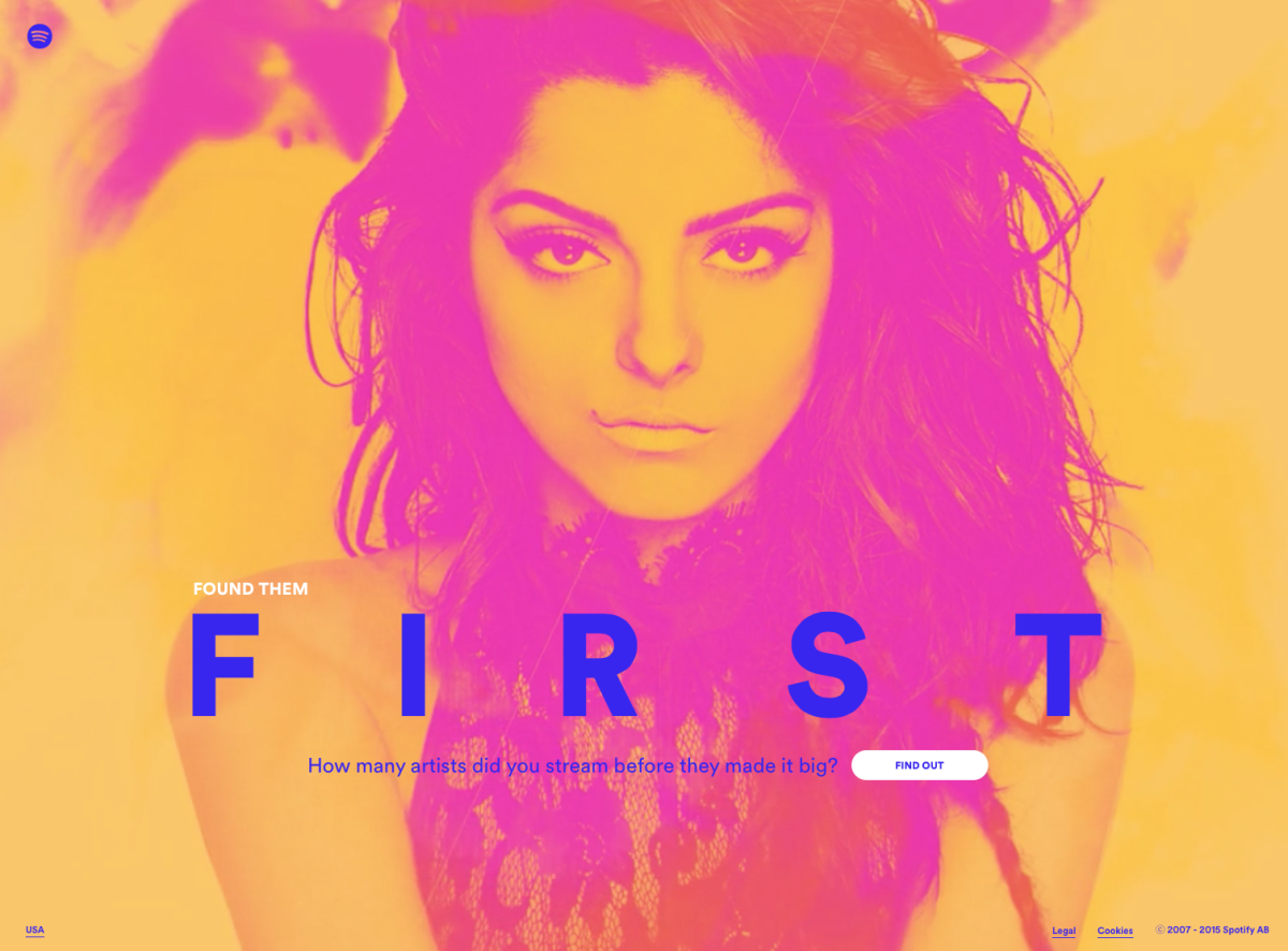
Spotify’s Found Them First is a clever, web-based tool that mines your streaming music play history to show you the artists that you “discovered” before they hit it big. It’s a terrific idea showcased beautifully with an impressive, slightly over-the-top video background that does its best to make up for the fact that Found Them First is not quite deserving of having its own site.
To be clear, I’m of the mind that this is the kind of functionality that Spotify and similar services need more of. As I argued almost two years ago in this essay, if streaming music is becoming a commodity (it is) then robust metadata is the best way for services like Spotify to distinguish themselves. A few weeks ago I wrote about the company’s excellent Discover Weekly feature, which automatically generates an uncannily well-tailored playlist for each user once a week, based on patterns that the company’s Echo Nest technology derives from analyzing listening habits.
Found Them First is another worthy contribution to this genre of tailoring music libraries specifically for individual users, but it should be built right into the main Spotify app. It’s a shame to strand it on a web site, no matter how beautifully designed, as most users are unlikely to ever visit it more than once.
Moreover, once integrated, Found Them First should notify me whenever an artist I’ve listened to has crossed various thresholds of fans following them and plays counted. What would be even better would be to show me which artists I discovered before my friends did, because relatively few people will ever discover artists before they get popular. You could extrapolate from there a whole raft of similar ideas that would make the listening experience at Spotify a lot richer: artists that my friends discovered before me who have not yet hit critical mass; friends who discovered the same artists as me at roughly the same time; artists that the artists I follow discovered on Spotify, etc. There’s a world of interesting data that could be unearthed here; the potential is only limited by our ability to turn data into meaningful insight for humans. While I’m encouraged by Found Them First and Discover Weekly, I’m eager to see Spotify—or Apple Music, or Rdio, or whomever—really take the plunge and create the next major evolution of the way we listen to music.

