Zingerman’s Lavishly Illustrated Catalogs

Zingerman’s Catalog - Breads

I’m a big fan of the mail order catalogs from the Ann Arbor, MI-based Zingerman’s, which sells all kinds of foods—cheese, cured meats, olive oil and even pecan pies. The pages completely eschew photography in favor of illustrations that curiously balance the whimsical and the intricate.

Zingerman’s Catalog - Pastries

You’ll find a fair share of fun spot drawings of the sort that would enliven any catalog, but what’s more interesting is how Zingerman’s illustrators lavishly portray their food products. The leavened texture of breads, the specific patinas of cheese rinds, the marbled cross-sections of salamis…these details and more are all lovingly and painstakingly rendered by hand to give customers a very clear picture of the product they’re buying. Yet at the same time they’re highly stylized, too—the line quality of the drawings is exaggerated in its roughness and perspective is thrown out the window to an almost Cubist effect. It’s surely the weirdest combination of realism and artistic license ever put into service of a mail order catalog.

Zingerman’s Catalog - Cheeses

You can browse the latest catalog at zingermans.com.

+

How They Got There—Now in Hardcover

Back in March I released my latest book “How They Got There: Interviews With Digital Designers About Their Careers” as a digital-only publication. Today I’m very happy to announce that a beautiful new hardcover edition is now available for pre-order—shipping next month, in time for the holidays—at howtheygotthere.com. Here’s what it looks like:

Hardcover Edition for “How They Got There”

“How They Got There” is a collection of interviews I conducted with designers of prominence like Geoff Teehan, Erika Hall, Nicholas Felton, Naz Hamid, Karen McGrane, and more—fourteen in all (see the full list). Each extensive interview is focused specifically on how these design superstars got their first big breaks, how they navigated the peaks and valleys of the industry, and how they charted their professional journeys.

The response to the book has been so gratifyingly positive; I said when I launched it that this was the book I wish I had had when I was starting out—it’s full of invaluable tales of how big careers are made. Since its release I’ve gotten so many enthusiastic emails from readers in just that position, complimenting me—or really my interview subjects—on all of the wisdom that they impart in its pages. It’s really proven to be a fantastic manual of sorts for starting out in the design field, or even making a mid-career switch.

When I started writing the book it was a bit of a lark; I wanted to do it as quickly and simply as I could, hence my decision to go for a digital-only release. But I secretly hoped that it would do well enough to justify a print edition. Thanks to the strong sales response and with expert help from “book developer” extraordinaire Adam Robinson I’ve been able to make that a reality.

This physical edition has been produced to be printed in batches at Bookmobile, specialists in short run books. This minimizes the cash investment that I have to make upfront while also keeping the cost-per-unit low enough (dramatically lower than at print-on-demand services like Blurb or Lulu) for me to offer it at a reasonable price. This explains the pre-order scenario: ordering now helps me get the first batch sized just right.

Important update: Please note new shipping information below.

The first batch will be printed in early December and will ship out to customers by the middle of that month. This should be plenty of time to get orders out to customers in the U.S. in time for Christmas. Unfortunately, for international orders, we can’t guarantee shipping in time for Christmas despite my earlier belief that that would be possible—many apologies if you were counting on that. However, digital orders are always available for instant download, and if you pre-order a hardcover edition you get the digital versions too. Order now at howtheygotthere.com.

+

Markus Brunetti’s Facades

Cathédrale Notre-Dame

Artist and photographer Markus Brunetti creates stunning photographs of European cathedrals from countless source images that he takes and painstakingly composites into photographic equivalents of elevation drawings. The results are intricately unreal; perspective is dramatically flattened, light is almost impossibly even, and all signs of human activity are removed—in effect, Brunetti reconstructs the original architectural ideal that motivated each structure. Brunetti discusses his technique in this video:

The output is enormous, as tall as ten feet each, as I understand it. An exhibition of them is on display through this week at Yossi Milo Gallery in New York City.

Markus Brunetti’s “Facades” at Yossi Milo Gallery

More of his work at markus-brunetti.de. Also see this article at nytimes.com. Many thanks to reader Adrian Ulrich for bringing this to my attention.

Basilica di Santa Maria di Collemaggio
Markus Brunetti
Duomo Santa Maria delle Colonne
+

Project Faces Sneak Preview

Adobe Project Faces

I realize that continually posting cool Adobe projects here can quickly come to look quite unseemly, but I can’t resist with this video, recorded at last week’s Adobe MAX conference. In it, Adobe developer evangelist Lee Brimelow demonstrates “Project Faces,” an iPad app that allows users to create bespoke typefaces on the fly just by manipulating a handful of parameter sliders. The screen grab of the app at the top of this post shows how simple the interface is to master, and in the video below you can see how quickly Brimelow is able to generate a completely new font and even export it for immediate use in Adobe Illustrator.

Professional type designers will have plenty of legitimate objections to whether this is really quality type design or not, but the sheer power on display here—the acute understanding of typeface mechanics combined with deeply informed engineering expertise—is amazing, and the democratizing spirit is thrilling, to boot. It’s another example of one of those things that, for me, fall under the heading “Only Adobe can do this.”

No more posts about my employer tomorrow, I promise.

+

The Rose Center for Earth and Space

Rose Planetarium

We were lucky enough to go to a wedding held at The American Museum of Natural History over the weekend. Here’s a shot of the museum’s glorious Hayden Planetarium, housed in The Rose Center for Earth and Space, at about 11p, with no one around.

+

Crowd-drawn Neighborhood Borders

DNAinfo: Greenwich VIllage Maps as Drawn by Residents Who Have Lived There Any Amount of Time

I’ve lived in New York seventeen years but I still don’t really know where Greenwich Village starts and ends. Neither, apparently, do most people, as you can see in the map above. That’s a composite of the Village’s neighborhood borders as drawn by visitors to DNAinfo’s neighborhood mapping project.

The site collected thousands of drawings from New Yorkers of how they define the area where they live and created fascinating visualizations of every neighborhood. What it shows is that these boundaries are very fluid, something that’s even more apparent when you compare the drawings from Village residents who have lived there more than twenty years (below) to those who have lived there any amount of time (above).

DNAinfo: Greenwich VIllage Maps as Drawn by Residents Who Have Lived There Twenty Years or More

You can see and play with the data across all of New York City’s neighborhoods at visualizations.dnainfo.com.

+

More Project Comet in This Demo Video

Project Comet User Interface

Wow, the reception for Project Comet, Adobe’s newly announced, purpose-built UX/UI design and prototyping tool, has been tremendous. Here’s another tease: a great hands-on demo of the app from Comet’s very talented lead designer Talin Wadsworth, as interviewed at this week’s Adobe MAX conference by Terry White, our design and photography evangelist.

This is a more extensive demonstration of what Comet can do than we saw in Monday’s keynote; it runs about thirty minutes long, and Wadsworth answers lots of user questions that folks have had about the product since its announcement. But if you want to see what this fantastic new app does in detail—and also get a glimpse at how Repeat Grid can materially change the design process—it’s worth it.

Learn more about Project Comet and sign up for the public beta in early 2016 at adobe.com. Also read my blog post about the announcement.

+

Job Spotlight: ProPublica

ProPublica

New York-based, independent, non-profit newsroom ProPublica is doing some of the best journalism on the Internet. That’s thanks in no small part to their design director, the very talented David Sleight, who has brought an exacting sensibility to the presentation and interactivity of the organization’s content. I first met David many years ago when I was at The New York Times, and though I don’t work in news anymore, he springs immediately to mind anytime anyone asks me for names of the very smartest news designers I know.

David is building out a small but ambitious team at ProPublica to take their news products to the next level. First on his list is an Editorial Experience Designer, a very particular type of design professional that I first wrote about in this 2011 blog post. Over email, I asked David about the position, his team, and the work that they’re doing.

How do you and ProPublica define “editorial experience design”?

For me, “editorial experience design” sits squarely at the intersection of interactive design and traditional editorial design.
It’s interactive design that conveys a narrative arc, and editorial design that recognizes content isn’t necessarily static or consumed in a singular, fixed way.

This is still such a new field; how is it changing, both at ProPublica and at large?

I think it’s becoming more common inside newsrooms, even if they’re not calling it that. I hope it’s on its way to becoming the accepted norm, because the cross-section of skills it represents feels like the natural language of the medium.

The editorial design process is evolving as a result, too. Fewer static deliverables later in the process, more discussion of design systems and pattern language, a proliferation of not-quite-fully-baked interactive comping tools. And, oh yeah, a healthy dose of code throughout.

More importantly, designers are working with reporters far earlier in the process, with skills that sometimes overlap. At ProPublica we want those folks working together right from the start, when ideas are first taking shape. As the field evolves, those roles will interweave to the point of maybe even becoming a little indistinguishable from one another, a little fuzzy around the edges. I think the result will be some truly amazing work.

Can you share some examples of the editorial experience design work that your team is proud of?
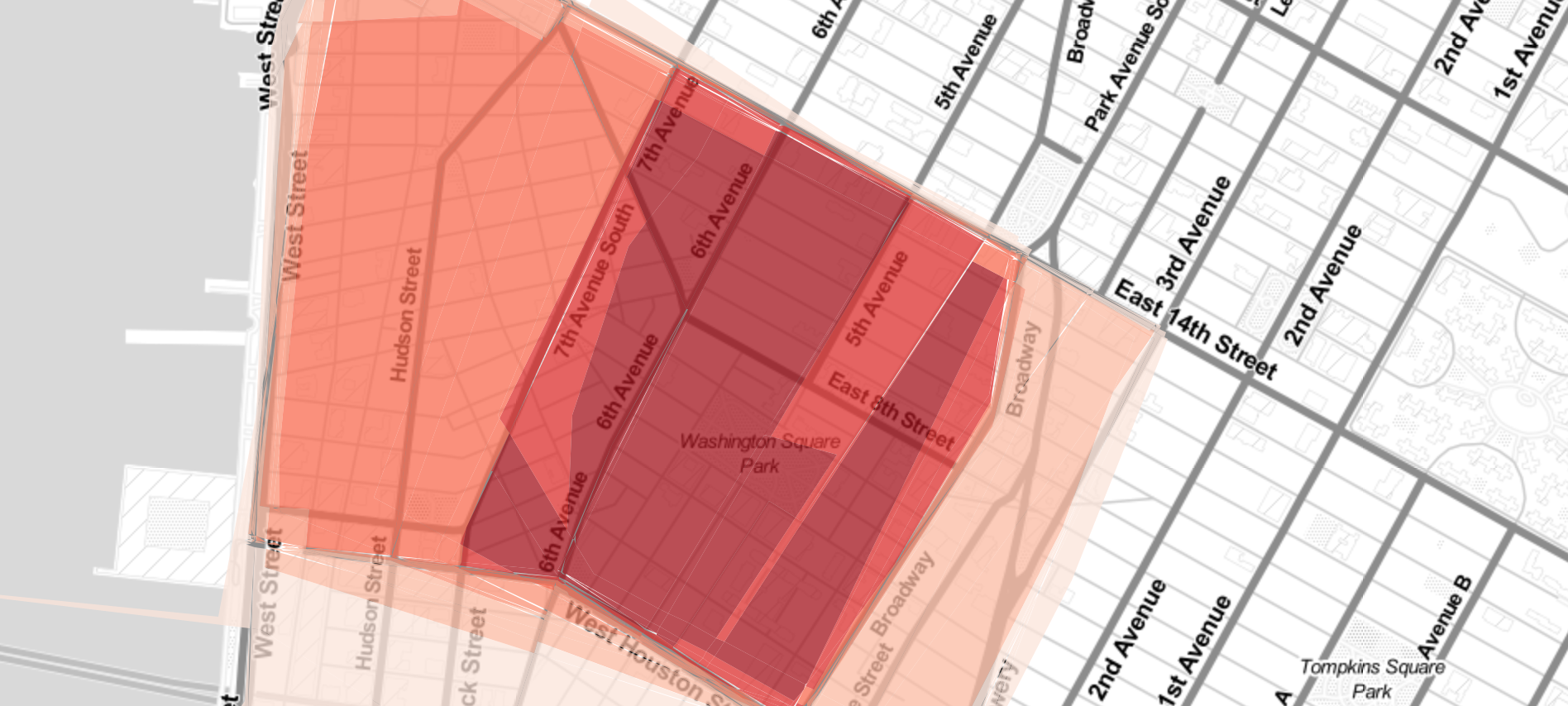
State of Emergency,” our recent photo/audio essay on Baltimore in the wake of Freddie Gray’s death, is a great example of our maturing photo work. “Killing the Colorado” is another.

Our worker’s comp series (“The Demolition of Workers’ Comp,” “Fallout of Reforms,” and Patrick Fallon’s accompanying photo essay) showcases our growing ability to incorporate illustration, photography, and data elements into more cohesive presentations.

I also have a soft spot for “Firestone and the Warlord,” and how we met the challenge of presenting a novella-length story online. The tools we incorporated into the layout, like the simple “Save Your Spot” email feature, stay out of the way and try to be coincident with user behavior instead of imposing themselves on top of it.

This is a rich area for development, and we’ll be pushing further and further into this territory. There’s a lot here yet to explore.

What does the team look like now, and where will this person fit in?

We’re a small team of nimble generalists. We started about a year and a half ago with me coming aboard as ProPublica’s first design director.

Since then we’ve added a dedicated Producer as well as a Design Fellow, and strengthened the roster of outside collaborators we bring in on special projects. That’s all in addition to the folks from ProPublica’s editorial, data, and engagement teams who we collaborate closely with on a daily basis.

What does the day-to-day look like for this role?

The team is responsible for three broad areas, ranging from the very tactical to the very strategic.

On the tactical side, we keep an eye on regular story production and any visual assets that are needed to support it, like photography, illustration, etc. In the middle is what we call “enterprise editorial”: the 10-20 major stories we publish every year that really rise to the level of genuinely custom design work. And then on the more strategic end is the platform itself, propublica.org.

We’ve made a lot of progress in the first two areas in a short amount of time, and are just starting to turn our attention to that last section.

This role will play in all three areas, but it will focus mainly on the custom editorial and the web site.

Is this a newsroom job, a tech job, both, other?

All of the above! Honestly, we’re all one newsroom and don’t really distinguish strongly between “tech jobs” and “editorial jobs.” To us, they’re all “journalism jobs.”

I know lots of places might say something like that as a marketing point, but we truly mean it at ProPublica. When I was first talking about coming aboard my future boss, managing editor Robin Fields, told me it’s the kind of place where, “Everyone is expected to participate in the journalism.” That really struck a chord with me, and helped seal the deal. It’s really proven to be the case, and something I take to heart as we continue to develop our design and UX practice.

If you’re interested in this opportunity, read more at Authentic Jobs.

This is the latest in my occasional series spotlighting interesting job openings for designers. Also see my interviews with Hyperakt, Carbon 3D, ESPN, The Coral Project, Digg and Toca Boca.

+