is a blog about design, technology and culture written by Khoi Vinh, and has been more or less continuously published since December 2000 in New York City. Khoi is currently Principal Designer at Adobe. Previously, Khoi was co-founder and CEO of Mixel (acquired in 2013), Design Director of The New York Times Online, and co-founder of the design studio Behavior, LLC. He is the author of “How They Got There: Interviews with Digital Designers About Their Careers”and “Ordering Disorder: Grid Principles for Web Design,” and was named one of Fast Company’s “fifty most influential designers in America.” Khoi lives in Crown Heights, Brooklyn with his wife and three children.
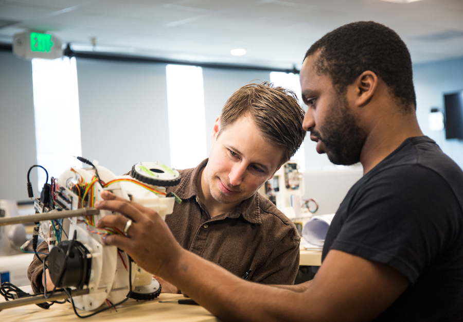
Interaction designer and author Dan Saffer is one of the smartest people I know working in technology. His résumé includes stints at Adaptive Path, Smart Design and Jawbone, among others, but I took notice when he recently joined Mayfield Robotics as vice-president of product. The early stage startup is focused on “making an adorable home robot”—a mission statement that manages to be both remarkably simple and impressively ambitious at once. Dan reached out to me recently for help hiring a Visual Product Designer for his small design team, a position that sounds easier to fill than it has been in practice. I invited him to talk about the open position here.
Your site says your want to “bring robot joy to people’s homes.” How?
Our goal as a company is to make awesome home robots. Robots you want to be around, who are fun, useful, and adorable. If you’ve ever seen R2-D2, Wall-e, or BB-8 and wondered when you could have one of your own, we’re trying to make that future happen.
Does the visual product designer you hire have to be handy with robotics?
No, although an interest in robots certainly helps, as will having some kind of background working with hardware. We have roboticists with Ph.D.s to handle all the hard robotics stuff. Our job is to advise them on what to make, help them make decisions that would affect the user experience of the product, and to fix what can’t be fixed in hardware with software and design. We’re designing the services and ecosystem around the robot.
How hard has it been to find this mix of visual design and hardware skills in a product designer?
Very challenging, because it’s not only an interest in robots; the person should have skills that span from print to mobile to web as well. We really need a generalist who’s comfortable in several mediums. And we’re looking for someone with a real sensibility and style they could bring to the table. Since it’s, well, robots, there’s an opportunity to do some things differently. For example, the mobile apps that help control and manage the robot could be more game-like than, say, a more functional app. (Although not too game-like, as you know there is valuable information in there.)
How about the rest of the team, what are their backgrounds and do they have similarly eclectic skillsets, or are there specialists as well?
We’re a startup, so the team is small and scrappy and we all do a bit of everything. There’s myself; Ellen Francik, our UX Lead; and Tisho Georgiev, who is a product designer and engineer.
Like all teams, we each have our strengths, but because we’re a startup, we all wear a lot of hats. Our team is responsible for not only design, but also product management, marketing, and brand. All three of us move between those disciplines to come up with how the robot works and to solve the issues that arise with the hardware.
There’s also deeply puzzling, although philosophical puzzles we as a team have to solve, my current favorite being: If a robot falls and there’s no one around to hear it, should it make a sound? We spend a lot of time thinking about things like that, because it has real implications for how people think about the robot.
What does the next year or so look like for this group—and the visual product designer you hope to hire, specifically?
It’s an intense and busy year ahead of us as we prepare to introduce and launch the robot. The first thing we’re finishing up is product definition: what does the robot do and how does it do it, and the visual designer is definitely part of that discussion. Parts of the robot need to be visually designed, so they will help determine that, as well as designing the accompanying apps (iOS and Android), the getting started (print) manual, and new web site announcing the robot.
There’s whole new brand to help define and work with there. Our corporate web site will need adjusting as well as we get ready to take pre-orders. The fall has us preparing marketing materials while we do in-home user trials (and, yes, the visual designer will be involved in user research as well). There will be movies to make and demos to prep and posters/stickers/brochures etc. to design. It’s a lot of work across multiple platforms/mediums, but it’ll be fun and exciting.
For the right person, it’s a terrific opportunity to help create a new brand for a new product in a new category, all while having a significant impact on the overall product design. It’s perfect if you’re a visual designer who has great visual design skills, but also a generalist at heart—and you love robots!
If you’re interested in this opportunity, read more at Authentic Jobs.
This is the latest in my occasional series spotlighting interesting job openings for designers. See previous entries here.
Recently I realized that some people are under the impression that these spotlights are sponsored content—that the companies I’m highlighting are paying for the interviews to be published. That’s not the case. While I do draw exclusively from Authentic Jobs (I’m a member and get proceeds from that site’s performance), I don’t get any direct income from the interviews. Additionally, I choose the subject of each interview independently.
Last week Apple announced several marquee features in its forthcoming iOS 9.3 update. Two of them I would classify under the heading Close But No Cigar, at least insofar as they match up to wish list items I’ve had for some time.
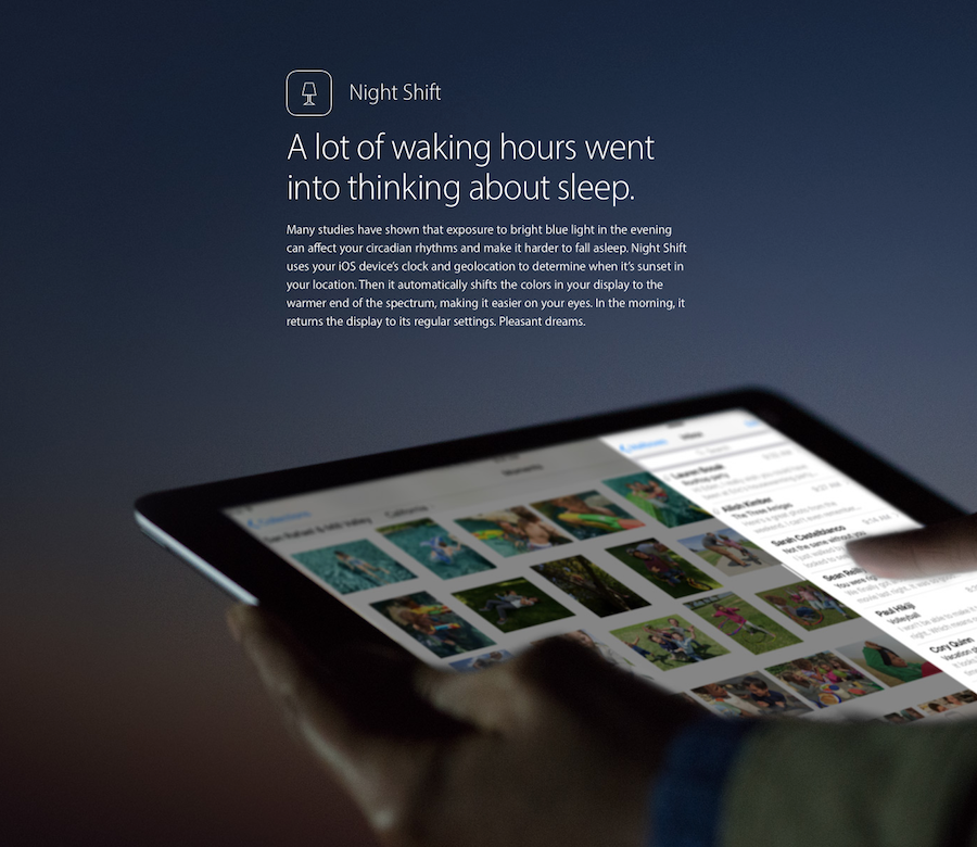
The first is Night Shift, which uses your device’s clock and location data to automatically shift the color of its display towards the warmer end of the light spectrum at night, much like the popular desktop utility f.lux. The goal is to ease users’ transitions into their sleep cycles by limiting evening exposure to blue light from the cooler end of the spectrum.
I have no quarrel with this feature, but if Apple is so concerned about sleep, I still wish they would implement a global “night mode” feature throughout iOS. I wrote about this idea in this 2013 blog post:
Apple should offer an API that lets developers specify a night mode interface for their apps, and that mode should be available from a system-wide switch. So instead of turning iBooks or Kindle to night mode individually, one flip of that switch would turn the whole device to night mode. In the beginning, of course, not every app will support this, but if Apple provides dim-light versions of the home screen, Mail, Messages, iTunes, Settings and other essential apps, that in itself would be a huge boon.
I still believe this would be not just a big benefit for users, but also a meaningful point of differentiation from other mobile operating systems. Few things seem more integrally mobile to me than software that responds to its environments; acknowledging the stark difference between day and night seems like an important one to get right.
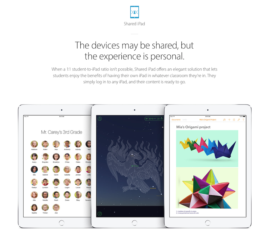
Apple also announced that this next software update will finally allow for multiple user accounts on iPad, something that that platform has sorely needed practically since its introduction. Much, much more than mobile phones or even laptops, iPads are shared between family members, and being able to allow individual access to specific apps and settings would make these devices significantly more valuable to customers.
Alas, iOS 9.3’s “Shared iPad” implementation is restricted only to education environments for now. It appears to be part of a more extensive solution for schools that includes a new Apple app for teachers, an Apple School Manager portal, and even a new class of Apple ID that can be created and assigned by the schools themselves.
All in all that’s a huge win for students, teachers and administrators, and I suppose it’s a hypothetical win for consumer users too, as it demonstrates that multiple accounts on iPad is possible. Hopefully something like it will come to general audiences before too long.
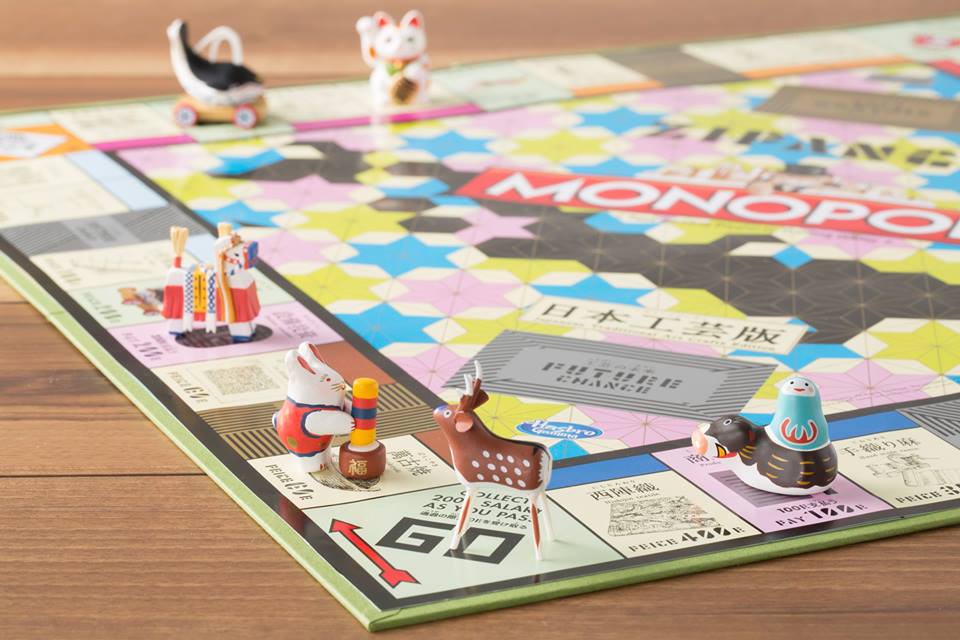
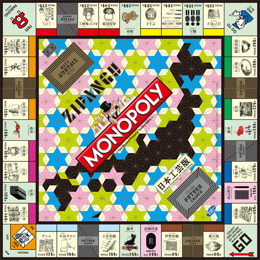
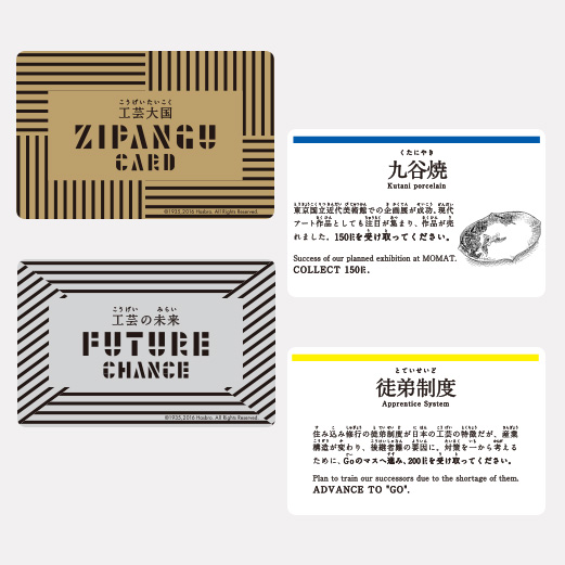
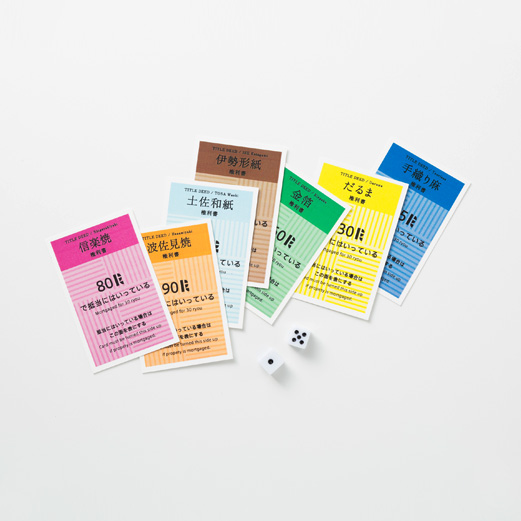
More specifically, a Japanese traditional arts and crafts edition of the venerable American board game Monopoly. It looks like a perfectly weird combination of blatant Western capitalism and exquisite Japanese design.
As the Japanese arts and design site Spoon & Tamago puts it:
Instead of Atlantic Avenue you’ll own a Daruma doll business. Instead of Illinois Avenue you’ll own the Nanbu Ironware craft of making teapots. Instead of the railroads you’ll control Hato-guruma (Dove Cart), an enduring folk art made of a woven two-wheeled bird. By collecting these handmade toys, you’ll discover that they originated in Nagano and are associated with industrious effort because they appealingly depict they way a dove pecks at food while walking.
If like me you’re tempted to buy one for yourself, 5,000 limited edition boxes are on sale at nakagawa-masashichi.jp for ¥5,400, which is about US$46. Read more at spoon-tamago.com.
More often than not I find that Helvetica is the right solution for the design problems I tackle, but I acknowledge that there are many great alternatives out there. Designer Hrvoje Grubisic has rounded up six of them in this simple inventory over at Medium. He also created these sharp illustrative samples of each; overall it’s a very handy resource.
Geoff Teehan talks to the Bohemian Coding founder on the “past, present and future of Sketch.” This was one of my favorite quotes:
In the last year we’ve spoken to a lot of people and companies and I’ve very often heard ‘Sketch is just perfect the way it is, you just need to add this one thing.’ One person mentions auto-layout, someone else mentions prototyping, someone else mentions data driven design. So often these suggestions sound easy to the speaker, but what they are saying is to take these already fundamentally very complex ideas and then if we could just add just one little thing to Sketch, then it would be perfect. Everyone suggests something else, there doesn’t seem to be any underlying parallel requests or even themes. And many of the suggestions may sound like an easy tweak, but are actually very complex to address. At some point we have to choose and understand we can’t satisfy everyone. I don’t want to make an application that is purely driven by what customers say or think they want. It’s also important to preserve your own vision with the app and not just dump things in because customers ask for them.
Sketch’s single biggest asset is Pieter Omvlee. He does three things well—the only three things that matter in building software: he defines a very clear, widely relevant vision; he builds a nimble, very talented team around it; and then they execute on that vision without distraction. That’s what’s made Sketch so successful, and that is what this quote summarizes so well.
Teehan’s interview is well worth reading in full at medium.com. Though the Guillaime Courtois painting (above) that he selected as the illustration is not as clever as he thinks (smiley face!).
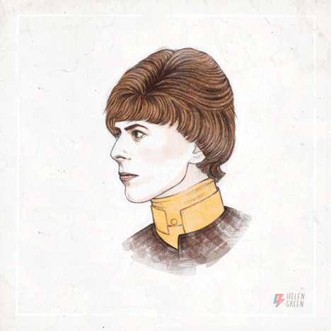
David Bowie died of cancer on Sunday. This animated tribute to the musician’s many faces was created by U.K. illustrator Helen Green for Bowie’s 69th birthday, which was just last week; it’s a lovely way to remember how expansive his career was.
I came to his music late—I remember trying, many times, as a teenager to grasp it but it was too sophisticated and advanced for me, and it wasn’t until I was in my twenties when it finally started to register how preternatural was his talent. In time, his artistry came to mean so much to me, and I’m deeply saddened by his passing.
Several months ago I had this idea that we, as a community of users and enthusiasts, should be tracking how well Apple is doing on its major initiatives. For better or worse, Apple is a very important company, and while its sales speaks volumes, I’ve always thought that it would be valuable—to us as well as to Apple itself—if we could somehow quantify all of the incredibly rich chatter and opinion about it that flows through Twitter, all the various technology publications, podcast, blogs, etc.
Trying to get a read on how well people think Apple is doing in, say, cloud services or hardware or stewardship of its various platforms is a very inaccurate science, but my thinking is that there is still lots of value to be derived from a community’s assessment, even if it’s only subjectively directional rather than objectively quantified.
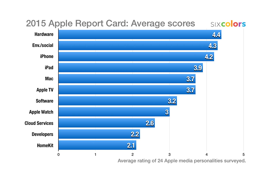
This could be a big job, but I figured we could get a good deal of the way there by surveying a very small group of people: developers and writers who focus on Apple. So I sent a note to Jason Snell proposing that he use his excellent Six Colors blog as a platform for just such a thing. It took him some time to think over but he ultimately bought into the idea, and not long ago he sent out a poll to more than two dozen “writers, editors, podcasters, and developers” on eleven subjects. He received twenty-four responses which he then averaged and assigned letter grades to—he’s publishing the data for the first time today.
Above, you’ll see Jason’s topline graph of the results. Each participant was asked to rate Apple from 1 to 5 in these eleven categories, and what you see here are the averages. Jason’s post goes into detail about what the numbers mean and the overall sentiment that they suggest, and also includes lots of quotes from the participants. He’s also made a version of the survey available to the general public, so if you’d like to make your voice heard, you can take part in it yourself.
Slack is wonderful. I’m now a member of eight Slack teams (that I can remember). Surely there are other users out there that have to cope with more, maybe many times more, than that. But at any given time I might need to access any or all of these eight teams from one or more of my three Macs, two iOS devices or two Android devices. In order to do that, I’ve had to manually sign into Slack teams a total of fifty-six times—an excessive number even if, violating good security practices, I might have reused the same password for a couple of related teams (don’t tell my sysadmin).
Relieving this user pain seems like something the Slack product team should be working on, if they aren’t already. I can imagine signing into a single “SlackHQ ID” on each device, then being presented with a list of all the teams available to me, each of which I can then check or uncheck depending on my preferences for that particular device. I could also associate any or all of my various email addresses with that SlackHQ ID so that I can join new teams with it.
And while we’re on the subject, how about a master view of all activity that’s relevant to me across all of my Slack groups? Sort of like the “all inboxes” feature that’s become common in email clients, which let you see across all of your email accounts.
Of course, this is all easier to blog about than to pull off, especially when, like Slack, you’re often dealing with the typically thorny logistics of corporate IT departments. This kind of scaling challenge is the downside of tremendous growth trajectories like the one that Slack has enjoyed over the past two years or so; adoption and user needs are now outpacing product development. I certainly don’t fault them for not having a solution to this kind of edge problem already. But at this pace, as more and more users encounter similar problems, they’ll need to address it soon, before the bloom is off the rose. Slack has so far been a model of startup execution and generally very good product design, but the next stage in its growth will really test its design and technology foundations.
This terrific short animated tribute to “The Wire” by director, designer, and animator Elliot Lim is chock full of visual riffs on the show that transition into one another with tremendous cleverness. It reminded me how much I miss that show, and how, even though we have so much good television available to us today, few shows have been able to match “The Wire” for sheer quality and substance.
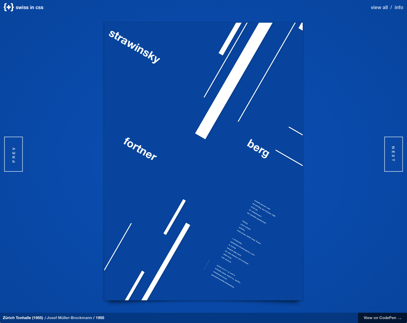
Eight classic designs from the Swiss International Typographic Style of mid-Century graphic design, lovingly recreated in CSS. What saves this project from being merely an academic exercise is designer Jon Yablonski’s gentle reinvention of each work for the browser. He cannily marries the International Style’s preference for simple, geometric shapes with CSS’s strength in lightweight animation to bring each design to life in an unexpected way, while fully respecting the original work. It’s a nearly perfect union of two methods of exploiting technology for presentation that just happen to be separated by a half century.