is a blog about design, technology and culture written by Khoi Vinh, and has been more or less continuously published since December 2000 in New York City. Khoi is currently Principal Designer at Adobe. Previously, Khoi was co-founder and CEO of Mixel (acquired in 2013), Design Director of The New York Times Online, and co-founder of the design studio Behavior, LLC. He is the author of “How They Got There: Interviews with Digital Designers About Their Careers”and “Ordering Disorder: Grid Principles for Web Design,” and was named one of Fast Company’s “fifty most influential designers in America.” Khoi lives in Crown Heights, Brooklyn with his wife and three children.
These mesmerizing landscape renderings by artist James Gilleard see nature through a lovely, faintly 1970s-esque geometric lens. Apparently this is a new style for the London illustrator, as this project, posted over at behance.net, is marked as personal work. As stylistic experiments go, it’s very impressive.
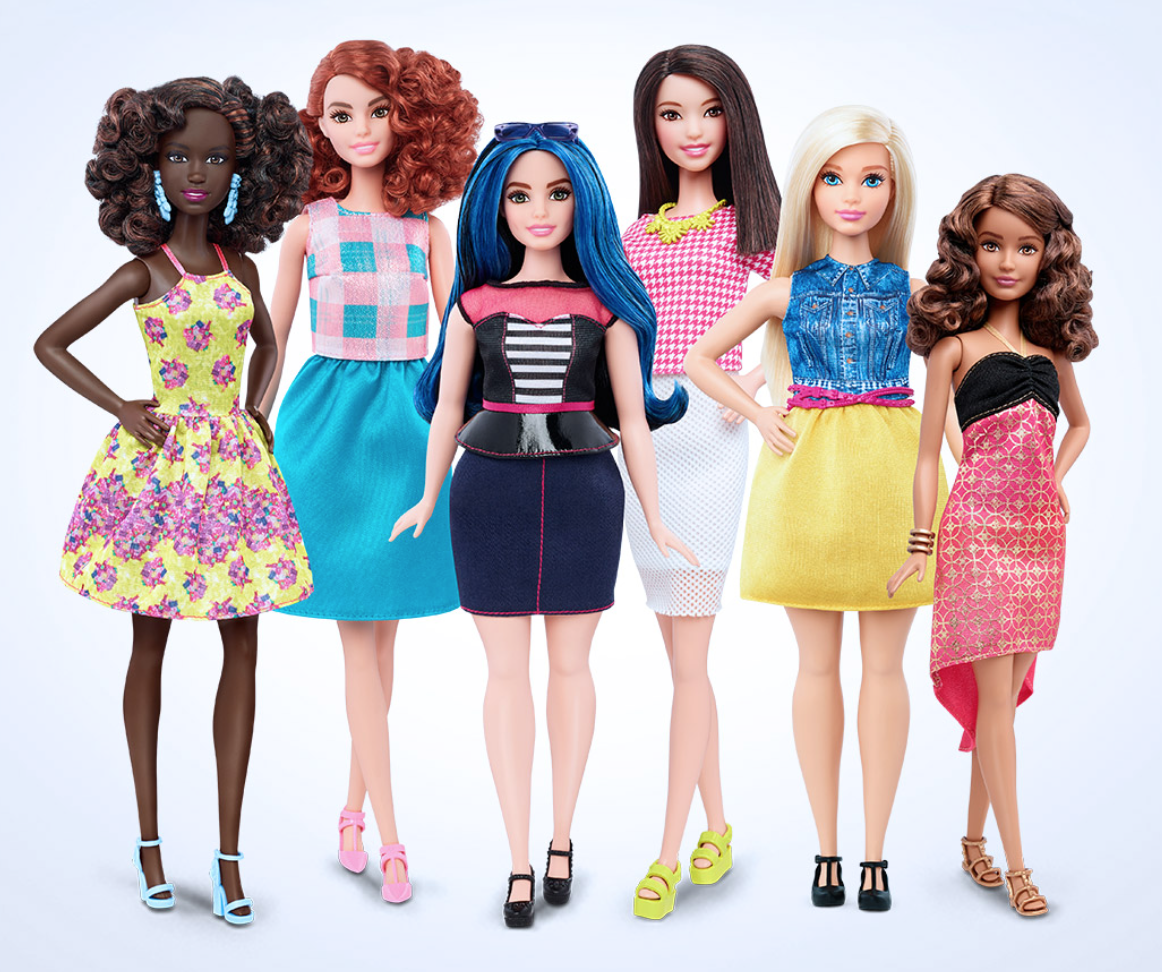
It didn’t take becoming a father to a young girl for me to realize how harmful the Barbie line of toys can be to a girl’s body image. In fact, I’m not sure I even remember a time when the brand wasn’t riddled with controversy; like the name of Washington, D.C.’s pro football team, Barbie is one of those elements of pop culture that’s just seemed like it’s been inherently wrong forever and would continue to be inherently wrong forevermore.
Still, this breakthrough doesn’t quite feel like a moment to be celebrated for some reason. For one, the sales performance of these new designs will determine whether it survives; Mattel recently saw improved sales for its Barbie line even before this rollout, so in the long run they may be incentivized to revert to old habits unless these new dolls are a hit. Even then, only time will tell if they’ll be able to assume the mantel of the original Barbie doll; they may sell fine, but they may also diffuse our thinking of the brand entirely, to the point where they become just generic dolls. Changing design icons—for better or worse, Barbie falls into that category—doesn’t always happen instantly. And finally, even with these laudably substantial changes, I’m still pretty sure that I don’t want to buy one of these for my daughter.
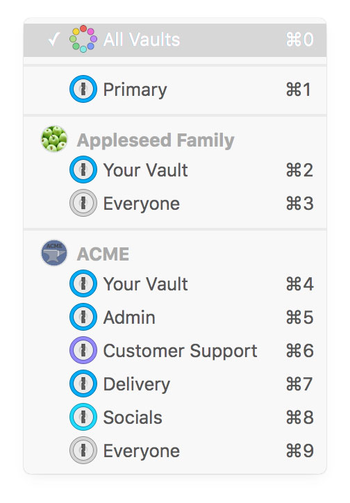
I got a kick out of this recent example of why it’s impossible to make every user happy. It concerns the most recent update of Agile Bits’ superb password password manager 1Password, which added a new view to see the contents of all of your vaults at once when accessing 1Password from within a browser. (Vaults are essentially groups of passwords, logins and other secure credentials; you might have one for work, another for home, another for a side project, etc.)
This is a fine idea, but when I upgraded, I was surprised to find that the new “All Vaults” view is the default view. Even when I selected a specific vault as my preferred view, the next time I launch 1Password from my browser it would revert to the “All Vaults” view. I found this very irritating. This change struck me as wrongheaded—it flies right in the face of how I use vaults, as I prefer to keep each group of passwords segregated from the others. I could only imagine that it would rankle every other 1Password user, as well.
However, when I went looking for a solution for this on the forums, I came across this response to another user from a member of the Agile Bits team:
It’s funny, in the previous implementation of multiple vaults, we heard from a lot of users who wanted to be able to see all of their items all at once, no matter which vault they lived in. We thought that ‘All Vaults’ was going to be an amazing solution for our users who relied on multiple vaults. It’s been really interesting reading all the feedback from users now and learning more about the various use cases that don’t quite fit into the ‘All Vaults’ mould.
It hadn’t even occurred to me that the way I use 1Password might be completely at odds with the way someone else might use 1Password, but of course this is exactly the case. It was a modest revelation to me; I went from being irate at Agile Bits to being immediately more sympathetic to their challenges.
Luckily, there’s at least one relatively straightforward answer here: always default to the user’s most recently selected vault view—whether it was a specific one, or it was “All Vaults.”
More to the point though, this modest bit of feature friction made me realize that, though I’ve always tended to think of 1Password as relatively simple, it’s become substantially more complex over the years. At this stage, having gone through at least six major revisions, the utility must accommodate many different usage styles—people who want strict separation among their vaults, people who want to see across all their vaults, and more. As with any software, as the number of use cases grows, it becomes harder and harder to reconcile them with a single coherent interface. That’s the unfortunate truth of creating great experiences; not all of your users are going to be happy all of the time.
Some smart user experience thinking in Neo, a project from Lennart Ziburski, a twenty-one year old design student in Berlin, that re-imagines OS X in a new, simpler way. Ziburski argues that while mobile has evolved dramatically over its short lifespan, the desktop is still rooted in concepts like folders, windows and the mouse that are remnants from another age.
What struck me about the project is that in many ways iOS for iPad already accomplishes many of these goals (or will hopefully do so soon), and that by drastically simplifying the desktop experience, Ziburski’s concept may actually be robbing that platform of its usefulness. One of Neo’s most dramatic aspects is changing the desktop’s overlapping windowing model to an “app panels” model where windows sit flush next to one another, with no overlap.
Ziburski and I had a friendly debate over this in an email exchange. He wrote:
Focusing on full-height panels allows Neo to use an interface that lets you switch extremely quickly between apps by just scrolling, while still giving you spatial awareness of where your apps are. My guess is that most productivity users probably want two to four apps on the screen at the same time, and full-height panels work best for that.
I argued that his app panels may undermine what power users value most from the desktop: the precision and flexibility that comes with being able to arrange windows exactly as you like them. It’s true that for many users this flexibility is unnecessary and even hampers productivity; for those users, I think that iOS, or some future version of it, makes the most sense.
At any rate, Ziburski makes a very compelling presentation of his ideas over at desktopneo.com.
A huge gift to the product design world from Australian app developer Bjango. Founder Marc Edwards and his team have produced this shockingly detailed and well-documented set of app icon templates for Photoshop, Illustrator, Sketch, and Affinity Designer.
The templates cover Android, iOS, OS X, Apple TV (tvOS), Apple Watch (watchOS), Windows, Windows Phone and web favicons. Where possible, they’re set up to automate exporting final production assets.
The cherry on top is that the whole kit is free and open source, released under the BSD license. You can find out more and download it at bjango.com.
This is a terrific television commercial for Apple TV that takes the device’s rectangular hockey puck-like shape as a jumping off point for a series of playful animations. It ostensibly showcases the many apps that can run on the platform, but it focuses on the brand names that make the box come alive. Though it’s not perfect, I’m a fan of this most recent incarnation of the Apple TV, and I think this commercial does a solid job of communicating its value.
National Handwriting Day falls each year on January 23, the birthday (according to the Gregorian calendar) of [John Hancock,] the American Revolutionary leader and first signer of the U.S. Declaration of Independence. (While the U.S. government recognizes Hancock’s birthday as January 12, others recognize his birthday as January 23 based on our modern-day calendar.)
The Writing Instrument Manufacturers Association started this holiday in 1977 to acknowledge the history and influence of penmanship. Its reason for being grows more urgent each year as pens, pencils and paper lose ground to the QWERTY keyboard…
Research shows that teaching handwriting skills benefit cognitive development and motor skills, and can lead to improved writing skills and reading comprehension. In other words, children not only learn to read faster when they learn to write by hand first, but research suggests they are also better at generating ideas and retaining information than children who do not practice handwriting.
More than newspapers and the giftability of music and movies, what I miss most from the pre-digital world is the ability to write by hand. I’m sure I’m not alone in finding that any extended use of a pen is physically uncomfortable; I’ve entirely lost the stamina for it. And that’s not even to mention how bad my penmanship has become. I’d gladly pay for lessons to recover this skill.
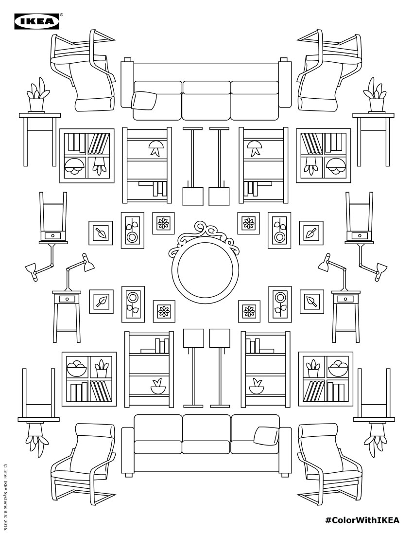
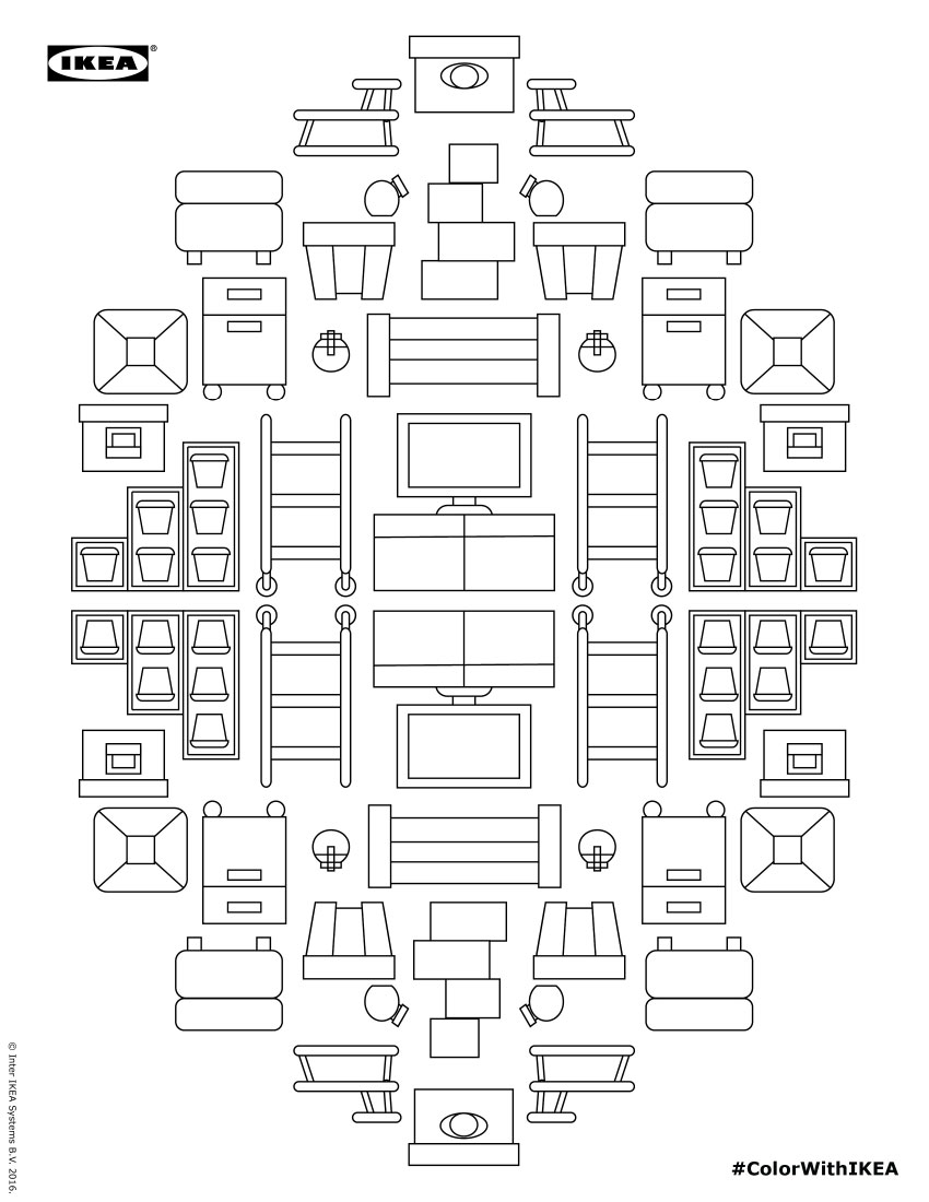
It was only a few months ago when I realized that adult coloring books are a legitimate new category of publishing, and that sales exploded last year. Evidently this trend is not just about the further initialization of modern adult adulthood (at least, not entirely), as the books claim significant therapeutic benefits. It makes sense, then, that a multinational conglomerate like Ikea seems poised to bring us what I’ll call customer coloring books. They’ve released a virtual coloring book—five downloadable pages of benignly outlined drawings prominently featuring the company’s homewares, ostensibly aimed at those experiencing elevated levels of stress over their home decor challenges.
Grab them all for free at this Dropbox link, then go color the heck out of them and get shopping.
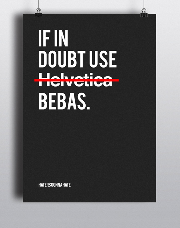
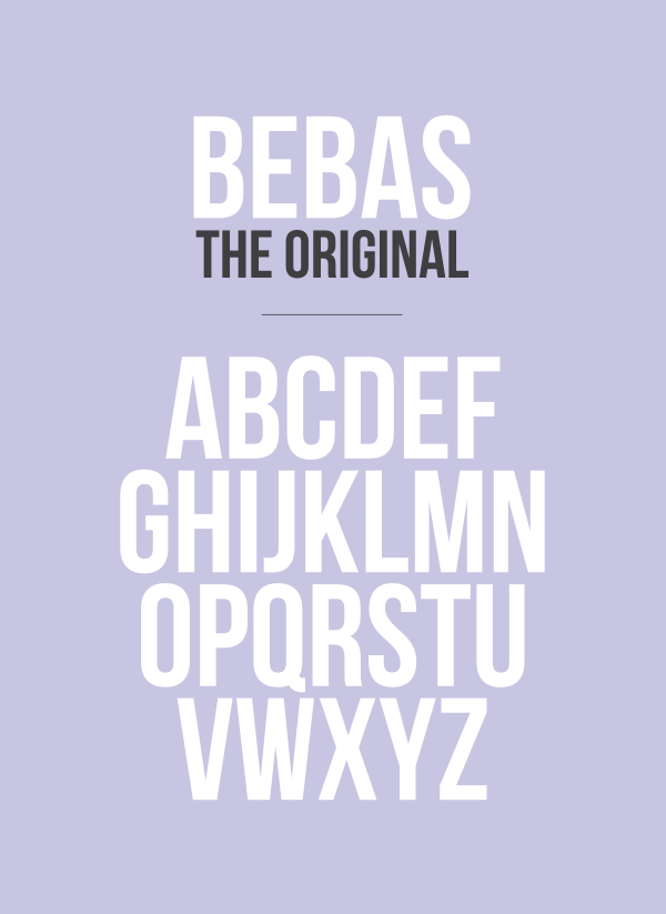
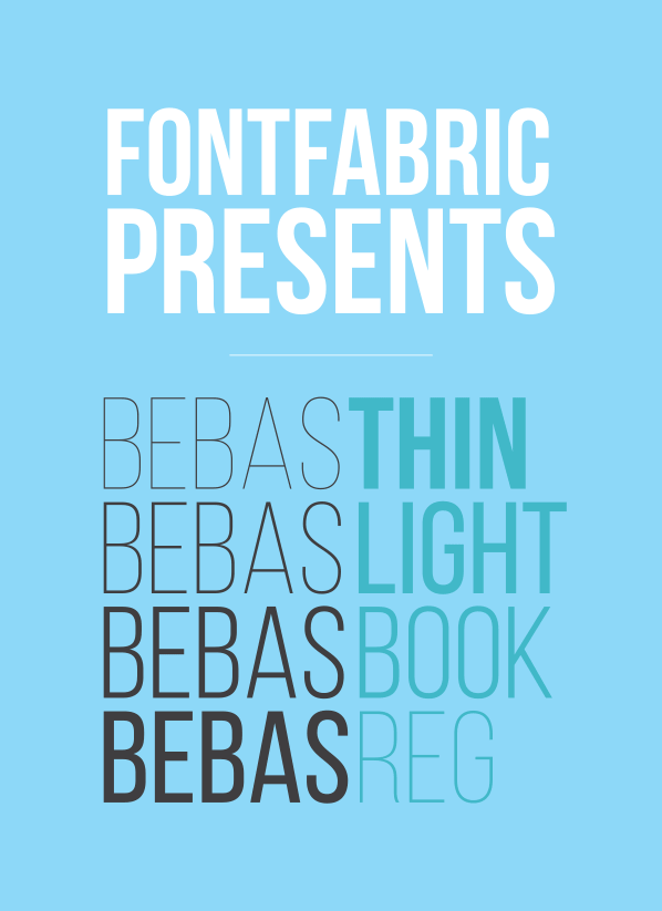
This is not new (in fact it’s almost exactly a year old) but independent foundry Fontfabric’s handsome Bebas Neue is an all-caps sans serif typeface that also happens to be free. It was originally based on an original, single-weight bold font by Ryoichi Tsunekawa, but a year ago the foundry released four additional weights: Thin, Light, Book, and Regular. While the character set is quite limited, the letterforms that are there are well drawn, and you can’t beat the price.
Before it gets too late in the year, here’s a quick roundup of all the films that I saw last year (or that were released last year; I snuck in a few viewings after Dec 31). First, my five favorite.
You could easily re-sort the top three any way you like and I wouldn’t disagree as I found it really difficult to choose the right ordering for them—even after watching each of them a second time.
Here are the movies I saw that I thought were worthwhile, and deserve attention from anyone who hasn’t seen them yet.
By the way, one of my new year’s resolutions is to track the movies I watch over at Letterboxd. If you’re at all interested, you can follow along there with my movie diary.