is a blog about design, technology and culture written by Khoi Vinh, and has been more or less continuously published since December 2000 in New York City. Khoi is currently Principal Designer at Adobe. Previously, Khoi was co-founder and CEO of Mixel (acquired in 2013), Design Director of The New York Times Online, and co-founder of the design studio Behavior, LLC. He is the author of “How They Got There: Interviews with Digital Designers About Their Careers”and “Ordering Disorder: Grid Principles for Web Design,” and was named one of Fast Company’s “fifty most influential designers in America.” Khoi lives in Crown Heights, Brooklyn with his wife and three children.
Walker art director Emmet Byrne interviews Rob Giampietro and Amber Bravo, part of the team responsible for Material Design. Their comments on that design language are worth reading:
Material Design is an open-source product and we treat it as such with regular updates and improvements that we share widely. On our team, designers and engineers work very closely together to build, and, perhaps even more crucially, maintain the system and services we develop. That’s a hallmark of our work at Google Design—the fact that we’re lead by design and engineering in equal measure. We’ve created a unique platform for sharing our work and the work of other design teams across Google, but it’s always geared toward the perspective of a team of people who are excited to polish and push the boundaries of design and engineering. We mentioned our mission earlier: to support designers and developers both internally and externally to Google. So part of our editorial and educational imperative is to share Google’s process and thinking with the design world around important topics like design tools or identity systems, and, just as significantly, we want to listen, learn, and respond to what the design world is talking and thinking about and bring the best of those ideas back into the company to power it and make all of our work better. Google is a technology organization, but, increasingly, and especially with the formation of Google Design, it understands itself to be a cultural organization as well.
This conforms to what I find interesting about Material Design: I’m less impressed by Google’s construction of a comprehensive aesthetic (although it is quite attractive) than by Google’s development of an expansive design culture. Material maintains a very tricky balance between establishing dicta and engendering participation in a conversation with its users—designers and developers—about design. It’s not always a successful balance (by necessity it’s far more prescriptive than iOS’s design language, and the results are more uniform and less innovative) but it’s still remarkable for having created an ecosystem of independent practitioners who are invested in growing and evolving the system.
Read the full interview, which goes into depth on the remarkable book of design-related essays that the team produced for its recent SPAN design conferences, at blogs.walkerart.org.
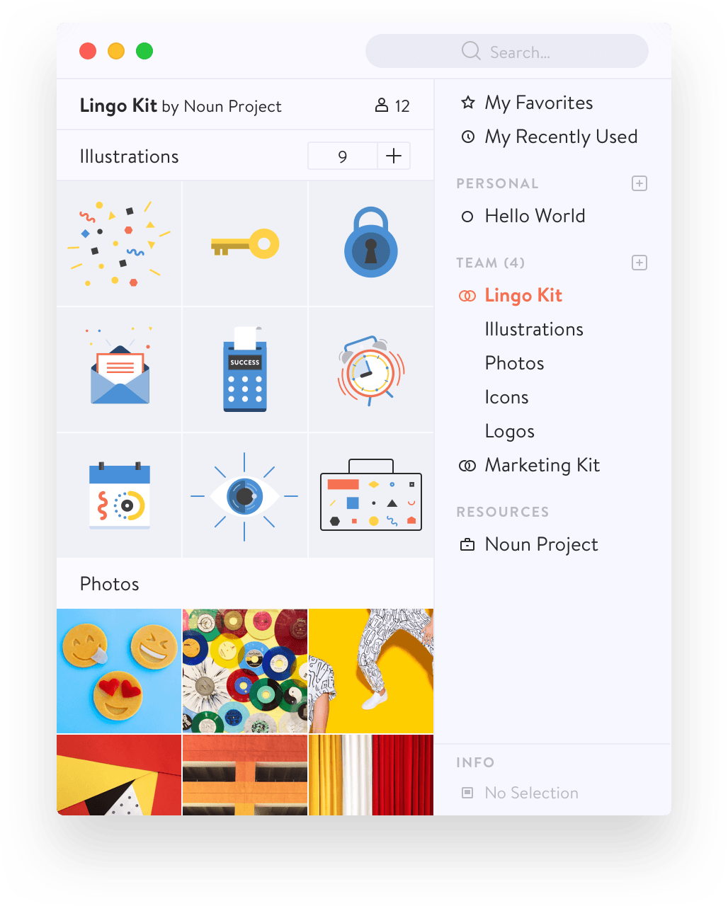
The amazing, community-powered icon resource team at The Noun Project has released a new piece of software aimed at helping designers organize their visual assets. It’s called Lingo and it makes the case that traditional file- and folder-based hierarchy is a disservice to image assets. Indeed, the marketing draws a line in the sand with its tagline:
Files hide in folders. Visuals live in Lingo.
Designers can drag and drop their assets into Lingo’s thumbnail browser interface; the assets are synced to Lingo’s own cloud service and are then accessible across computers.
That Lingo is both expressly made for designers and smartly crafted are big wins, but it’s still only a first step towards making visual asset management easier. It’s more modern and more thoughtful, but still not all that dissimilar from the various other image asset management solutions that have been with us since computers and visual artists first started hanging out together. My main complaint is that Lingo still requires rich keywords for icons to be readable in its search mechanism. You can search for “pencil,” for instance, and get any asset that’s been tagged with that keyword, but you can’t find an image that happens to have a pencil in the background. Neither can you search for black and white assets, or vector assets, unless someone has tagged them accordingly.
This is a bit of an unfair line of criticism because Lingo is really a beautiful piece of work and sure to prove handy for lots of people. (Its ability to let you drag assets into popular design tools is particularly nice.) It’s more accurate to say that image management as a whole is still fairly primitive; the fact that we’re still relying on keywords to look for visual items and not on machine learning to do that job shows a huge gap between what’s possible in current technology and what has trickled down into the design tools space.
This was one of the first Kickstarter projects that I ever backed, way back in June of 2011. After years of delays, I began to wonder if I’d ever see it, and as other movie projects that I backed on Kickstarter started coming to fruition and I saw how rag tag in quality many of them turned out, I began to lose hope that anything particularly noteworthy would come out of this one.
Alas, it was all worth the wait. “All Things Must Pass: The Rise and Fall of Tower Records” is a wonderfully made, passionate documentary of one of the first superstores in American retail, one that also happened to cater to not just broad tastes but the most eclectic, obsessive consumers as well. It scores great interviews with not just Tower’s founder and the many music celebrities that he attracted to his stores, but also many of the long tenured employees who created its unique, music-friendly but not necessarily customer-friendly culture. It’s a really great movie.
I spent a lot of my youth trolling the aisles of various Tower Records stores in various cities, flipping endlessly through the bins, weighing carefully the relative worth of certain records over others, often with only money enough in my pocket to buy one of them. That sounds practically barbaric today, and I have no interest in painting that method of consuming music as some kind of lost golden age—it wasn’t. For as many great albums that I bought at Tower, I bought many more crap ones too. For better or worse though, Tower just meant a lot to me; browsing the album covers, seeing them all assembled there together, looking wistfully at the ones I couldn’t afford or had no idea about, that was all a big part of my youth. It’s a treat to see that lost history treated so well in this documentary.
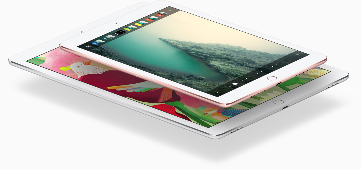
The trend in mobile devices for the past year or two has been making everything bigger, but I count myself among those who still believe that smaller is still better. Most of the time.
For instance, I was pretty enthusiastic about the original, 12.9-in. iPad Pro when it debuted last fall, but in the end I couldn’t bring myself to buy one. I had already been using my iPad Air 2 as a laptop replacement (along with a Belkin Qode Bluetooth keyboard) and I was more than happy with the compact size; even today, it’s all I take with me on my frequent business trips and I couldn’t be happier with the way it’s lightened my load. It’s true that it’s only .61 lbs. lighter than a 12.9-in. iPad Pro, but every ounce counts.
What I really wanted at the time was what Apple announced yesterday: a smaller version that’s fundamentally the same form factor as my iPad Air 2 (and the exact same weight) and that includes the original Pro’s four-speaker sound system and, most importantly, support for the amazing Apple Pencil. If you haven’t yet tried a Pencil, I can confidently say it’s better than any other stylus ou there. The best way I can describe the experience is this: the variable line quality is such a convincing replication of what it looks like to make marks on paper that I often find myself bearing down harder on the Pencil, expecting to feel the texture of the substrate through the implement. (I imagine someday, with tiny motors providing haptic feedback, that quality too will be replicable.)
I’m also optimistic that this smaller, more capable and more affordable iPad will continue the burgeoning trend of tablets replacing laptops. People are surprised when I tell them how much of the work that most people do on their laptops is possible on the iPad; with continued adoption of the Pencil and as the technology that’s unique to the iPad Pro starts trickling further down the product line, I expect soon that there will be even more work that can only be done on iPad. That’s exciting to me, because creating unique value in the iPad is what will ultimately prove out what I believe to be true: for most people, tablets are a better computing experience than laptops or desktops.
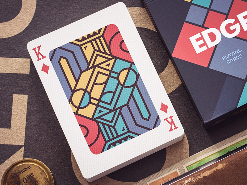
This self-initiated design from a Czech designer on Dribbble really caught my eye: modernized designs for playing cards. I’d really like a deck of these; alas they’re not yet a real thing. See the shot at dribbble.com.
This short reel unpacks many of the computer-generated scenes in the recent box office hit “Deadpool.” Though the video itself is sometimes edited too rapidly for the untrained eye to keep up with all of the many substantial changes and wholesale creations that the effects team adds to each frame, that rapid fire sensibility is appropriate. “Deadpool” itself is barely a film in the sense that films capture real people and things on celluloid (or digital). In its cartoonish plot and characters and its physics-bending world, it’s almost closer to animation—the video shows that the balance between what’s recorded in the camera and what’s generated from computers was highly malleable. In short, almost everything in “Deadpool” was fake. Except for the sophomoric humor; that was totally real.
My 2015 Subtraction.com Design Tools Survey continues to draw interest; there’s a regular influx of daily visitors and people signing up to take part in this year’s yet-to-be-announced follow up. Well, as it happens, the time has come—sort of.
Even though 2016 barely feels broken in yet, I’m beginning to think about this year’s survey, which will launch in early June again. I figure I need a bit of a head start partly because these side projects take me so long to pull off, and partly because I want to get more help on it this year—in two ways.
First, as the design tools landscape has shifted so much in just the past nine months or so, I’d like to hear from readers: What questions I should be asking that I didn’t ask last year? And what questions that I asked last year should I be changing up for this year? As a review, here are the basic topics that I put in front of survey participants last June (for more detail, see what the answers looked like in the survey results):
What tools do you use for brainstorming and ideation?
What tools do you use for wireframing?
What tools do you use for interface design?
What tools do you use for project management?
What tools do you use for version control and file management?
What country do you live in?
What kind of company do you work for?
What platforms do you design products for?
So if you have ideas on this, please let me know using the form at the bottom of this post. I’ll be very interested to hear what you’re interested in hearing about.
On the second topic where I need help, I want to first draw your attention to the wonderful design and development work that my friends at Hyperakt did for last year’s survey results. They took the tabular data that came out of the Typeform-powered questionnaire, crunched the numbers, filtered it through their expert data visualization sensibilities, and hammered out some pretty interesting (and beautifully presented) insights. It was great fun working with them.
So here’s my ambition: not only do I want to run this survey every year, but I also want to work with a different studio every year on the web site for the findings (they’ll replace what you see today at tools.subtraction.com). I really see this survey as an opportunity for talented teams to do some amazing work with some juicy content. So if you’re on the leadership team of a scrappy design shop with a penchant for information graphics and narrative, and if you have the design and development resources to devote to a side project like this, this could be the perfect fit for you. What I offer is a blank canvas; Hyperakt did wonderful work but there’s no mandate to reuse anything that they did this year. It’s really a chance to cut loose creatively and do some really entertaining work for an audience of your peers (your credit will run prominently on the site, of course). I only ask that you turn the data into a compelling visual story, and that you have fun doing it. So if you’re passionate about design and about the tools designers use, drop me a line.
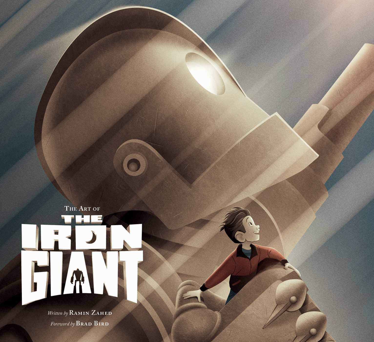
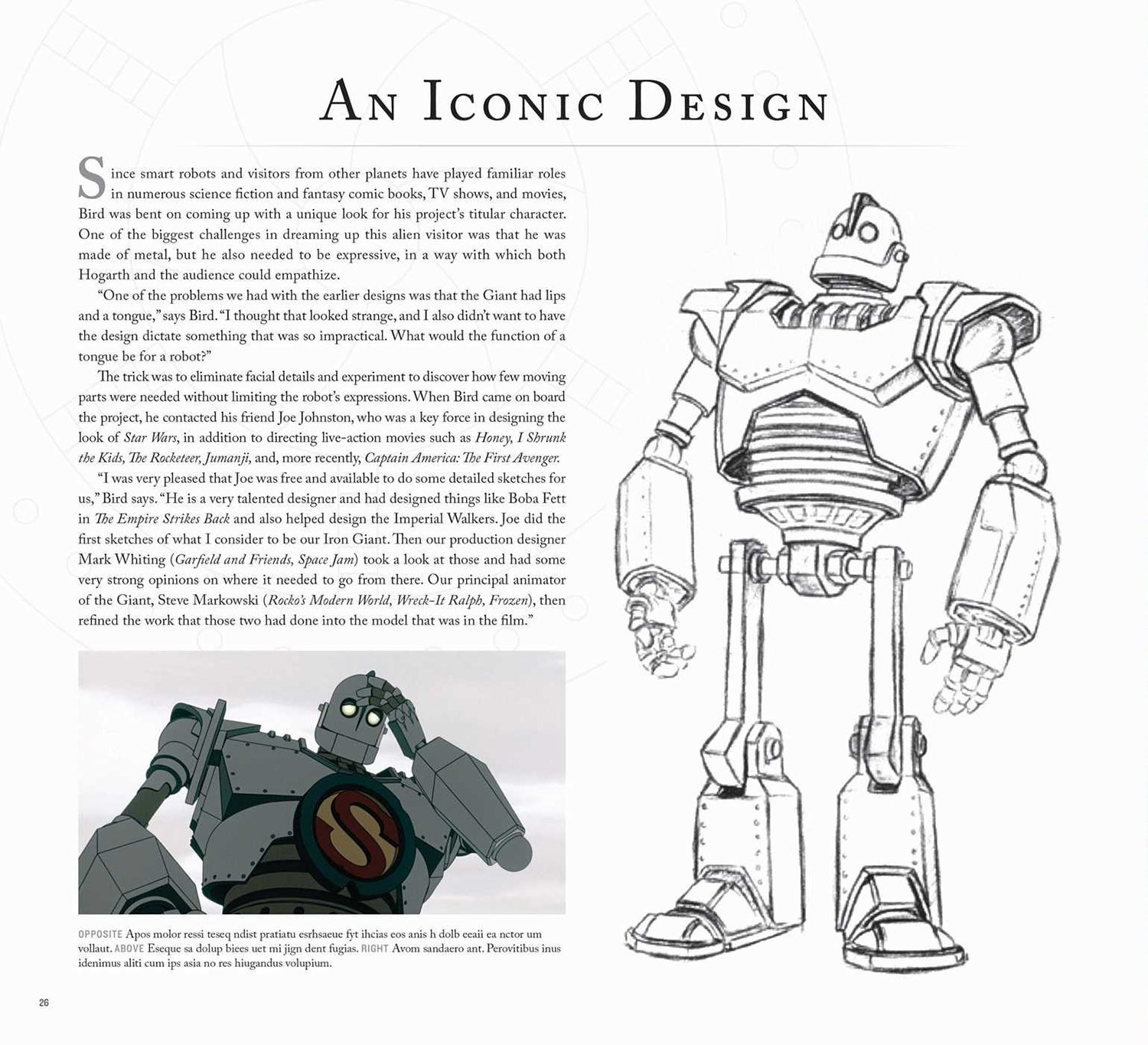
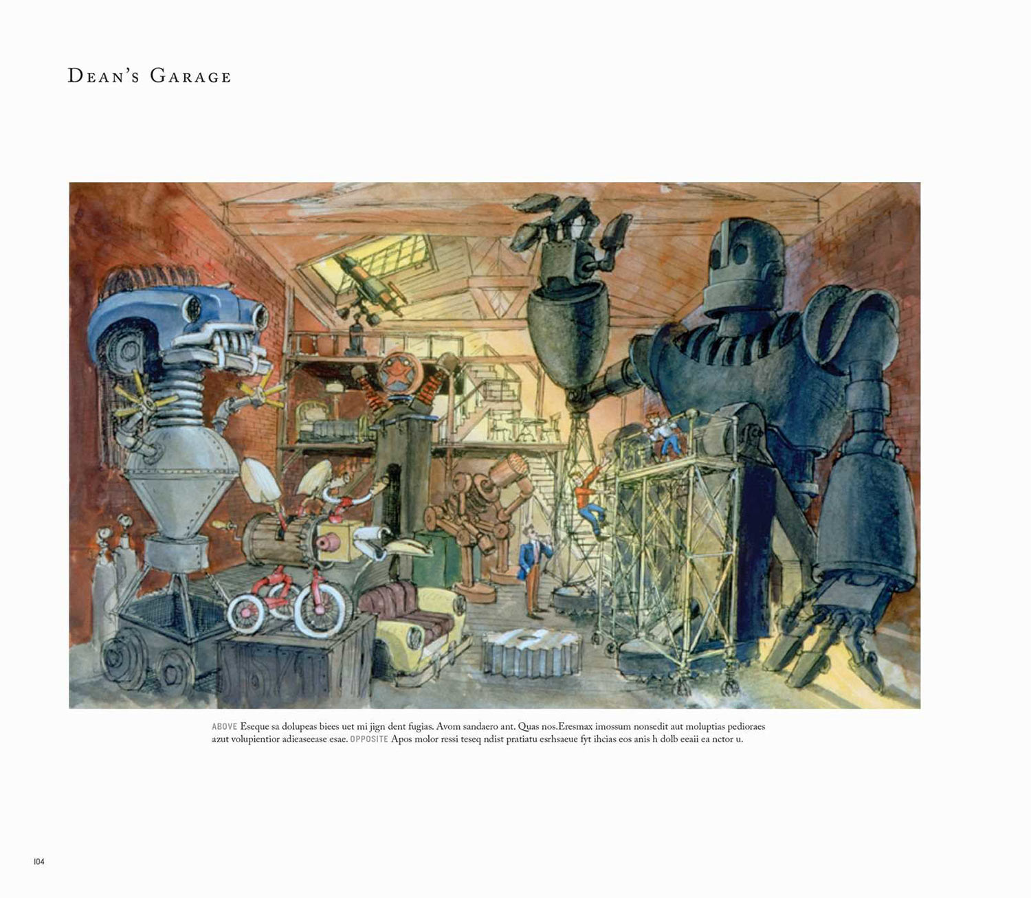
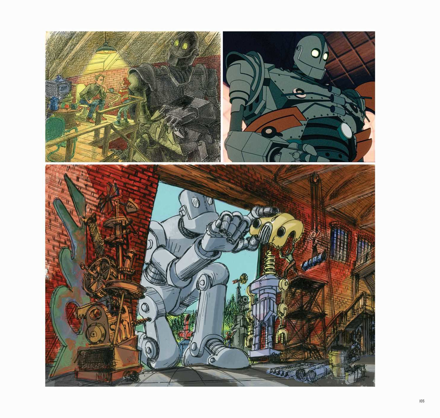
Director Brad Bird’s 1999 animated epic about a boy who discovers a robot was a flop at the box office, but it was well loved by aficionados of great animation—and just plain great movies—from the first. I’m not too proud to admit that it left me a blubbering mess of tears when I watched it, and I’ve always had a fond place for it in my heart. Now, seventeen(!) years later, its cult status looks close to its tipping point. The movie was re-released in theaters last year in a limited run “Signature Edition”; a new Blu-Ray version loaded with extras is due soon; and maybe best of all, this wonderful book, “The Art of the Iron Giant” will be published later in the year. It features storyboards, concept art and interviews with Bird and his creative team.
The estimable John Maeda, who has been a design partner at venture capital firm Kleiner Perkins Caufield & Byers for the past few years, has published his latest Design in Tech Report, a survey of the impact that the craft of design has made on the tech sector. It’s basically a vision of design through the lens of the venture capital industry, emphasizing not just how design figures into the success of companies, but also the quickening pace of mergers and acquisitions of design-led companies. While it makes some effort to present a sober view of the state of the industry, overall it has a bias towards the sanguine, and is not that particularly penetrating on the potential downsides of this current design-in-tech boom. Nevertheless, it’s fascinating and more than a worthwhile contribution to our collective understanding of the industry.
Update 2016-03-17 A few folks on Twitter have asked me to elaborate on what I referred to, admittedly obliquely, as “the potential downsides of this current design-in-tech boom.” Here are a few that come to mind:
What is the relative risk—or rate of failure—of design-led startups/products?
What has the success rate of designer founders been in raising capital? How has that compared to the mean?
What has the inflationary impact been on design salaries and the total cost of employing a designer? Are we able to quantify that versus the value that design talent brings?
How many designers have risen to C-suite positions at public companies, and how does that compare historically?
How is the design-in-tech segment of the profession faring in diversity, especially versus other segments of design?
How is design being commoditized by offshore talent pools during this boom, if at all?
How has this boom affected the employment rate of recent design grads, and what are the long-term employability trends for designers in tech, especially with regard to age and ethnicity?
By no means am I faulting Maeda’s report for not covering all of these issues, or for not providing a truly comprehensive assessment of the industry. As I said, it’s valuable work. My hope would be that next year’s report drills a bit deeper into some of the less clearly rosy aspects of the overlap between design and technology. And it’s not even accurate to say that all of these issues are necessarily even “downsides.” They’re just intended to expand on what the report has begun to do so well already: give us a clearer picture of how our profession is evolving.
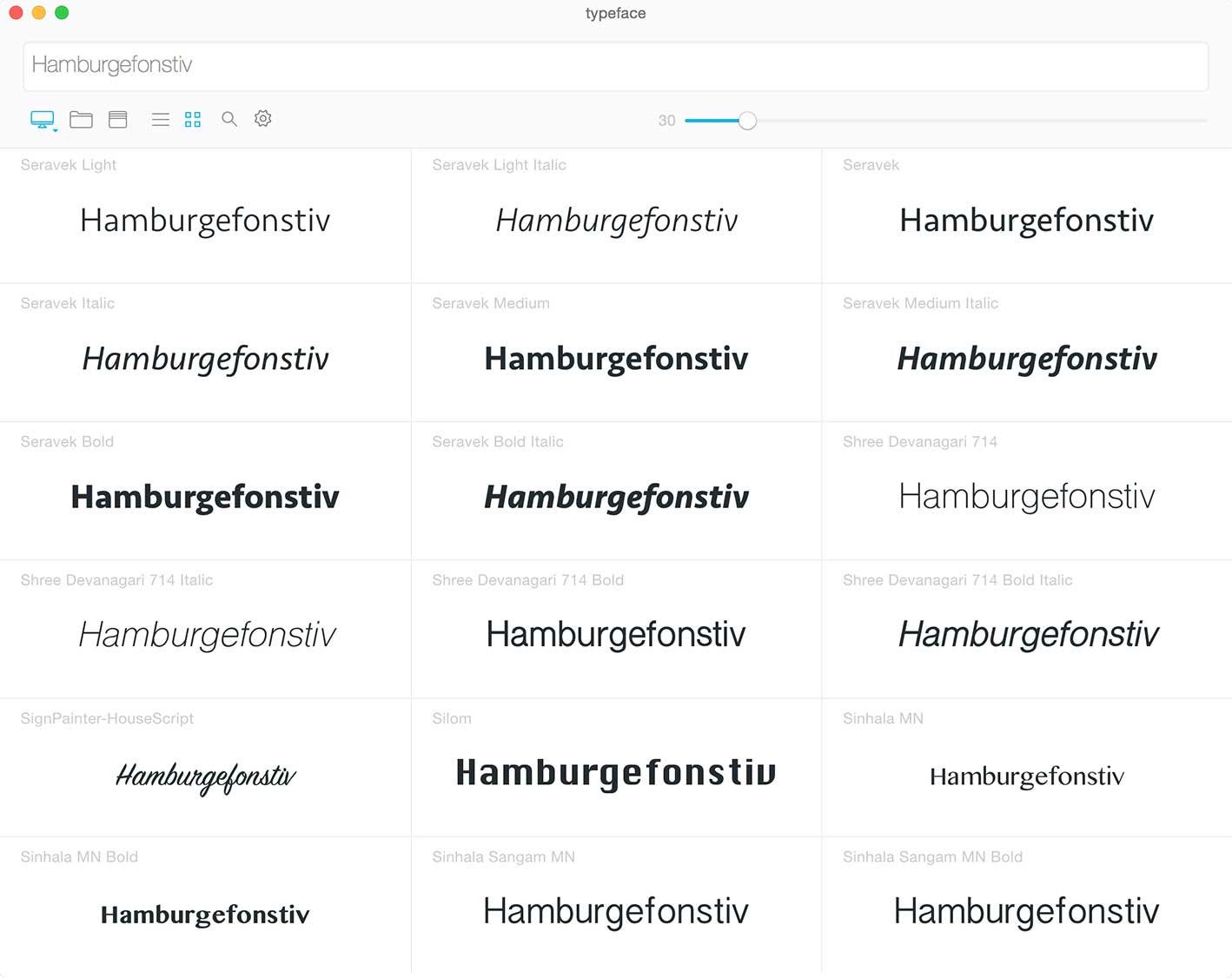
For a long while, I had stopped using third party font managers and would just manually move fonts in and out of the Fonts folder in OS X’s Library directory. In recent years I’ve been using Apple’s awkward but workable Font Book app.
Every once in a while a new font manager comes along that tempts me, though, like this one from a shop called Criminal Bird, called (perhaps too archly) Typeface. It looks elegantly designed and promises to allow you to compare typefaces with overlays. The app’s marketing says that “It helps you pick the perfect font” which struck me as a great idea—a font manager that suggests complementary typeface pairings would be a real, attention-getting innovation. Alas, it doesn’t seem like Typeface does that, but maybe the next contender will.