is a blog about design, technology and culture written by Khoi Vinh, and has been more or less continuously published since December 2000 in New York City. Khoi is currently Principal Designer at Adobe. Previously, Khoi was co-founder and CEO of Mixel (acquired in 2013), Design Director of The New York Times Online, and co-founder of the design studio Behavior, LLC. He is the author of “How They Got There: Interviews with Digital Designers About Their Careers”and “Ordering Disorder: Grid Principles for Web Design,” and was named one of Fast Company’s “fifty most influential designers in America.” Khoi lives in Crown Heights, Brooklyn with his wife and three children.
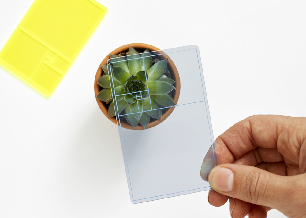
You really don’t need this, but it’s a cute idea: Chicago-based design studio Parsons & Charlesworth created this “pocket-sized gazing device” that lets you find the golden section in the world around you. You might inspire some chortles from bystanders as you use it, but hey, no one said seeking perfection was a pursuit above ridicule. Available for just US$10 from areaware.com.
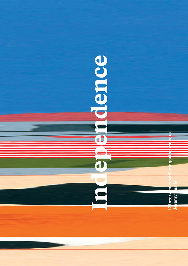
Creative director Jeremy Leslie is a true believer in the idea of magazines as a media form that continues to be uniquely relevant and vibrant, despite the challenges to the industry wrought by digital publishing. For many years, Leslie has been the irresistible force behind MagCulture, a web site and London-based studio devoted to the “ever-developing discipline” of editorial design. Recently, Leslie published “Independence,” a book that surveys the current landscape of distinctive, adventurous independent publishing. In it, Leslie interviews twelve “makers” of some of the most interesting indie mags in the market today. I interviewed Leslie about the book, his thoughts on how this particular strain of publishing is changing, who the readership for these magazines is, and what lies ahead.
Khoi Vinh: You wrote a book twelve years ago that also focused on small, independent magazine publishers—you called them “microzines” at the time. What’s changed since then, and how does this new book reflect that?
Jeremy Leslie: In that book I identified a new interest in making and buying small mags. The term “microzines” never stuck, but since then the breadth and range of the magazines has grown enormously and we now know them as “independent magazines.” Not a name of great clarity, but it does reflect the difference between them and the titles published by the big publishers.
The main change is that many of these magazines have ambitions beyond just being labors of love. The new book contains interviews with the makers of twelve such magazines, each of which is seeking to assert itself beyond being well-regarded among a cognoscenti and reach a wider audience and become successful businesses on their own terms, independent but ambitious.
Can you expand a little on “ambitions beyond just being labours of love”?
Many small magazines start off with ambiguous expectations; often as an experiment or trial, a reaction to frustrations in other areas of the protagonist’s work lives. An attempt to see what it is to make a magazine. At this stage they are labors of love, produced out-of-hours like so many personal projects. Often (but not always) there is little thought put to assessing success; the act of doing is what counts, even if there is a background dream of sheer success. After several issues the makers can learn a lot about their publication and their audience. Other factors come into play: can we improve the finances, the creative approach, the content… can we make it into a sound business?
You write in the introduction that “today the best-selling independents can match the smaller mainstream titles for sales.” Some might argue that’s more of a comment on how difficult the mass market publishing business is these days than a comment on how healthy the independent magazine market is. What’s your take?
It is both; the failure of so much of the mass and the success of the indies means the figures meet in the middle. At that point our notional ideas of “mass” and “indie” might be called into question, but the key point is that the indies are on their way up.
Because they’ve grown from zero sales and zero costs, the successful indies have controlled their growth (expense, income and scale) very tightly. They have invested in quality as opposed to quantity, and have a stronger sense of who their readers are and what they want. Their readers are highly engaged. These magazines are better positioned to succeed than a failing “big” mag. I hear mass publishers offering sound words, paeans to quality, but they have legacy costs—big offices, large staffs—that they struggle with.
How useful is it to group these publications under this single umbrella term of “independents”? What are the common characteristics that you see in all of them?
For the sake of discussions like this it’s useful to have a term that separates these magazines from the mass market. But inevitably “independent” is a shorthand, and not all the magazine makers who participated in the interviews fully embrace the word. Wrap’s Polly Glass doesn’t see their magazine as part of a broader publishing scene, while Delayed Gratification‘s Rob Orchard goes a step further, expressing concern that the independent label might be a self-defining restriction to their growth.
What is common is a desire to do things their own way, ignoring convention in favor of self-learning. Some conventions are turned on their head, others confirmed.
The term “independent” is constantly questioned. What does it mean? I suggest it represents a working process where creative and financial decisions are made in tandem; the vision underlying these projects supercedes short-term financial gain in favor of longer-term creative ambition. The mass market by its very business model defaults to quantity over quality; these magazines value quality over quantity first.
Let me ask that again from a different angle. It seems as if all of the publications featured in this book are more or less targeted at the same kind of reader: a knowledge worker, member of the so-called “creative class,” upper-middle class, probably with a higher education degree, and disposable income. Is that fair to say? Is this wave of independent publishing primarily aimed at these kinds of readers?
Both the people that make the magazines and the people that read them are part of the broader “creative class” you describe but are more diverse than your description allows.
Different magazines have different readers;Cereal portrays a lifestyle beyond the reach of many but for £12 you can have a window on that world, a very traditional role for a magazine; Intern supports the work and endeavours of the younger creative class as they start their careers; Weapons of Reason seeks to deliver its environmental message beyond the converted to the people of all ages and classes (it’s distributed free). It’s notable that most of the interviewees pay little attention to the other magazines, they are focused on their particular subject area rather than the indie magazine world.
These magazines are specialist and by necessity limited in their distribution; but most are pretty uncomplicated and clear in their intent. Their uniqueness initially draws the creative class but the sales figures some are achieving suggest they are reaching beyond that world alone.
How about design-wise? Are there common traits to be found in their approach to layout, photography, typography?
There are common traits to the way the indies present themselves, and there’s been some chatter and noise about how they’re “all beginning to look the same.” This is nonsense; like any endeavour that comes to be seen as successful or directional, there are copyists trying to catch the bandwagon, but they’re a small part of the whole and besides, different people have different ideas about “who came first.”
A more fundamental design trait is simplicity; these magazines have small staffs so their options are limited in terms of complex style sheets, grids and typographic effects. Their pages are not dense patchworks of commercial dependencies slotted between advertising pages. Instead, stories have space to breathe across multiple spreads and there’s an assumption the reader wants to read rather than has to be attracted/persuaded/led by the hand. Thus monochrome design is a common default, letting imagery provide the color.
Editorial design concerns the relationship between function and character, and in the indie magazine both are dealt with quickly and then worked hard. As ever the detail varies: a magazine like Weapons of Reason is highly regarded for its illustration, but is typographically naïve. By contrast The Gourmand has worked closely with Monotype to rediscover and digitise early versions of individual characters from some of their most famous typefaces (check out their Monotype Grotesque ampersand).
Do the founders of these independents have more—or less—design in their DNA than the editors at major publications?
In the broadest sense, the people behind the independents are certainly more concerned with design than mainstream editors. They design their magazines as physical objects, they have the option to select different/mixed types of paper, add special print effects and finishing techniques. Touch, sound and smell tend are added to the visual in a way mainstream mags can’t manage.
Zoom in on the more traditional aspects of editorial design (typography, layout etc) and things are a little more mixed. If a founder is a trained designer you can expect the highest standards of detailing and design. But others are less thorough, and learn issue by issue.
For instance, a common problem is printing body text too small, and sometimes with poor hyphenation and justification control, affecting legibility.
It’s not as simple as indie equals good design, mainstream equals poor. There are editors and designers in all sectors of magazine making that are natural visual journalists, and those that aren’t.
If you had to guess, what do you think independent magazines will look like twelve years from now? Will print still be with us? Will the notion of “digital magazines” be viable, finally?
In twelve years time I expect things on the surface won’t look so different. Some of the mags we regard as indie now may have become a new mainstream, and the gap between indie and mainstream in physical production terms will have closed considerably—high-end quality will dominate the print sphere. Newspapers will exist as weekly magazines that owe a lot to today’s indies. So in that sense what we regard as “indie” may have turned “mainstream.”
The immediate future will be influenced by the countries that are now joining the global interaction, China et. al. There’s a huge print heritage from the Far East that will add direction to what we’re all doing, we’re already looking to cover more of that on the MagCulture Journal.
But really, the exciting thing about publishing and media is that whatever we try and guess will be wrong. The central concerns of people making magazines haven’t changed ever; the way they express those concerns have.
Print and digital will both still exist, the concept of “digital magazines” will be laughed at, just as we giggle at “radio with pictures.”
It will also be fascinating (as ever) looking back at today’s magazines from that distance. I wonder what we’ll make if them, which ones will be held up as the leading examples of this time? I think that will be pretty surprising too.
This article by designer Bethany Heck extolls the virtues of using lots of typefaces—far more than the commonly accepted good practice of limiting yourself to three—to create richly expressive design solutions.
This approach is antithetical to almost everything that I believe about how good typography is crafted, and Heck’s results are strike me as nearly alien to my own aesthetic. I would be loathe to advise any young designer to follow her lead.
And yet, the article is a wonderfully reasoned counter-argument to rarely questioned typographic dogma, a refreshing inversion of the “rules” to which designers can cling with too few questions. There’s also no denying that Heck’s results are wonderful, gorgeous even. With each typeface she uses, her designs become elaborate systems, almost like orchestras of typographic instruments. I’m humbled just poring over her work samples.
If you hunt for similarities in the typefaces you use and exploit them, you can have a great, diverse system of multiple faces that are fundamentally quite different but work well together because you have a specific role for each to play.
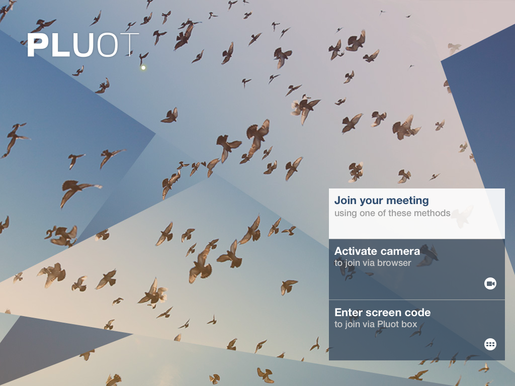
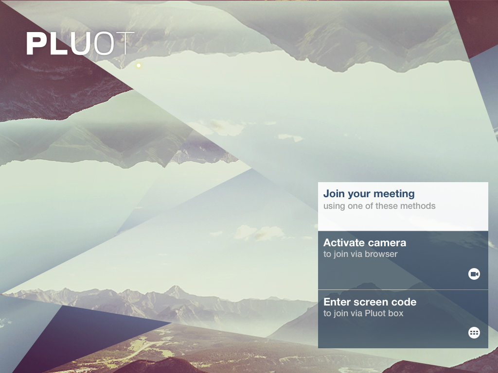
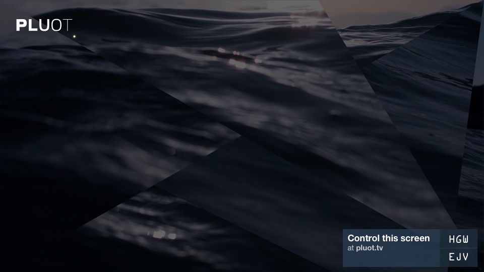
It’s rare that it happens, but once in a while I do get to do a little freelance design work for other businesses. Recently I did some foundational identity and user experience design for Pluot, a startup in San Francisco run by two friends. Pluot is trying to reinvent video conferencing for small- to medium-size businesses; they have an elegant set-top box that hooks up to large, flat-screen TVs and makes the process of connecting to remote coworkers—both via camera, and also via sharing your desktop—incredibly easy. The company recently completed the Y-Combinator program and are in an early release phase right now.
The first thing I did was work on establishing a simple brand identity. I used varying weights of slightly hand-modified Rein Grotesk letterforms to imply a subtle motion in the letterforms, and added a small terminator dot at the bottom right that’s meant to suggest the power light at the bottom of an HDTV.
The logotype is actually meant to be somewhat quiet and is aesthetically less forward-leaning than the vision the company has of itself. The video conferencing market has traditionally been dominated by very conservative players who themselves market to often stodgy Fortune 1000 enterprises, but Pluot is focused on getting their product in the hands of startups like themselves and other technologically savvy companies—not because a Pluot box requires advanced skills, but in fact because these buyers are much more demanding in terms of having a superb user experience in their video systems.
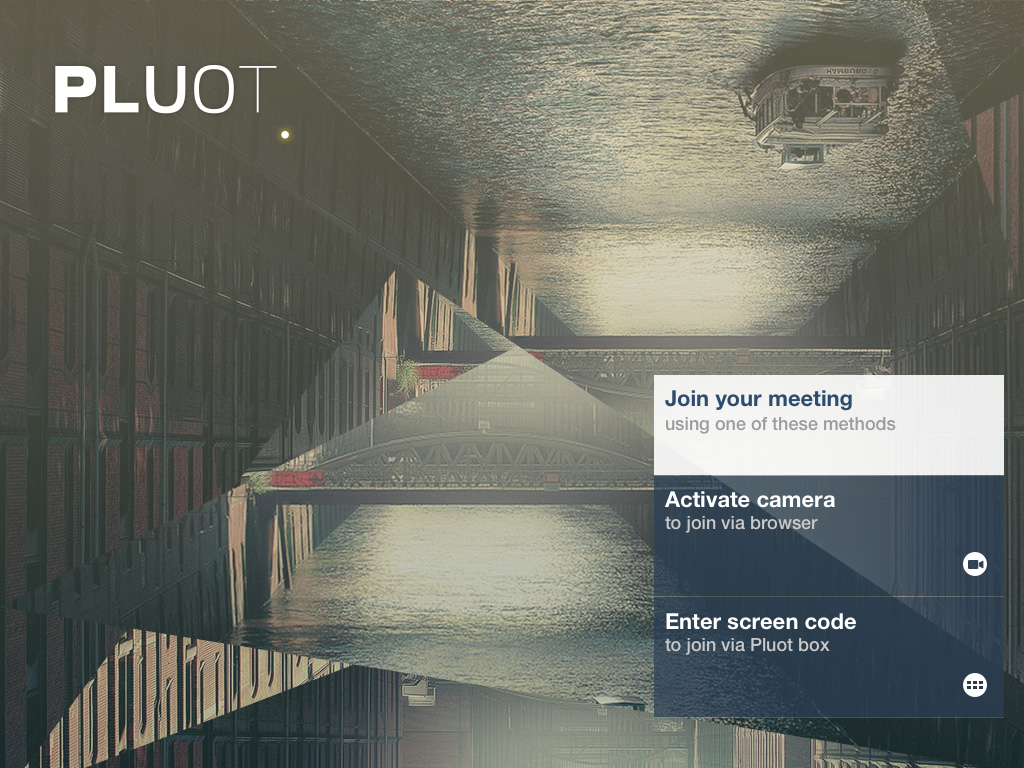
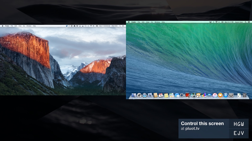
Video conferencing software also relies on a lot of background screens, or wallpapers, and so I used those “surfaces” as an opportunity to communicate Pluot’s less conventional qualities. I strove to create an abstract visual language from photographic “materials”; I used a series of stock photos that are refracted through a geometric kaleidoscope, if you will. The effect distorts their details substantially but not entirely. Here are a few of the backgrounds that I created to set the tone.
In these designs you may also notice some of the patterns I set up for the user experience. The amount of space that you need on an HDTV (or even a web browser; Pluot also works on your desktop) to display video conferencing controls is relatively small, and so I really wanted to make the wide expanses feel intentional and not just a byproduct of poor layout planning. So I tucked everything at the bottom right of the screen—the “end,” if you read screens from top left to lower right—and stacked the elements up, one by one, from the bottom edge. In this example, you can see how the controls grow upwards as they get expanded:
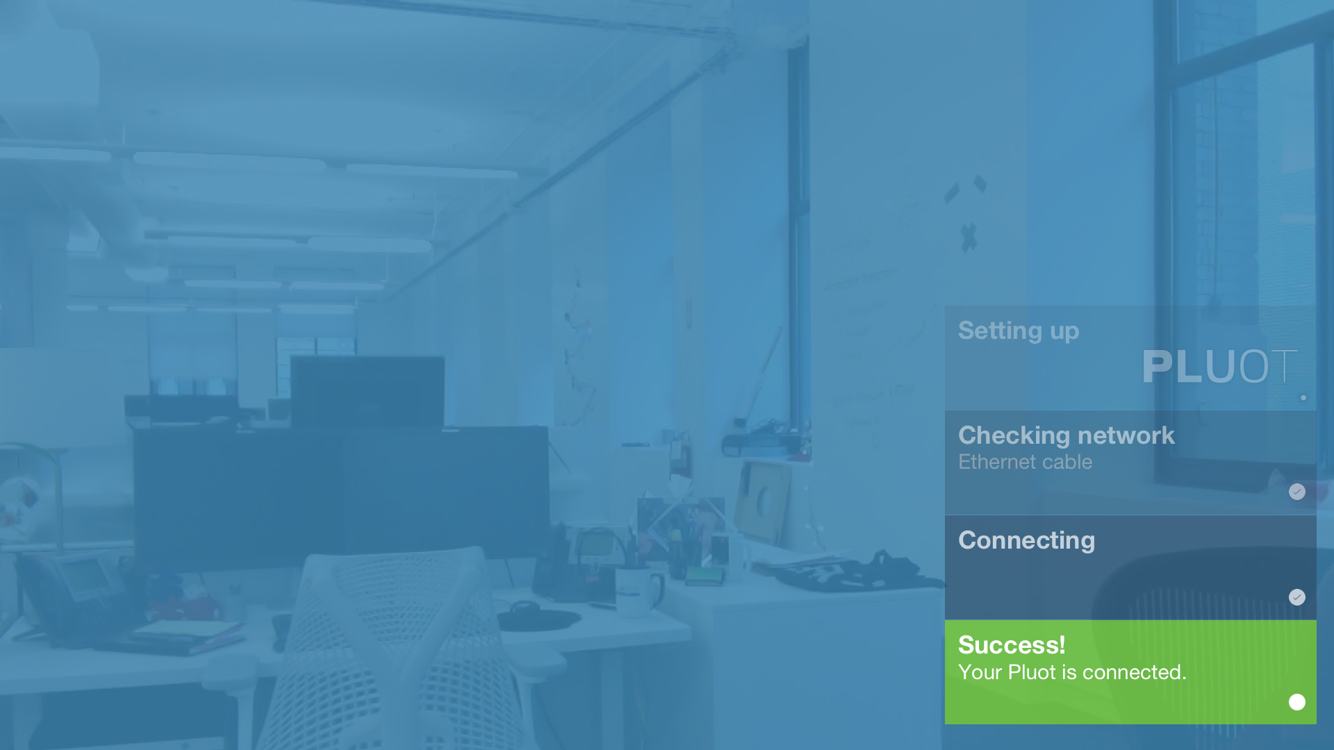
I used that same stacking pattern for the setup wizard. As the user completes each setup step, it gets nudged upwards by a new one that replaces it below. The older steps also get progressively more translucent.
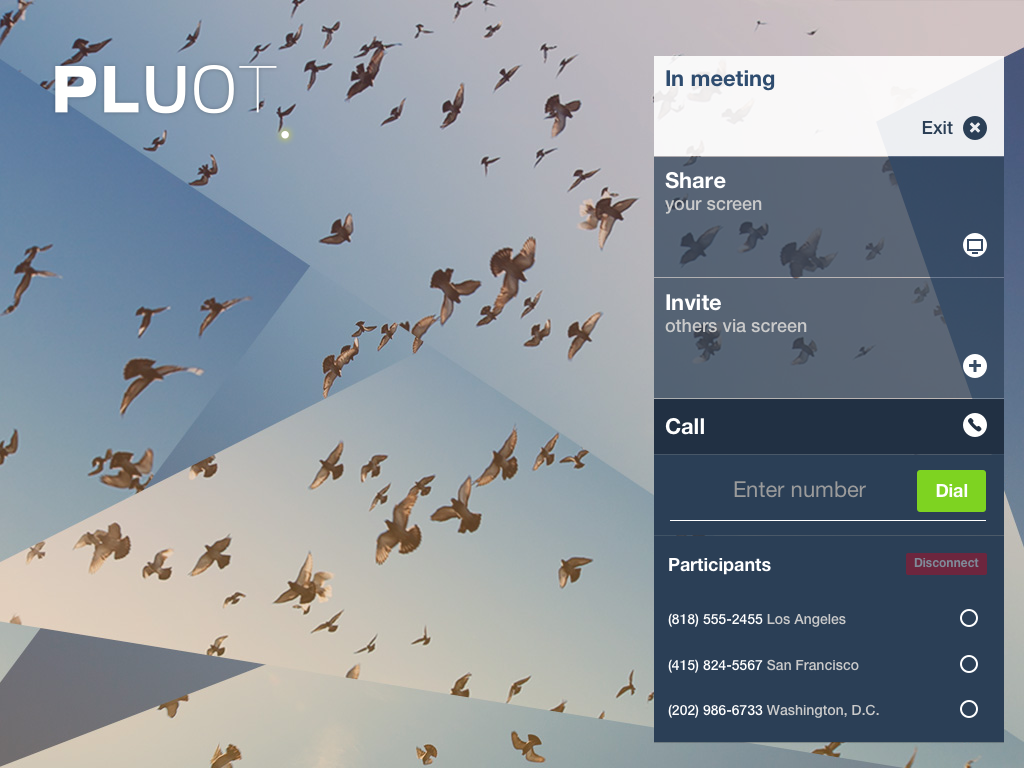
Establishing that lower right region as a central control area also set the tone for the Pluot experience on screen when viewing conferences, too. Users join meetings by entering a simple six-character code that’s displayed on the screen in the room; I broke the code into two parts and stacked them so that they would be easier to read from the screen and type into the control interface. The shared screens sit side by side or stack as necessary to accommodate all the participants; Pluot meetings can host as many as four of your colleagues at once (with support for more coming soon).
It was actually a lot of fun working through all the various permutations of video meetings and trying to create a cohesive user experience for combinations of video and desktop participants in all sorts of configurations. Working with Pluot was a great side project for me for a number of months; I was able to set a clear, finite scope with the company that allowed me to get a lot of these foundational pieces done in a limited amount of time. Unfortunately, due to being ridiculously busy with my day job and my family, I wasn’t able to stay really close to the implementation process, though I continue to chat with the co-founders periodically. They’re off to a great start though, and I feel very fortunate to have been able to work with them to get it out to the world. If you work at a company with remote colleagues, I encourage you to give Pluot a try and let me know what you think of the experience I designed.
There’s more like that out there, apparently, including this one: a six minute supercut of countless moments from the immortal “Seinfeld” where nothing happens. As with the “Friends” video, this one is unexpectedly mesmerizing; I had watched nearly the whole thing before I realized it had me so hooked. Even though it’s nearly impossible to identify the particular episodes or narratives that any given shot was a part of, the overall sensation is surprisingly familiar and even intimate, almost like being on the set of the show without all the cast and crew. For some of us, I guess, these shows will forever be a kind of second home.
A few recent public-ish appearances. First, a few weeks ago I was lucky enough to be invited to appear on Ilise Benun’s HOW Design Live Podcast. Benun’s show focuses on entrepreneurship and the business of creativity, and that’s largely the ground that we covered. You can listen to it below, and hear more episodes at howdesign.com.
I also took part in the inaugural installment of powerhouse photography community 500px’s new series “Take 5 with 500px.” Basically, it’s a short question-and-answer in which I talked about photography, design and a bit of what we’re up at at Adobe. If you’re interested, it’s a short read over at iso.500px.com.
Also, tonight, I’ll be making at an appearance on stage at my good friend Paul Ford’s company Postlight, where we’ll have an interesting back and forth about what we’re working on at Adobe and various design and technology issues. Paul is one of the smartest people I know, so I’m sure he’ll be even more enlightening than I am—tickets are still available at meetup.com. It’s worth mentioning that I’m also set to appear on a forthcoming episode of Postlight’s excellent podcast Track Changes; stay tuned for more information on that.
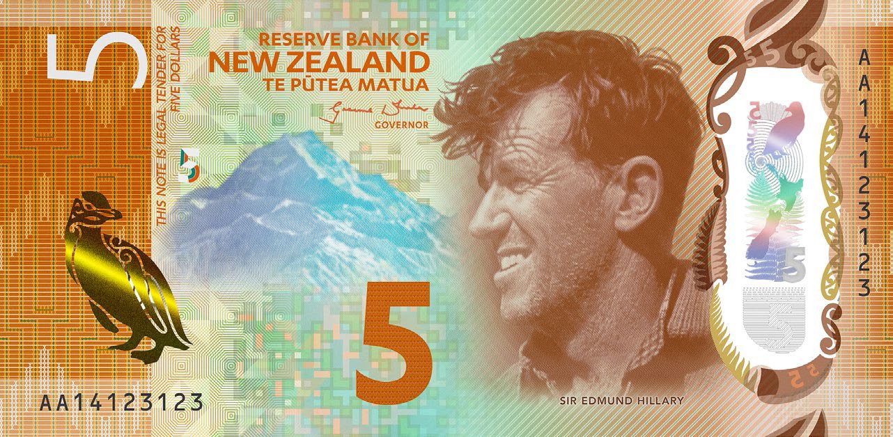
The International Bank Note Society has awarded its annual prize for best designed bank note to New Zealand for its $5 polymer note. The design features the face of native mountain climber Sir Edmund Hillary, with a backdrop of Mount Cook and, for fun, a yellow-eyed penguin seemingly printed in metallic ink.
I know a lot of people complain about U.S. bank notes being unimaginative and not particularly attractive, but I’m not sure I’ve seen a lot of other bills that strike me as significantly better. Like this New Zealand note, most seem overburdened with too many colors and too many details. I realize that a lot of these design decisions are security focused and so any evaluation of their aesthetic worth needs to be seen through that lens. But for me, most all of them fall down on the job of creating a distinctly original currency brand for their respective countries. It’s unfair to say that you can spot American money from a mile away—the notes themselves benefit from the huge worldwide brand that is the U.S. of A.—but for better or worse, our greenbacks are distinctive.
The New Zealand $5 note beat out runners up from Sweden, Russia, Kazakhstan and Scotland, but I bet if you mixed them all up, most people couldn’t tell at a glance whether they were from different countries or all from the same country, much less identify their origins. That seems like a missed opportunity.
Read more about the competition in this article at theguardian.com.
This is the last in a series of eight endearing tributes to Bill Watterson’s much beloved daily comic strip “Calvin and Hobbes.” Each episode is a live action, verbatim re-creation of a classic strip. They’re very short and very watchable. And also, because everything is more appealing when it’s somehow related to hip-hop reimaginings of American history, the actor who plays Hobbes in this series is Daveed Diggs, who plays the Marquis de Lafayette in Lin-Manuel Miranda’s smash hit Broadway musical “Hamilton.” It all comes back to that, in 2016.
See all eight “Hobbes and Me” videos at youtube.com.
I’m still having a lot of fun with Apple Pencil and Adobe Illustrator Draw (see what I made with them last week). Here’s a new drawing, of a young Elvis Costello. I’m not sure if I got the likeness really right, as portraits are not really my thing. But I do know I had a lot of fun doing it.
As I’ve been using the Pencil, I’ve naturally had lots of thoughts about its design and how it works. Here are a few of them, randomly ordered.
The weight of the Apple Pencil feels just perfect. It’s substantial enough to be very satisfying to hold and write and draw with, but not so heavy as to be wearying to use. I’m not sure that any stylus should cost US$99 the way that the Pencil does, but this one is built solidly enough to make a pretty convincing case for the price tag.
As elegant a design as the Pencil is, I can’t help but feeling that it’s not a finished design. That there’s no way to attach it to your iPad, and there’s no available pen clip (there are cheap hacks out there, but none of them seem perfect). Those are two of the more notable shortcomings that people talk about frequently, but just as significant, in my mind, is the fact that you need an adapter to charge the Pencil with a Lightning cable.
The cap at the top of the Pencil hides a male plug that lets you charge the stylus in your iPad’s Lightning port, of course, but it’s very awkward to do so, and I would prefer to just be able to use the same cable I use to charge my iPhone. The Apple Pencil box ships with a strikingly diminutive Lightning adapter that lets you do that; I lost mine within a day or two.
I added a Pencil Cozy to the top of the Pencil to prevent loss of the cap. It’s also a great way to easily identify your own Pencil if you’re in a room full of people who are using iPad Pros and Apple Pencils, which is something that happens at Adobe.
Lastly, I’m very eager to see Apple Pencil support migrate further down the iPad line. I demonstrated Pencil and Illustrator Draw for several people, and more than any other demo of what an iPad can do, what I heard was, “I want one.” Apple Pencil really feels like a killer app for the iPad, but it faces a big problem right now: it’s not exactly cheap, and it also requires spending at least US$599 on an iPad Pro (or at least US$749 for a 128G model, which is really the smallest capacity model anybody should be buying). That price point is a significant hurdle for non-professional users, and I hope Apple clears them soon. Imagine if, by this year’s holiday season, Apple releases an iPad mini-style tablet—something at an entry level—that works with Apple Pencil. That could make for the biggest quarter the iPad has had since its launch.