is a blog about design, technology and culture written by Khoi Vinh, and has been more or less continuously published since December 2000 in New York City. Khoi is currently Principal Designer at Adobe. Previously, Khoi was co-founder and CEO of Mixel (acquired in 2013), Design Director of The New York Times Online, and co-founder of the design studio Behavior, LLC. He is the author of “How They Got There: Interviews with Digital Designers About Their Careers”and “Ordering Disorder: Grid Principles for Web Design,” and was named one of Fast Company’s “fifty most influential designers in America.” Khoi lives in Crown Heights, Brooklyn with his wife and three children.
Japan has more brick and mortar music stores than anywhere else in the world, reports Quartz in this fascinating article. Oddly, this a result of a market that became immersed in digital technology years before many other first world countries, and that experience has engendered an unexpected consumer fondness for physical media. Japan’s music industry has also been smart about maximizing the perceived value of the compact disc:
The huge popularity of girl and boy bands, and the rabid fandoms that they spawn, allow record companies to cash in using the marketing gimmick of limited editions. It’s not uncommon for a CD to be released in five different versions, featuring different covers, B-sides, or bonus DVDs.
This speaks to a love of physical objects that’s characteristic of Japanese and also German culture, says Mulligan. These two countries have a shared preference for cash over credit cards, and also the strongest sales of physical music in the world.
This has led to a transformation in what CDs mean—from being objects that play songs to a form of merchandise. It’s less about the music itself and more about the experience of supporting, and feeling closer to, your favorite idol, says Ronald Taylor, music correspondent for the Japan Times.
In the last 15 years, record companies have partnered with artist management agencies to take this further. Inside the CDs there are tickets to special concerts; handshake events, where buyers can spend a few seconds locking hands with their idol; and voting cards used for annual ‘elections’ that determine the popularity of band members within the group. Popular members get TV appearances and endorsement deals that the bands and management can further profit from. Fans can vote as many times as they want—one CD single counts as one vote—leading extreme fans to buy thousands of copies of the same CD.
I have mixed feelings about this. On the one hand, I’ve never been fond of the exploitive tendencies that physical formats, especially CDs, seemed to inspire in music marketers; there’s no good reason to buy five versions of the same album, and, environmentally speaking, plenty of good reasons why there shouldn’t be five versions even issued.
On the other hand, I admire how the Japanese music industry has apparently continued to add emotional resonance to their products—not just to the actual CDs, but to the idea of an album or a release as a work to be valued, as a connection to the artist. This is diametrically opposed to the trend that I’ve experienced with streaming services, where the value of a work seems to degrade all the time; I feel less connected to the artists (and albums) that I’ve discovered on Spotify than I do to the music I actually owned—whether in physical form or even as a digital download. There’s got to be a happy medium between buying five copies of the same CD and feeling generally blasé about an infinite catalog of streaming music.
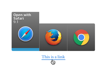
Last year, in this blog post, I mentioned in passing a macOS utility that my friend Scott Ostler and I have been tinkering with, on and off, for several years. It’s called “Handlr” (we’ve since dropped the “e”) and it intercepts links that you might click on in apps like Slack, Mail, Messages, Notes, Preview, etc. and lets you decide which browser to open them in. The interface looks like this:
There was enough interest in Handlr that we decided to finally finish the work and release it to the public. It’s just about ready, but before we pull the trigger, we’re hoping to find a handful of beta testers to help us kick the tires and make sure it’s really sturdy. So if you use multiple browsers (or would like to) and want to have more control over where your links are opened, please head over to this Google form and sign up to be a beta tester. With luck we’ll have this out before too long. Thanks!
My favorite photo utility on my phone is SKRWT, which I think is meant to be pronounced as “square it” but reads to me like “screw it.” However it’s pronounced, it allows me to “correct” (or “distort,” depending on how you think about it) photos I take so that all the straight lines in a shot actually appear straight, or very close to it. This overlong video shows how it’s used; you’ll get the idea after thirty seconds or so.
The app includes controls for manipulation of your photo’s rotation, perspective and lens distortion. The adjustments must be done manually, which I don’t mind too much. The effect is inherently artificial, so making the decisions as to how much to tweak on a case by case basis feels more like genuine artistry than just having it done for you automatically (though it would be nice to be able to save my own presets). Aesthetically, the results you can achieve are particularly effective for shooting architecture, but it’s also very much the look that I favor in photography—when everything’s on a straight line, I’m happy.
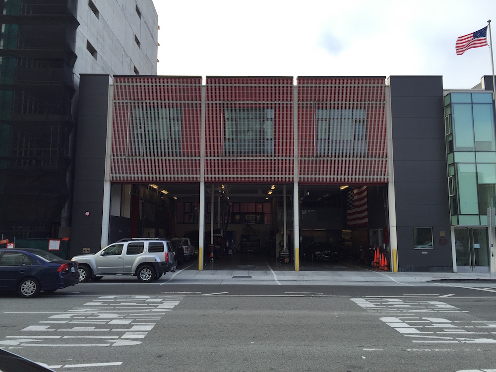
Here’s one example; a shot I took on the street in San Francisco recently from ground level, holding my phone as level and upright as I could.
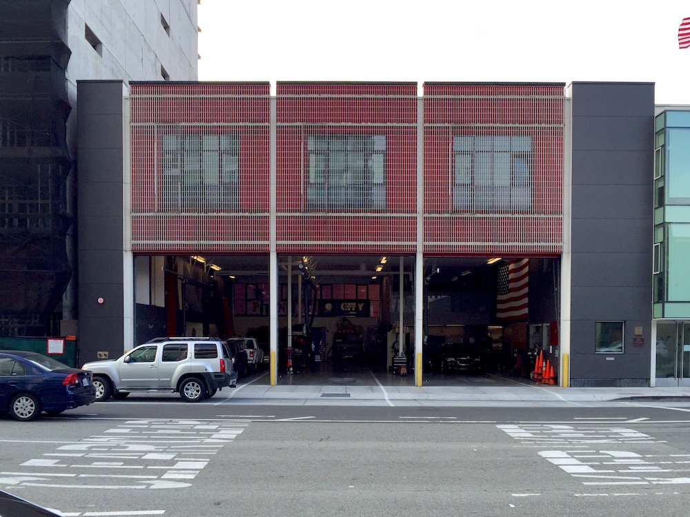
Here’s the same shot after just a few quick edits with SKRWT and some light color correction.
The results are not perfect, of course—the changes I made show an exaggerated distortion. That’s one of the inherent drawbacks of trying to get precise results while editing on a phone screen. But given a little more time and care, SKRWT absolutely lets you get better results than this.
Unfortunately, SKRWT hasn’t had a meaningful update in quite some time; it was released two years ago and was last updated in the App Store last November. It’s also broken on the iPad; the UI gets scrambled on that device, which is unfortunate because the greater screen real estate would lend itself nicely to these kinds of edits. Still, I find that it’s worth the relatively paltry US$1.99 price tag, though in an ideal world, this kind of functionality would be built right into Apple’s or Google’s own photo apps.
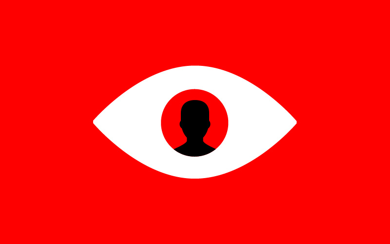
This is a fascinating article at The New Yorker by Patric Radden Keefe about a unique team of police at Scotland Yard composed of what are known as “super recognizers.”
Each officer has an extraordinary ability to recall and recognize faces, and to help solve crimes they employ that skill in scanning the endless amount of footage generated by London’s countless CCTV cameras (the city is regarded as the most highly surveilled in the world). In a little more than a year of operation as a dedicated unit, they’ve identified nearly two thousand perpetrators who would otherwise not have been caught.
The article examines the notion that the ability to recognize faces may in fact be a spectrum, with super recognizers on one end and those who suffer from “face blindness” on the other. Keefe writes:
In 2008, a postdoctoral student at Harvard named Richard Russell began working with a team of perceptual psychologists on a study of prosopagnosia, or ‘face blindness,’ a condition in which patients are unable to recognize human faces. In extreme cases, prosopagnosia can be a socially debilitating affliction: a mother tries to retrieve the wrong child from day care because she does not recognize her own baby; a patient is shown a photograph of a woman and wonders who it is, only to be informed that she is looking at a picture of herself. But many people suffer from milder forms of face blindness, and may not realize that they are in any way abnormal. ‘We’re not good at talking about how we recognize faces,’ Russell said. ‘So we assume that other people are like us.’
Until recently, only a few hundred prosopagnosics had been studied, and from this research neuroscientists and perceptual psychologists had established a binary ‘pathological’ model: either you were normal, and could recognize faces, or you had face blindness. But new studies have indicated that although prosopagnosia can result from a stroke or traumatic brain injury, it is a heritable condition that is sometimes present from birth. It’s also much more widespread than was previously believed. With the advent of the Internet, formerly isolated individuals have found a community of fellow-sufferers.
Collaborating with two psychologists, Ken Nakayama and Brad Duchaine, Russell disseminated a bulletin in the Boston area seeking research subjects who thought that they might be face blind. The researchers heard back from many people who believed that they were prosopagnosic. But they also heard from a small group who said that they were ‘the opposite.’
Russell had come to suspect that facial recognition might not be simply a faculty that was either present or absent. What if it was on a spectrum? If most people are pretty good at recognizing faces and prosopagnosics are terrible at it, Russell recalls thinking, shouldn’t there be ‘some people on the high end’?
If this particular ability can be graded, it’s interesting to think that other kinds of visual acuity could be subject to similar ranges, especially through the lens of design. We think of the ability to recognize typefaces, for instance, as purely the result of close study of the craft, but what if some of us are just naturally more capable of discerning the difference between say Garamond and Goudy? Or, what if there is no baseline inherent to the ability to discern and interpret icons or interface elements? It seems possible that as designers, our understanding of the way that consumers of design perceive our work is fairly rudimentary. In the future, science may be able to quantify readability and usability more accurately, and also shed light on how much of the many details that designers fret over really matter to people who are not already steeped in the vernacular of our craft.
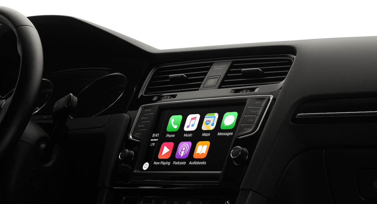
Earlier this year I bought a 2016 Kia Sorento. It was a great deal for a car rife with luxury features, and one made in the USA, to boot. But like a lot of cars, the operating system that powers its in-dash console, called UVO, is pretty bad.
Last month, Kia released a software update that brings CarPlay, Apple’s in-car solution for using iOS while driving, to several recent models including mine. (Kia’s update also enables Google’s Android Auto, but I haven’t tested that yet)
CarPlay is a substantial upgrade over many aspects of the user experience of UVO, but I was surprised to find that many of my assumptions about how it works were unfounded. CarPlay is not a full telematics system; it doesn’t truly become the car’s operating system, as I had assumed, but essentially allows your iPhone to “cast” a modified version of its UI, and a select few apps, to the in-dash console. This was probably obvious to anyone paying close attention to the branding; it’s not called CarOS, after all.
Rather, the CarPlay name is meant to evoke Apple’s AirPlay living room casting technology, and while it’s more capable than AirPlay in that you can actually interact with it, it’s still quite limited. Beyond the fact that only certain apps will work with CarPlay (a reasonable restriction; there’s no good safety argument for displaying Instagram, say, on your car’s head unit), the user experience is decidedly rough around the edges and noticeably more compromised than one typically associates with Apple.
A Compromised User Experience
The most prominent example of CarPlay’s challenges may be that it looks terrible, though through no fault of its own. The display of most in-dash consoles is not of Retina quality, and as a result, the CarPlay apps and UI elements look jagged and poorly rendered. That’s compounded by the fact that, even though you can tap and swipe on the screen, the performance is sluggish and occasionally choppy.
Beyond that, I was surprised to find that CarPlay only works when your iPhone is plugged into your console’s USB port via Lightning cable. This is probably necessary for the “casting” aspect of the experience, as the CarPlay interface that you see on the console is essentially powered by your phone. But for me, it represents a step back from the ability to connect your phone to the car’s system via Bluetooth. Of course, that wireless connection really only transmits audio, but having the freedom of putting the phone anywhere in the car—and especially the ability to pass it to passengers to use—is something I missed immediately when using CarPlay.
I was similarly disappointed to realize that when CarPlay is active, your dashboard screen and your phone can’t show different apps at the same time. If you’re following directions via Apple’s Maps app, for instance, and you switch to Spotify to make a music selection, the map view on the dashboard monitor will be replaced by Spotify’s music catalog. Whether this is a safety-oriented decision (one of CarPlay’s main goals is to minimize distractions from your phone) or simply an inherent limitation of a casted user experience, it ignores real world use cases in which a traveling companion may want to use other apps while you’re driving. (The inconvenience of this behavior suggests a new rule of thumb in multi-screen experiences: if you have two screens, as you do with CarPlay, the user should be able to use them independently, even if they are linked.)
Where This Road Leads
This firsthand experience with CarPlay really helped me to understand exactly why Apple is reportedly working on its own car. CarPlay’s inherent flaw is that it’s a software solution that’s intended to work with a variety of hardware configurations, none of which are controlled expressly by Apple. This is the antithesis of what Apple prefers to do, and it shows. The user experience is the best that it can be given the reality of having to design a system for implementation by literally dozens of auto makers, it’s true. But it demonstrates relatively little of the elegance, thoughtfulness and regard for the user experience that Apple is able to pull off when it controls both the hardware and the software. If Apple regards the automobile as a growth opportunity, and obviously it does, then it can’t be happy with what it’s able to accomplish with CarPlay, nor with the many compromises it must contend with. The logical conclusion would be to control the hardware, to build its own car, where every detail is within its purview.
This looks like an entertaining if esoteric documentary from director and producer Briar Levit, who is also a professional graphic designer. The film explores the world of graphic design production—the tools and methods that enable the craft, and how they underwent a dramatic transformation between the 1950s and 1990s. The trailer is basically a wonderful supercut of analog design production techniques; sort of the graphic equivalent of the magnetic “authenticity” of locally sourced goods, hand-made crafts, farm-to-table dining, organic produce, etc. The project was funded via Kickstarter, a sponsorship from Adobe Typekit, and a Faculty Enhancement Grant from Portland State University, where Levit works as an Assistant Professor of Graphic Design.
This short documentary spotlights Grace Rawson, an 83-year old New Zealander who, in her youth in the 1950s, worked as a hand colorist. Along with other young women, she was employed by a company called White’s Aviation to meticulously add color tinting to the company’s aviation photography. As she says in the video, each piece was created lovingly by hand, and though the technique is not generally looked back upon with great fondness, the care that Rawson put into them is evident. She demonstrates the technique here for the first time in many decades, and the results have a winningly imprecise charm that is rare in today’s age of highly manipulated digital color.
Designer Jose Bento wrote in this Medium post about his experience re-creating the InVision user interface, detail by detail, including redrawing every icon. In doing so, he says he was able to put himself in the shoes of the app’s designers and learn about their thinking in a way that wouldn’t be possible by merely examining it.
This got me thinking about the value of copying. In this day and age, copying in any artistic pursuit is taboo. Culturally, economically and legally we emphasize the new and the novel, if not the original, and we look down on copying as lazy and ethically bereft. And rightly so; there’s nothing to redeem the act of copying another work and presenting it as your own.
On the other hand, there’s a compelling case to be made for copying as a learning technique. It’s a time honored form of learning and apprenticeship in painting, for example; if you’ve ever visited an art museum you’ve probably seen art students with easels and palettes literally reproducing canvases from the great masters. Of course, the point of doing so is not to produce a finished piece of work to call your own, but rather to understand each constituent decision that the master made and in doing so develop for yourself a more comprehensive way of thinking about how you practice your craft.
Furthermore, the end goal isn’t even to be able to paint or produce work in the style of the artist being emulated. The writer Hunter S. Thompson famously re-typed, word for word, F. Scott Fitzgerald’s “The Great Gatsby” just to learn how it was done. In fact, that exercise fed directly into a much different, highly original work of his own, as Louis Menand recounted in this article about Thompson in The New Yorker:
He used to type out pages from ‘The Great Gatsby,’ just to get the feeling, he said, of what it was like to write that way, and Fitzgerald’s novel was continually on his mind while he was working on ‘Fear and Loathing in Las Vegas’…
It’s odd then to realize that copying product interfaces is such an uncommon learning technique in design. If you think about what Bento did, it’s exactly in line with what Thompson did and what art students (or apprentices) have done for centuries: understand a work at its lowest level in order to improve at the highest level. What’s more, as Bento demonstrates in his video, it’s even easier to re-create designs than it is to re-create other forms of art. With a painting or sculpture, it’s often difficult to get access to the historically accurate tools and materials that were used to create the original. With today’s product design, the tools are readily available; most of us already own the exact same software employed to create any of the most prominent product designs you could name. If you want to learn how to design like the designers you admire, there may be no technique you could pursue that would be easier and more enlightening than just copying it, pixel by pixel.
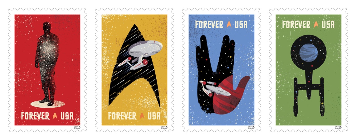
The venerable “Star Trek” franchise turns fifty this September. To commemorate, The U.S. Postal Service will be issuing these four stamp designs. The one of Captain Kirk in mid-beam is particularly nice—the transporter effect is very well executed here. They’re geeky good graphic design, but then of course they would be, as they were designed by Philadelphia’s awesome Heads of State design studio.
There’s a lot of pretty phenomenal new thinking at Adobe, especially among the designers working here—there’s new leadership, new faces, new approaches to building products, and even a new brand. For many years, the internal design group went under the moniker “Adobe Experience Design,” but of course that’s the name of our new flagship product design app. The new name is now simply “Adobe Design,” and recently a few intrepid designers developed a new mark and system for it. It looks terrific, if you ask me, but what I’m really excited about is the more public-facing, community-oriented shift that this signals. In the coming months, you’ll see Adobe Design be more active in the industry. Meanwhile, have a closer look at the new identity over at behance.net.