Subform Brings Responsive Controls to Design Tooling

Last year I wrote briefly about BoxBox, a new design tool then still in development with a focus on responsive layout of UI elements. That project has now become Subform, and it’s raising money over at Kickstarter. Here is their video:

The team behind Subform is notable for their ability to express their mission in uncommonly lucid, relatable language. A few worthwhile quotes that capture their aim and scope, first from their Kickstarter campaign:

Subform empowers designers to create responsive layouts, enforce consistent styles, build stateful components, and work with real content—all inside of a familiar, desktop-based visual design environment.

And second from this Medium article about the shortcomings of static design comps in contemporary digital product design.

Subform is emphatically a design tool, not a WYSIWYG code editor like Dreamweaver.

Subform’s focus is not on exporting production code (although it does export well-organized classes). Rather, code export is a way to create a standardized, versionable record of a UI design that preserves the designer’s intent, while making implementation and change-tracking easier for the developer.

We’ve started with HTML and CSS because they are mature, widely-used structural and styling languages.

So, essentially, the work product that Subform produces is not static PNG or JPG files like Sketch or Adobe Xd, or even a clickable prototype composed of constituent static images, like InVision or Principal. Instead Subform produces code, but for specification purposes, not for development purposes. Its goal seems to be to confer on designers the benefits of working in code—the ability to specify real values and behaviors that can be cleanly translated into the language of development—without having to write code. The user interface looks reasonably close to other design authoring tools, but its controls are heavily focused on the behavior of the design elements on the canvas. There seem to be a lot of values to input and controls to set.

https://subformapp.com/

The team makes prominent mention of drawing inspiration from CAD programs, which both intrigues and worries me. I’m not deeply familiar with that category of software, but I’ve never heard anyone say, “I wish our tools could be more CAD-like.” That said, allowing designers to be explicit about the behavioral intent of our designs is the next frontier for design authoring, so I’m excited to see how Subform solves this problem. (I’ve backed the project, but I have not been able to play with a working build yet.) At the very least, Subform looks set to broaden the conversation about the amount of control and specificity that designers should have at our disposal. That in itself will be a valuable contribution.

+

Meetup’s New Brand

Meetup Brand

Late last month Meetup, one of the stalwarts of New York City’s tech scene, launched a new redesign, developed in partnership with the famous design studio Sagmeister & Walsh. This video gives you an enthusiastic tour of the new look:

https://www.youtube.com/watch?v=-MDwPMCrysg&feature=youtu.be

As those familiar with Meetup will notice immediately, the new identity does away with the longstanding “Hi, My Name Is…” nametag logo that had been a defining feature of the brand for many years. This change surprised me; when I asked the Meetup team why they made this decision, they told me that the old logo, though much loved, felt dated. It also continually proved “hard to work with in the modern world. The most important example is that it made a bad app icon. If we tried to fit the entire nametag into the small square the text became unreadable, so we cut off the sides, and that made it unrecognizable as a name tag.”

New Meetup Mobile App

What I really appreciate about this work is that it’s comprehensive in its approach to the problem of crafting a new brand for a company for which many people have tremendous affection. This is rare; what’s more common, especially for tech companies, is to roll out a new identity that gets shoehorned into the existing product. In this case, the Meetup team integrated its new design principles directly into a major revamp of the Meetup product itself as Sagmeister & Walsh developed the supporting system. The Meetup product design team told me:

Once we got a look at the direction they were thinking, we started integrating that into our mocks. It was a good amount of back and forth and we evolved the app’s visual language as the branding work developed. We also sent over prototypes of the app as we built it out, so that they could see the work in action and give us feedback.

The result of this expansive system includes a photographic series articulated in a visual vocabulary that, from the start, is intimately tied into the new direction of the company. All the elements look of a piece. Here are some examples of the work:

New Meetup Imagery
New Meetup Imagery

I’m always curious about how effective it is for technology companies to work with design studios, especially veterans like Sagmeister & Walsh. There have been some truly bland outcomes from such pairings in the past, and it often seems clear to me that the act of going to a big name branding studio is really about validating the company in a way meant to comfort investors and business partners more than it’s about doing what’s best for products or customers. I wouldn’t say that Meetup’s rebranding falls into that category—it has far more personality than most, to begin with. There’s a good write-up of the logo and its merits over at Brand New, which captures my sentiments when it concludes, “I highly appreciate its effort for standing out in a sea of logo sameness.”

Read more about the development of the new brand in this Medium article and the revamp of the product in this Medium article.

+

Classic Penguin

“Classic Penguin” Cover

This new book from Penguin creative Director Paul Buckley is gorgeous overview of the past decade or so of wonderfully inventive design at the iconic publishing house. It‘s a “curated tour featuring illuminating commentary by artists and writers, including Malika Favre, Mike Mignola, James Franco, Jessica Hische, Jillian Tamaki and many more.” Buckley sent me five spreads to choose from for posting here; they’re all so graphically sumptuous that I couldn’t leave any of them out.

Classic Penguin: Cover to Cover” is out now and available at amazon.com; more information at penguinrandomhouse.com.

Spread from “Classic Penguin: Cover to Cover”
+

Figma Debuts

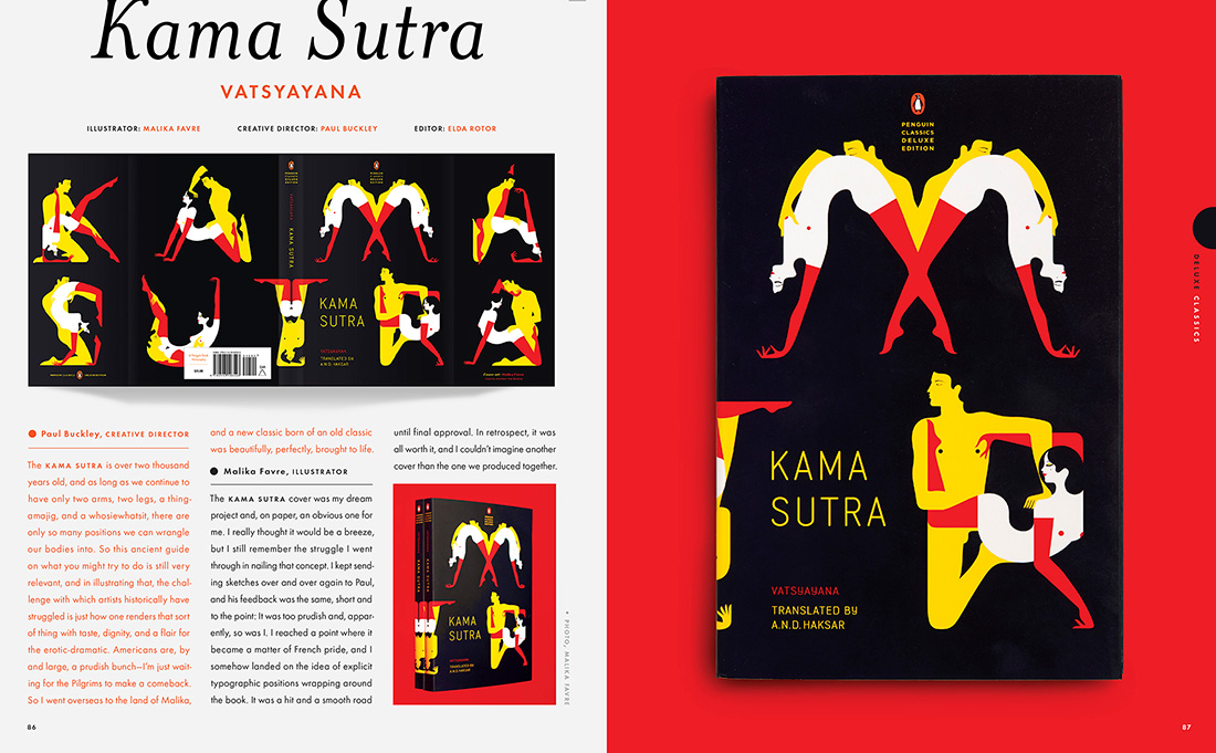
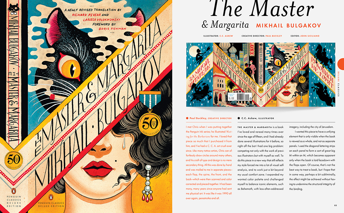
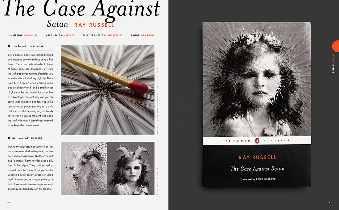
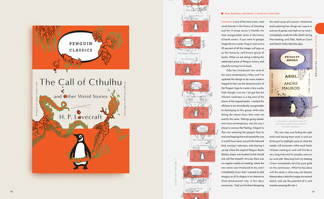
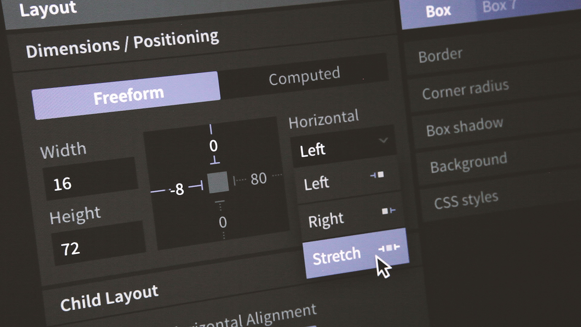
Last week Figma, a major new contender in the UX/UI design tool space, officially ended its lengthy beta period and launched publicly to the world. If you’ve followed along with its progress at all, you’d probably agree that Figma’s most notable feature is almost certainly that it lives in your web browser rather than as a native desktop app. That alone is a major departure from the kind of software that designers have been comfortable with for decades.

On that account at least, it’s a real achievement. Figma is almost surely the richest browser-based authoring tool ever released for design customers, a distinction that’s likely to inspire varying levels of skepticism among many. However, in my limited usage over the past several months, I’ve been surprised—impressed, even—by how compellingly the Figma team has delivered on this promise. It’s far more robust than you’d expect; there’s not a ton that you can do in Sketch, Photoshop or Illustrator that’s missing from Figma, and the ability to get up and running it without a download or installation process is the epitome of low friction. Kudos to the team.

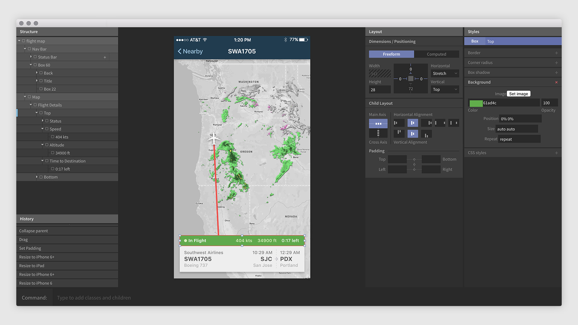
That said, re-creating commonplace desktop functionality on a web stack still feels like more of a technically impressive demonstration than a true user necessity. Figma’s response to that is to use the inherently connected nature of the web platform to allow “multiplayer” designing—the ability to collaborate in real time with other designers on the same canvas. This video demonstrates it in action.

https://www.youtube.com/watch?v=NXmHkoz2rGw&feature=youtu.be

Again, many designer’s hackles will go up. Few of us were asking for live, simultaneous editing per se, but looked at another way, there’s a lot of potential here. As design problems get more complex and solutions demand that designers cover more and more surfaces and screens, the ability to have a team of designers working together in one canonical document—rather than splitting up a project into an untold number of individual documents to be recombined later—seems like a legitimate hypothesis for how the design process will work in the future. Figma thinks of it “Google Docs for design,” and indeed, the app provides a robust version history feature to let you roll back those ill advised layout or type choices that a coworker might have made while you were on your break.

It’s still early days for this approach though, as I discovered as I tried to push the multiplayer feature through some edge cases. In one instance, I tried editing a simple gray square by changing its color to red. Meanwhile, a colleague made some changes to the box’s shape. Figma reconciled both our sets of changes by returning the shape my colleague made, colored red. That may or may not be what users intend, but the granularity of change management seems like it can be too much for some users to fully grasp, or at least predict.

Still, this is what it means to add ambition to a relatively static feature set—whether you’re using Sketch, Photoshop, or Illustrator, the basic models for how we work are basically all the same and not dramatically different from what was available a decade or two ago. Some things are going to work great out of the box, some things are going to take some ironing out, and some things are going to take time for users to accept. Congratulations to the Figma team for nudging us all forward.

+

Art in Film

These two videos from filmmaker Vugar Efendi show some beautiful examples of films that have paid homage to famous works of art. They’re short but they’ll enhance your appreciation of many movies you’ve probably already seen.

+

Designing Chat Interfaces

There are some pretty intriguing riffs on the basic premise of chat-based user interface design collected on this page by Muzli (which was apparently acquired by InVision today, congrats!). It’s definitely worth a scroll if you want to take the temperature of designers who are thinking about how to expand the form of chat in visually appealing ways. A few examples:

Designing Chat Interfaces

It’s interesting that even though chat interfaces would in theory obviate a lot of UI design, there’s tons of playful UI design going on these examples. There’s many, many different formal tweaks to the basic building blocks of chat—avatars, speech balloons, threads, embedded content, and animations. What you see aggregated on this page is a kind of meta conversation, if you’ll forgive the pun, between dozens of different, independently operating designers about the best ways to present a fairly standard interface paradigm.

Another thing that strikes me is that in the long run users will probably only have so much patience for an endless number of variations on these basic paradigms. There are certain innovations, like automatically expanded inline content and being able to @reply people, that will soon become expected features of any chat interface, regardless of what color or shape its speech balloons take. In spite of the wide range of visual expression on display here, it seems likely that before too long the most successful chat interfaces will all start to look more and more like one another.

+

How Graphic Design Reduced Damages to VanMoof’s Shipments

VanMoof Shipping Box

Dutch bicycle company VanMoof printed a picture of a flat screen television on its shipping boxes and saw an incredible 70-80% reduction in damages. Nothing on the box explicitly claims that there’s actually a TV inside—there’s even a silhouette of a bike in the screen—but the image alone spurred those handling the shipments to treat them with significantly more care. It’s a truly ingenious, low-tech hack of delivery channels, and it’s netted tons of attention for the company, as demonstrated by the fact that you’ve now heard of VanMoof. You can read their creative director’s thoughts on it at medium.com and Quartz has a write-up at qz.com.

+

A Head-Slapping Proposal for a New Google Logo

Proposed Google Logo

When I saw this proposed redesign of the Google brand by L.A.-based graphic designer Dana Kim, my jaw dropped a little. I can’t believe no one thought of this solution before—using a search field to suggest the company’s two Os and relying on the elongation of the field to visually express the “oo” sound is extremely clever. (Maybe someone has thought of it before, but it’s the first time I’m coming across it.)

Kim’s stationery designs aren’t half bad either.

Proposed Google Rebranding

Pedants will complain, “That doesn’t say ‘Google.’ That says ‘Gogle.’” Well yeah okay, I guess it could never fly in real life. Still, doesn’t stop it from being brilliant.

See the rest of the project at behance.net.

+

Hidden Feature in Apple Pay

Apple Pay

So, bad news: my wallet got stolen yesterday. I won’t go into the details, except to say that it’s basically my fault that it got swiped. There wasn’t a lot of money in it, but there was a nice picture of my daughter that I’ll miss. Of course, aside from losing cash and a photo, the worst part of losing a wallet is that I had to spend yesterday morning canceling all my credit cards and, when the new cards arrive, I have to re-enter new card numbers across the many subscription services that hold my payment information on file.

One small bright spot though: I discovered today that for the credit cards that I had connected to Apple Pay, each respective bank went ahead and updated my Apple Pay information with the new card number. So even though I had no identification (my driver’s license was taken too) and no way to get cash from an ATM today, I was still able to buy lunch and pick up some goods at the drug store—with just my phone. I didn’t have to do a thing; everything was taken care of automatically and my bank sent me an email saying that it had been done before I realized it was even possible.

This is not the kind of feature you ever really want to discover for yourself, much less actually benefit from, but it impressed me greatly. It also confirms for me the notion that of all the many fronts that Apple is moving on, their work on Apple Pay is among their best initiatives right now. Of course I would like to see wider adoption of Apple Pay by retailers, but aside from sheer scale, almost everything else about the way Apple Pay works strikes me as exactly the way it should work.

+

Where the Comic Book Font Came From

Vox shines a light on comic book letterers, none of whom you will ever recognize in public, but who have together inadvertently created a universally recognizable and understandable visual vernacular. Most people would be surprised to learn that this kind of typography is not uniformly the same, or that a business like Comicraft can sell such a wide variety of fonts that mostly riff on a single, visually common trope—just look at this selection to see.

+