is a blog about design, technology and culture written by Khoi Vinh, and has been more or less continuously published since December 2000 in New York City. Khoi is currently Principal Designer at Adobe. Previously, Khoi was co-founder and CEO of Mixel (acquired in 2013), Design Director of The New York Times Online, and co-founder of the design studio Behavior, LLC. He is the author of “How They Got There: Interviews with Digital Designers About Their Careers”and “Ordering Disorder: Grid Principles for Web Design,” and was named one of Fast Company’s “fifty most influential designers in America.” Khoi lives in Crown Heights, Brooklyn with his wife and three children.
There have been disappointingly few apps that truly capitalize on the potential of the iPad as a personal computing platform. The criteria I would use here is simple: does the app do something that you can only do on the iPad, that you can’t do on a desktop or laptop, or even on an iPhone?
The unique app Liquid Text is one of these apps. Started as a doctoral project by founder and CEO Craig Tashman when he was Georgia Tech, Liquid Text adds a number of innovative direct manipulation features to the experience of reading documents. In fact, it’s more accurate to call LiquidText a research or working app than a reading app, as its value is in allowing the user to better use and understand the information and relationships that are most relevant to her in a text.
You can do more than just highlight information; you can make explicit and functional relationships between salient bits by simply drawing lines between them, or you can circle a chart and excerpt it instantly, or you can collapse whole passages or pages to condense content to just the essentials. This video captures some of this power in action; it’s notable that the features can be demonstrated without a voiceover and with only the briefest of text explanations, as the value of the features is powerfully self-explanatory. It’s also clear that this kind of product could only happen on an iPad.
The nature of the current state of voice assistants like Alexa, Siri and Google Assistant is that they commonly provide the wrong answers to users’ queries. Sometimes this is comical and sometimes this is egregious, especially as they typically return only one answer, thereby effectively presenting it as fact. In this superb article titled “Systems Smart Enough to Know When They’re Not Smart Enough,” designer Josh Clark digs into the problem and reframes it as a design challenge.
Let it first be said that in the billions of requests these services receive per day, these examples are rare exceptions. Google, Siri, Alexa, and the rest are freakin’ magic. The fact that they can take an arbitrary request and pluck any useful information at all from the vast depths of the internet is amazing. The fact that they can do it with such consistent accuracy is miraculous. I can forgive our answer machines if they sometimes get it wrong.
It’s less easy to forgive the confidence with which the bad answer is presented, giving the impression that the answer is definitive. That’s a design problem. And it’s one that more and more services will contend with as we build more interfaces backed by machine learning and artificial intelligence.
Just as with the web and mobile technology before them, in order for voice assistants—and the A.I. and machine learning-backed technologies that are emerging with them—to reach their full potential and for them to function responsibly for the common good, user experience design is going to be necessary. Read the full article at bigmedium.com.
Four years ago I wrote praisingly about Moves, a then promising iPhone app that tracked your steps and location throughout the day. The company that made Moves was eventually acquired by Facebook and though the app continues to get periodic maintenance, there hasn’t been a truly meaningful feature update in years. (Plus, giving all of one’s data to Facebook is maybe not the best idea, as explicated by technologist Vicki Boykis.) There have been other tracker apps that have come along since but none of them have had the elegance or accuracy of Moves.
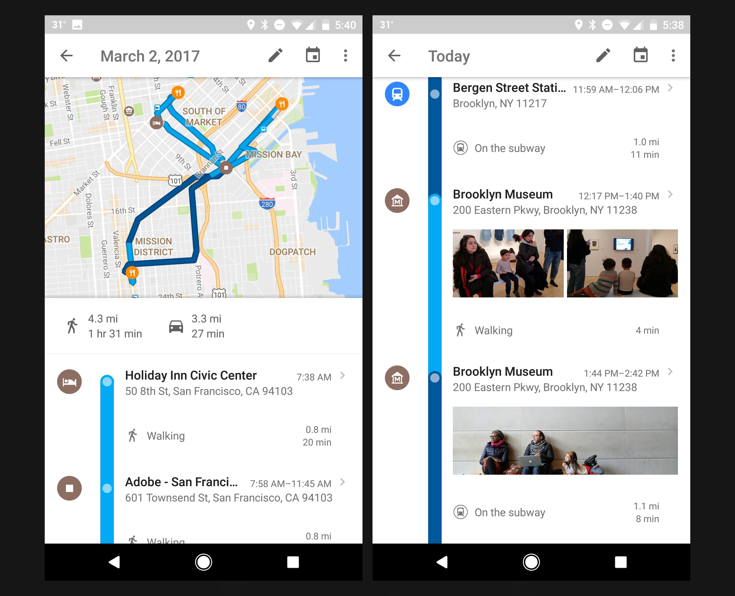
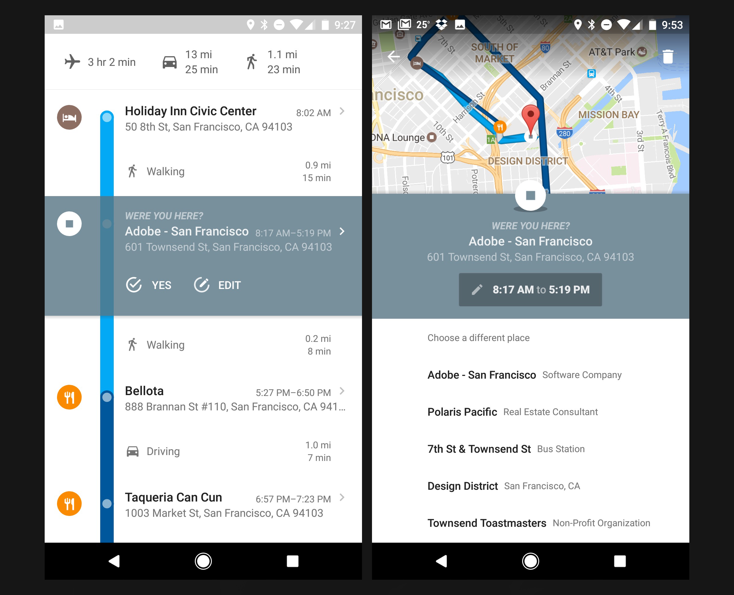
At least not on iOS. Android users, as I discovered recently, have enjoyed what is very much a truly worthy successor to Moves for nearly two years now in the form of Timeline for Google Maps. It does nearly everything Moves does but in a better, more evolved fashion. Though it doesn’t place as much emphasis on actual steps that you take during the day, it still records distance and understands not just walking, running, cycling and driving, but also air travel, boating, hiking and even horseback riding, among many other motion types. Activities are also captured alongside photos that you’ve taken in those locations, which is an ideal integration that makes Timeline an unexpectedly effective personal journal.
Location accuracy is as good or better than Moves (which is still a compliment to how well engineered Moves was when it launched) and you can easily edit the venues it gets wrong. Additionally, unlike Moves, Timeline lets you add a place along a route if it failed to understand that a brief pitstop you might have made was meaningful enough to you to be recorded; that happened a lot for me with Moves and the inability to correct the record was frustrating.
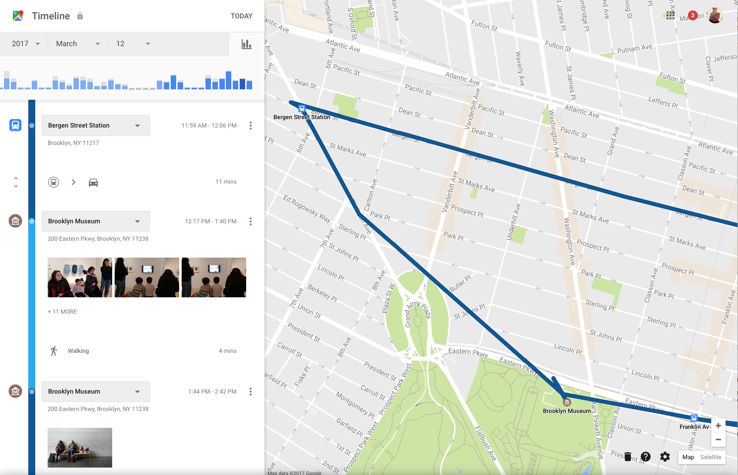
Timeline is also almost a fully fledged service in that your history is available via a web browser. If you have Timeline data, it’s available at google.com/maps/timeline and looks something like this:
Of course, the catch here for fans of Moves, which was iOS only, is that Timeline is only available for Google Maps for Android. This is one of the few times that I’ve encountered an Android-only feature that I truly want on my iPhone. Hopefully that will come soon, so I can stop carrying two phones around.
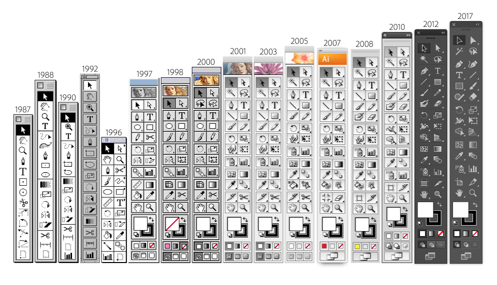
Adobe Photoshop gets all the attention but Adobe Illustrator might be used for more things and probably by more kinds of designers. For all of its faults—and even as an Adobe employee, I admit it has many—it’s still a workhorse that gets the job done, and it’s still an invaluable part of the toolbox for many, many creative professionals. Last week the app hit its thirty-year milestone, an incredible achievement. Adobe has a brief write-up of it in this blog post, and this video tells the product’s story very nicely.
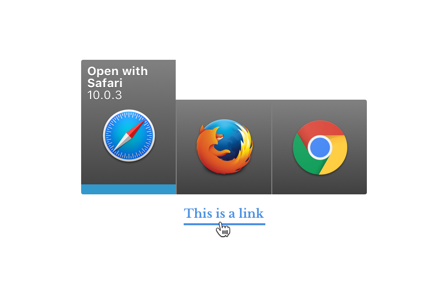
Many, many moons ago my friend Scott Ostler and I started tinkering with a really, really simple Mac utility that lets you choose which app you want to open your links in, on the fly. Today, after many distractions, we’re finally launching it as Bumpr—it’s available right now in the Mac App Store—with special half-off launch pricing for a limited time. Here’s how it works.
Click on a web link in, say, Slack or Preview or your desktop Twitter client—basically any desktop app—and Bumpr seamlessly intercepts the link. Basically, Bumpr is acting as your default web browser, but instead of opening your page, it very, very speedily displays a simple, compact menu of the web browsers you have installed. Click on one and that link opens in that browser. It’s simple and easy and fast, and it’s particularly useful if you have more than one Gmail or G Suite account and want to use a different browser for each.
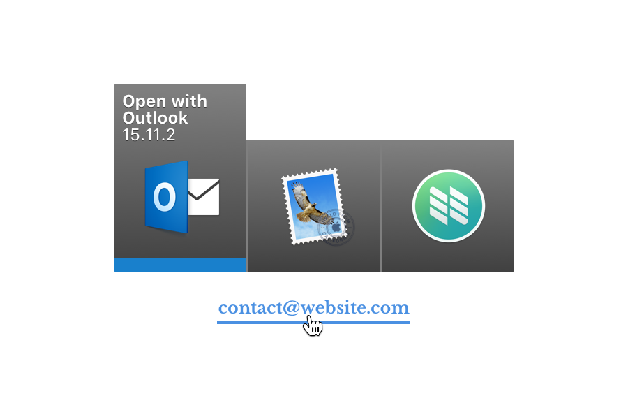
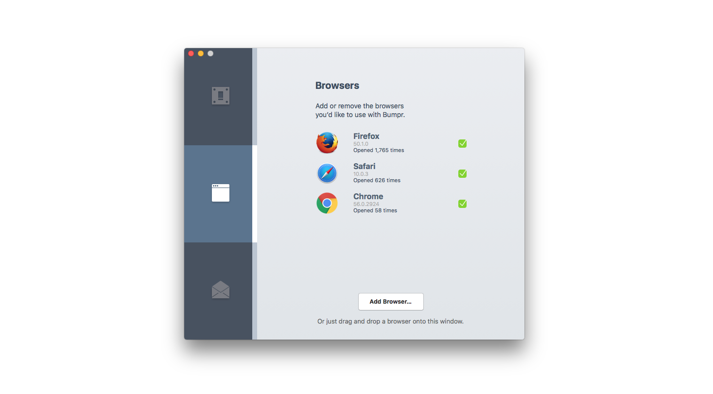
Bumpr also works with desktop email clients. Click on a mailto link and you get a menu of your available email clients. You can of course tailor the email clients or browsers you want to show up in Bumpr via the simple and, if I do say so myself, pretty nicely designed preferences, accessible from the Bumpr icon in the menu bar. That looks like this:
As you can see the preferences include some simple stats on which browsers or email clients you’re opening most. (Yes I still use Firefox a lot.)
Scott and I have both been using Bumpr every day for, well, for years. (We’re pretty happy to have finally finished it!) It’s one of the very first things I install every time I get a new Mac. I can’t live without it. You might feel the same way. Get it today at getbumpr.com. Also join the conversation over at Bumpr on Product Hunt.
Robust programming environments for animation and prototyping like Origami are powerful, but it’s no accident that the player in this category that has so far captured the most mindshare among designers is Principle. Though it has its limitations—it’s perhaps too linear and it can be laborious to create large-scale prototypes—Principle is beautifully elegant and rewardingly easy to learn. It also demonstrates that for design tools, simplified interaction models and WYSIWYG is what wins nine times out of ten.
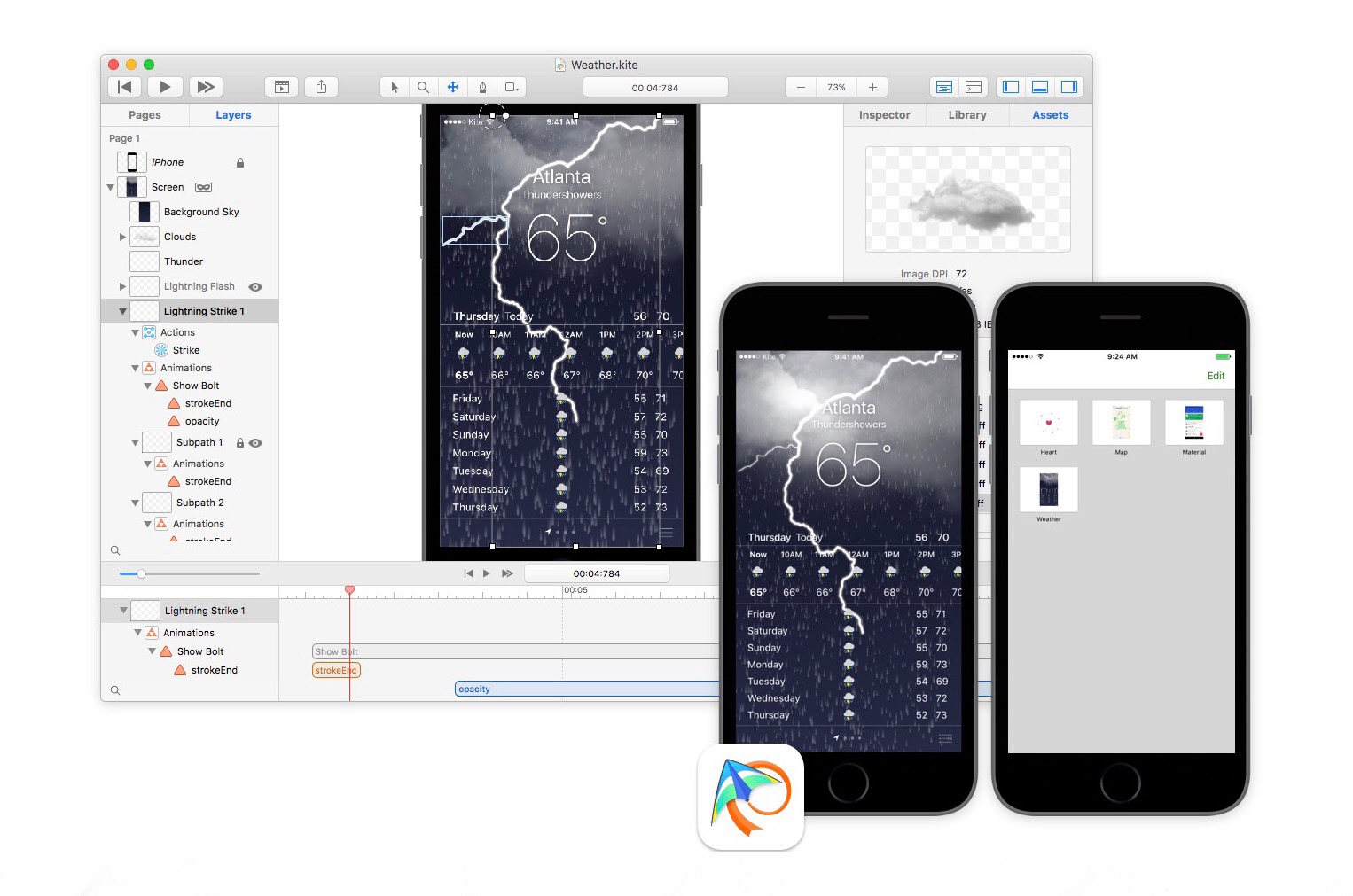
Kite Compositor, a new animation and prototyping app, seems to offer a similar promise. It claims to marry a focused layout toolset with the ability to create bespoke animation effects—all with the shallow learning curve of applications like Keynote. There is a code editor built into it, though, which perhaps belies its true nature. Coding and the ability for a user to default back to editing functions and variables in an editor can be such a powerful center of gravity within authoring applications that they can effectively cloud the WYSIWYG model. If it’s there, you’ll probably end up using it. Still, the Kite Compositor demonstration video is compelling. I’m looking forward to giving it a spin.
Kite Compositor is US$99 and available today. More info at kiteapp.co
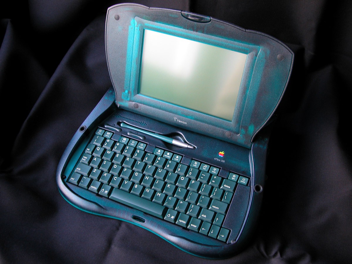
Not many people will remember the exceptionally odd Newton eMate 300 which Apple introduced exactly twenty years ago today, incredibly. It was one of the last Hail Marys from Apple’s doomed Newton OS line of portable digital assistants—basically the iPad to the original Newton’s iPhone—but it was aimed at the education market.
The eMate 300 sported a 25 MHz ARM chip, 1MB of RAM and 2MB of flash memory which, I’m guessing, couldn’t even run iOS’s home screen today, much less any apps. I never owned one but I remember liking the idea of it very much: a rugged, highly portable computing device that required none of the overhead of a file system, suitable for writing and capturing ideas anywhere.
Basically this weirdly shaped, pre-Bondi blue sorta-laptop postulated a kind of mobile computing that left behind all of the encumbrances of the desktop. The eMate tanked so I eventually gave up on ever owning one, but taking a step back I realize that my 9.7-inch iPad Pro with Smart Keyboard is a fully realized version of the eMate’s early promise, though far more powerful and versatile. These ideas have a way of succeeding in the long run, even if the products that first embody them don’t.
For those interested in this footnote in tech history, Stephen Hackett has some fun links over at 512pixels.net, including this entertaining remembrance from my Adobe colleague Andy Welfle who, believe it or not, is an honest-to-goodness Millenial who actually used one of these things in its heyday.
Technologist Vicki Boykis has done an incredible service to literally hundreds of millions of people everywhere by writing this clearly delineated and level-headed overview of the data that Facebook collects from you and the implications of that practice:
Facebook collects data about you in hundreds of ways, across numerous channels. It’s very hard to opt out, but by reading about what they collect, you can understand the risks of the platform and choose to be more restrictive with your Facebook usage.
One detail that Boykis highlights: Facebook captures your keystrokes before you post a status update, so that even if you don’t actually publish what you type into its status update box, your draft gets logged in its database anyway. Suffice it to say, you can’t ask for the removal of something that you don’t realize is there to begin with. The full contents of this post should disturb anyone who cares about his or her privacy. Read the full article at veekaybee.github.io.
The identity animation for this year’s 36 Days of Type was done by the London-based Nom9 Studio. For those not familiar with it, 36 Days of Type is an annual open invitation to “designers, illustrators and graphic artists” to render, one per day, each letter of the alphabet plus the numbers zero through nine. Participants add the hashtag #36daysoftype and the work can be viewed on Twitter and Instaface etc. The results, seen in aggregate, are pretty stunning. More info at 36daysoftype.com.