Reimagining New York Architectural Landmarks

One Wall Street Concept by Hollwich Kushner

Designers who can’t help but want to hypothetically redesign everything they see may enjoy these conceptual renderings from architecture firm Hollwich Kushner. Entitled “New(er) York,” it’s billed as a “research project” that “applies contemporary construction techniques and design methodologies to timeless Art Deco landmarks,” essentially refashioning them as if they were being built in the 21st Century.

The aesthetic merit of this work, of course, is dependent on your personal taste. The rendering above is the firm’s take on the 1931 Art Deco classic One Wall Street which in real life looks like this:

One Wall Street, New York City

This diagram and the reference below show the scope of the project.

New(er) York Overview Diagram
Photos of Existing Buildings

So, you know, you decide the hits and misses.

Here’s a rendering of 214 West 29th St., a less well heralded building in what was once Manhattan’s “fur district,” but appreciated nevertheless for its exquisite details.

214 West 29th Street Concept by Hollwich Kushner

And here’s The Eldorado building, which is a distinctive part of the skyline along Central Park West.

The Eldorado Concept by Hollwich Kushner

More about the project at hwkn.com.

+

Are Smartphones, Social Media—and Designers—Ruining Teenagers?

Last week The Atlantic published this amazing feature-length article by San Diego State University professor of psychology Jean M. Twenge. After two-and-a-half decades of researching generational change, Twenge contends that she is seeing abrupt, perhaps unprecedented changes in psychological behavior among today’s teens that suggests a looming “mental health crisis.” She argues that this phenomenon can be directly attributed to the advent of the smartphone and the rise of social media.

It’s a shocking contention perhaps not best served by the provocative title “Have Smartphones Destroyed a Generation?,” and I initially approached it with some skepticism. Twenge makes far-reaching assertions—“The arrival of the smartphone has radically changed every aspect of teenagers’ lives, from the nature of their social interactions to their mental health,” she writes—that make for an ambitious polemic. Even casual observers of popular commentary on technology would recognize the trope of a new technology or media form being accused of “ruining” today’s kids. Indeed, some education observers are calling some of Twenge’s facts into question, though the main of her argument hasn’t been fully refuted, at least as of yet.

It’s also not necessarily logical to say that just because it fits an historical pattern that that means it’s also wrong. If nothing else, there are some aspects of Twenge’s argument that are worth examining in greater detail, including the idea that there is a correlation between unhappiness or even depression and teens spending more time than average with screens. She writes:

There’s not a single exception. All screen activities are linked to less happiness, and all nonscreen activities are linked to more happiness. Eighth-graders who spend 10 or more hours a week on social media are 56 percent more likely to say they’re unhappy than those who devote less time to social media.

More to the point, the unhappiness and depression are leading to worrying changes in the data on suicides:

Girls have also borne the brunt of the rise in depressive symptoms among today’s teens. Boys’ depressive symptoms increased by 21 percent from 2012 to 2015, while girls’ increased by 50 percent—more than twice as much. The rise in suicide, too, is more pronounced among girls. Although the rate increased for both sexes, three times as many 12-to-14-year-old girls killed themselves in 2015 as in 2007, compared with twice as many boys. The suicide rate is still higher for boys, in part because they use more-lethal methods, but girls are beginning to close the gap.

Of course, teen behavior is a product, at least in part, of parental attitudes. As a father myself, I recognized a number of widespread smartphone- and social media-oriented habits that I have internalized myself and inadvertently presented to my kids as acceptable behavior. These include, of course, an addictive propensity to check one’s smartphones, often at the expense of remaining present in real world situations; the habit of sleeping with a phone by one’s bedside or even with the phone in bed; and the reflex of looking at the phone before literally any other function upon waking up in the morning. These have all become normalized over the past decade, and it’s pretty clear they’re not doing much good for anybody.

Twenge only passingly touches on culpability in her article, suggesting briefly that social media companies’ motivations are “complex.” But clearly there are many difficult questions to be asked here—asked of the entire tech industry, really. And that would include designers, too, who clearly bear some responsibility in constructing this potentially toxic mix of hardware and software. Perhaps without realizing it, we have all consented to the idea that design should be measured almost exclusively by the concept of conversion, on a solution’s ability to get a customer to click or tap, again and again, as quickly and often as before. You could say that that has become the primary motivation of this current generation of design professionals—we have become drug dealers, in a sense, focused only on propagating addiction. That’s a potentially incendiary assertion in and of itself, but even if it’s not accurate, it seems evident to me that we’re in an era now where the craft of design is able to achieve much of the influence that it has always longed for—and so it must contend soon with the consequences of that influence.

The full article is well worth a read and can be found at theatlantic.com. Twenge’s findings will be published more extensively later this month in a book called “iGen” by Simon & Shuster.

+

Gender Representation in Comic Book Characters

Wonder Woman Illustration

In this report, data visualization designer and journalist Amanda Shendruk examines the naming conventions, types of superpowers, and representation on teams of 34,476 female comic book characters to better understand the differences in how men and women are portrayed. The results are not necessarily surprising—comics have long had a reputation for being skewed toward the fantasies of adolescent males—but the particulars that she discovered reveal how egregious the imbalance actually is. For example:

  • The number one male super-hero power is strength, while the number one female super-hero power is agility
  • Far more male super-heroes than female super-heroes carry paraphernalia, e.g., gadgets, strength-augmenting suits, scepters etc.
  • More female super-heroes than male super-heroes are blessed with “mental” super-powers
  • Among characters who can shapeshift, female super-heroes generally change their form entirely, while men can manipulate the size of their, er, bodies
  • Among female super-heroes’ names, the top three terms used are “Lady,” “Mrs.” and “Girl.” Among male super-heroes, the top three are “Man,” “Mr.” and “King.”

Read the full, fascinating report at pudding.cool.

+

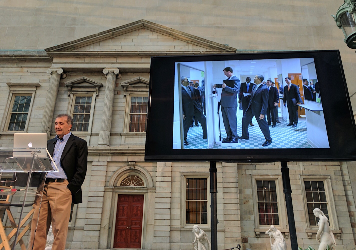
Obama Photographer Pete Souza at The Met

Pete Souza at The Met

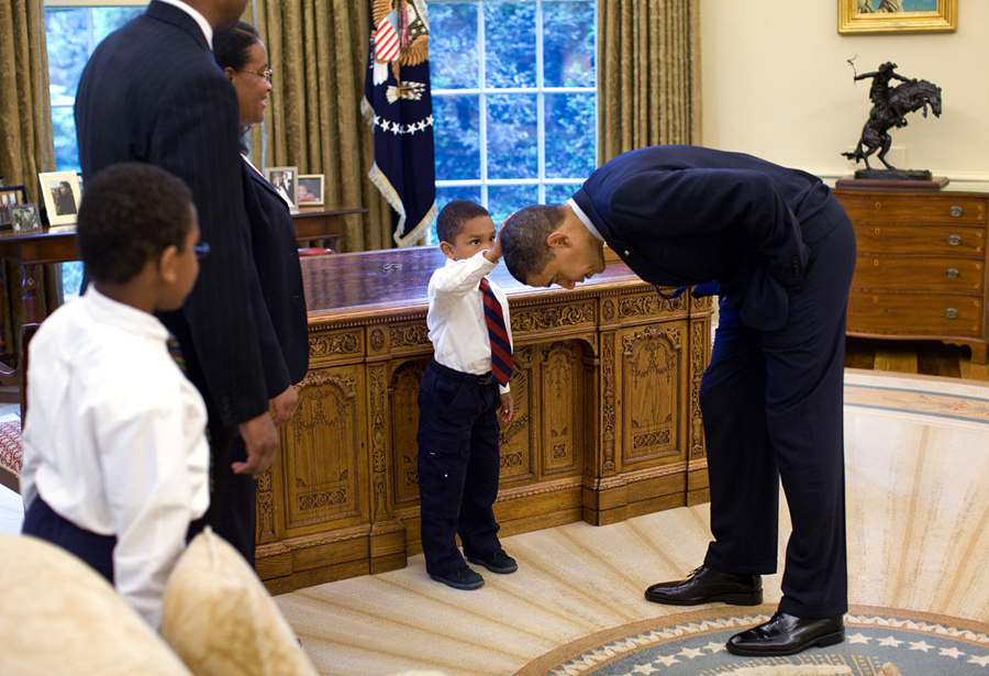
It never occurred to me that I could get so intensely nostalgiac for a time that ended less than a year ago, but that’s how I felt last night when I went to see a talk by Pete Souza, the former White House photographer for the Obama administration. During those eight years, Souza’s job was to document Obama’s presidency for the public record, and he captured countless images of the president both in his official duties and in his personal life at the White House. The most famous of them might be this utterly disarming moment of Obama bonding with a young African-American boy.

President Obama with Young Boy by Pete Souza

Souza’s work achieved substantial fame on social media, and even though the Trump administration wiped clean the White House’s official Flickr account when they assumed office (as is their prerogative), the photographer continues to post images from that era on his Instagram account—often as sharp commentary on the current administration. Souza has also been working on a book of this work called “Obama: An Intimate Portrait,” to be published this November.

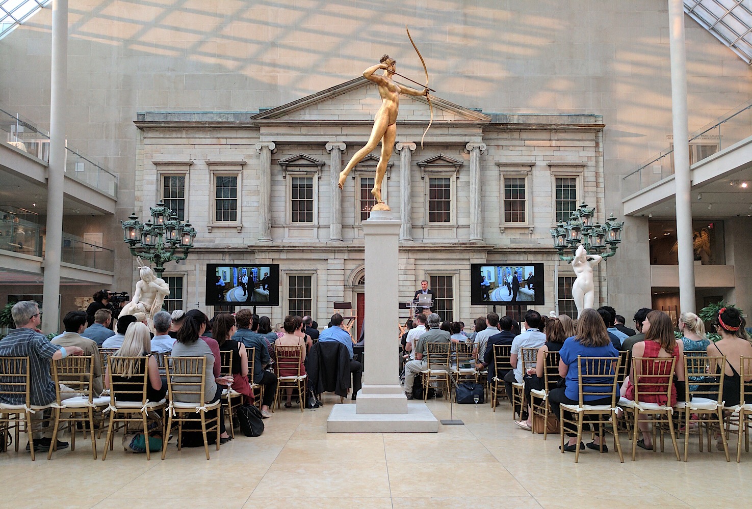
The event, hosted by Adobe, I’m proud to say, was held in the beautiful American Wing courtyard at The Metropolitan Museum of Art.

The American Wing Couryard at The Met

In spite of the majesty of the space, at first I found it to be an unsettlingly odd setting; it almost suggested we were enshrining a just passed administration among other antiquities. But I stopped thinking about all of that when Souza began recounting his eight years of photographing Obama; Souza is a perfectly fine speaker but his imagery is incredibly powerful and affecting. I felt a sense of intense longing—and maybe even despair, too. Souza had an eye for capturing Obama’s genuinely deep regard and empathy for other people, a wonderful trait that practically permeates every photo he took. That’s in stark contrast to the current occupant of the Oval Office, suffice it to say, and I found myself nearly moved to tears many times throughout the evening.

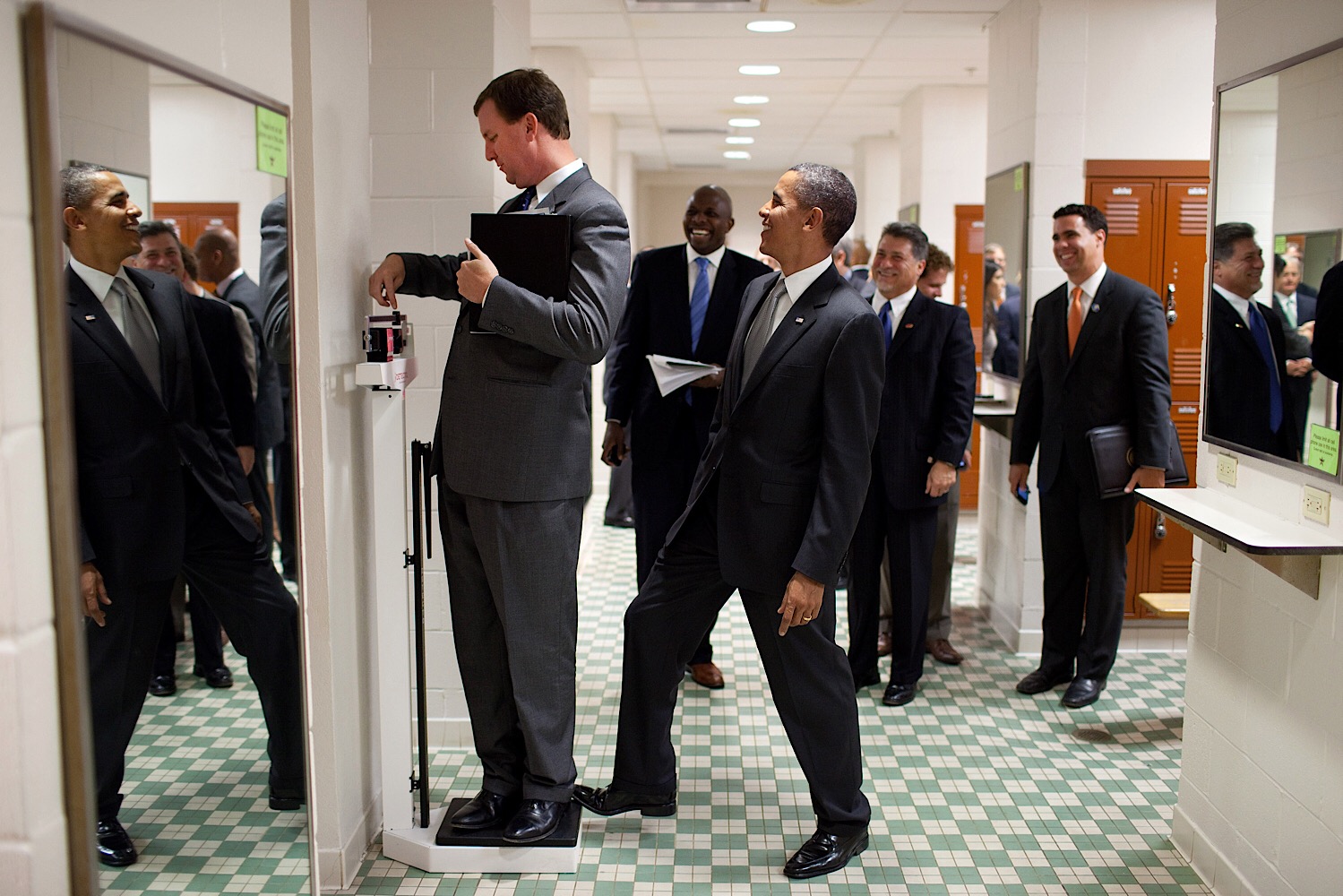
That is the power of photography though, that ability to immerse us in other times and places, sometimes reflecting them back to us in idealized forms. To his credit, Souza’s work largely avoided hagiographic territory. If anything, they revealed the humanness of not just the president but the entire White House family as well. My favorite photo, displayed on the screen in the picture of the top of this post, shows Obama playing a practical joke on an aide.

President Obama Tipping an Aide’s Scale by Pete Souza

Moments like these reminded me that the progress we saw in the Obama administration needn’t be a singular event, never to be repeated, even though it sometimes feels that way as we cope daily with the grim news emanating like a toxic gas from the Trump White House. All the achievements of the last administration were brought about not by superhumans but by regular people who put the interests of others first. That’s not such a tall order; it was done before and it can be done again.

You can read more about the book at hachettebookgroup.com or pre-order it from amazon.com. You can also follow Pete Souza on Instagram.

+

Movies Watched, July 2017

Still from “Dunkirk”

Only under extreme duress will I go see a movie in 3D. The picture quality is universally horrid and I have no tolerance for the inflated ticket prices. On the other hand, after watching Quentin Tarantino’s “The Hateful Eight” two years ago and now Christopher Nolan’s “Dunkirk,” both in 70 mm film, I’d gladly pay the premium for that experience. The 70 mm picture is monumental, warm and truly gorgeous, and it really feels like watching something you’d never be able to replicate in any other environment.

Of course, it’s unfair to compare 3D and 70 mm when the latter has the attention of filmmakers like Tarantino and Nolan. But that is the point; these people tell stories that can only be depicted in film, tall and wide and watched in public. “Dunkirk” was exactly that, a stunningly ambitious, expertly executed and surprisingly concise war film whose power, it’s evident almost from the first moments, is uniquely derived from the bigness that you only get at your local cinema. I found myself completely swept up by it.

Here are all twelve movies I watched in June.

If you’re interested, here is what I watched in June, in May, in April, in March, in February and in January, as well as my full list of everything I watched in 2016. You can also follow along with my film diary over at letterboxd.com.

+

Reissuing Humanscale, the Classic Human Factors Guide for Designers

This Kickstarter campaign endeavors to reprint a classic designers’ reference from the 1970s:

In the golden age of American industrial design, Henry Dreyfuss Associates knew that there was more to design than just looking good. Products had to be good, crafted to work with the people who use them.

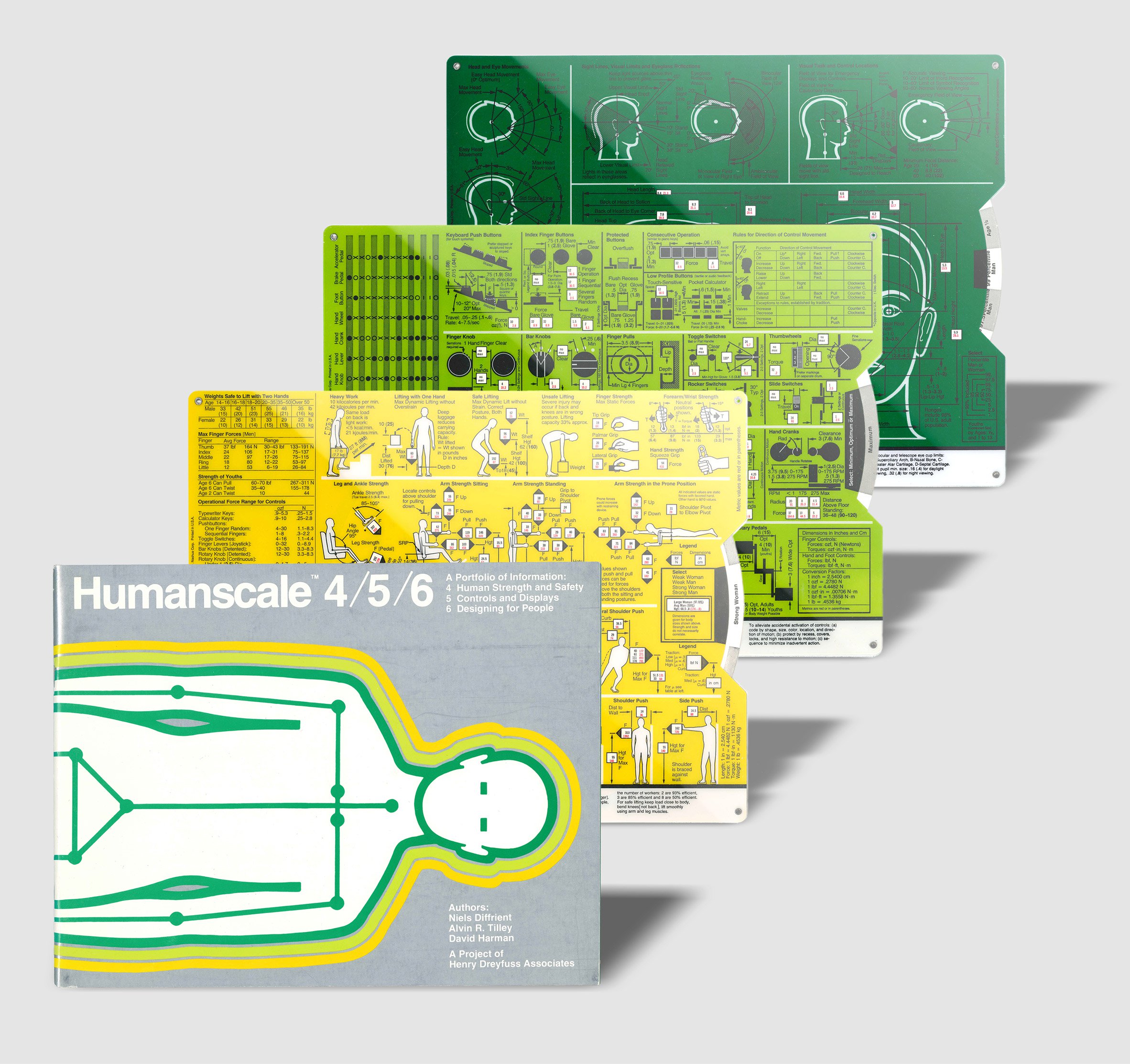
With this in mind, HDA designers Niels Diffrient and Alvin R. Tilley created Humanscale, including its ingenious data selectors, providing access to over 60,000 human factors data points in one easily referenced, user-friendly “portfolio of information.”

Humanscale has long been out of print. Now we’re bringing it back.

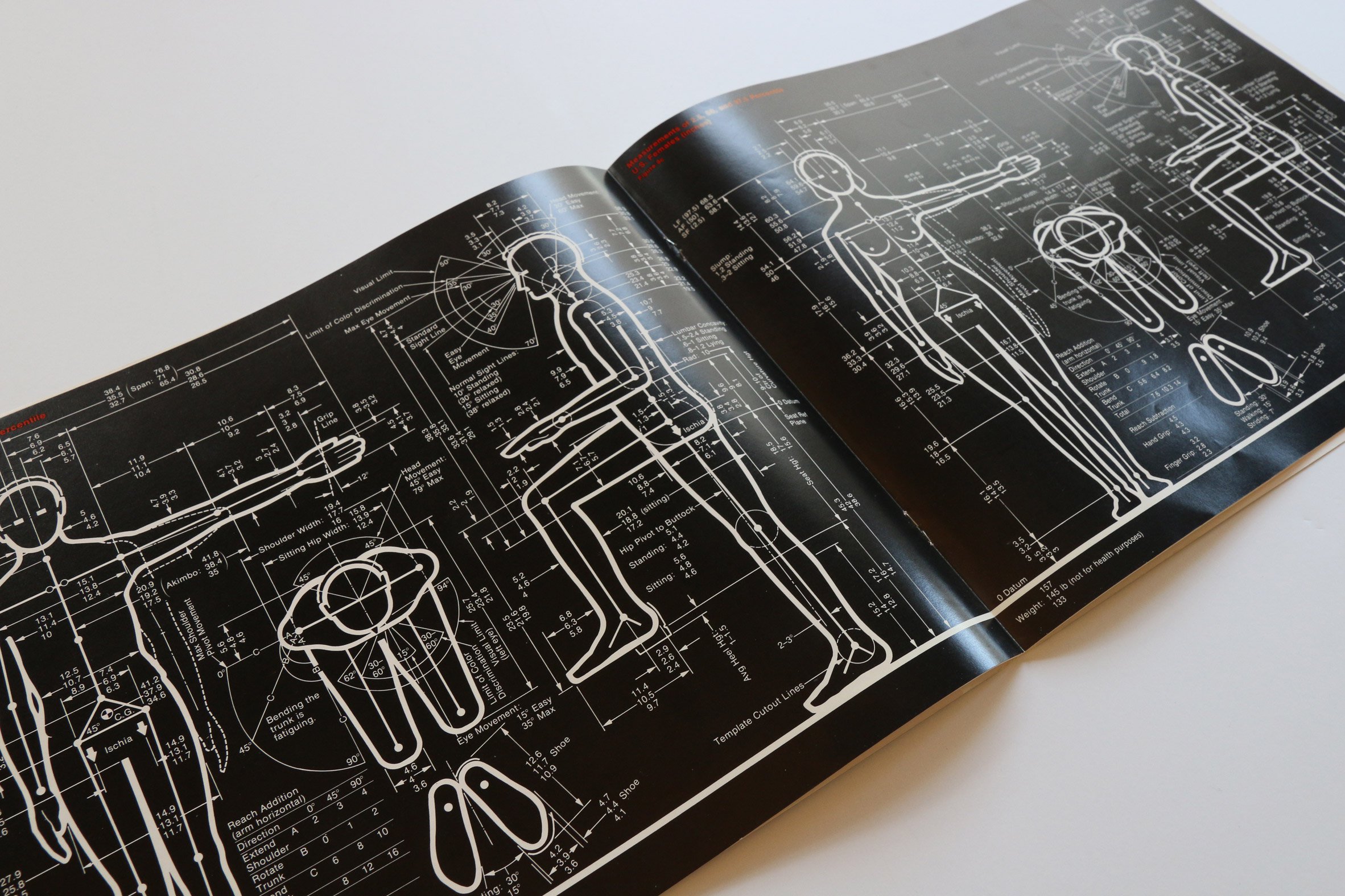
These references are delivered in part as volvelles, also known as information wheels, a paper enclosure with a circle cut-out inside that spins to reveal new data through die-cut windows. They’re also decorated with meticulously drawn graphics from the age before precise vector software. This shot of one of the originals gives you a good idea of the exquisite level of detail they employed.

Original Humanscale Sample

The reissue seems committed to reproducing that detail faithfully:

Humanscale Reissue Sample

Many of the incentives for the campaign are already gone but there are others and still about three weeks left to take part. Find out more at kickstarter.com.

+

Even If You Have a Real TV, You Might Want a FakeTV

FakeTV Model FTV-11

Not every gadget needs to be an amazing technological breakthrough in order to delight. A case in point is the FakeTV that I bought just before heading out on vacation with my family in July. It’s such a simple and necessary device that it might be my favorite thing I’ve bought this year; if nothing else, it’s the one that’s made for the most amusing conversational fodder.

Like the name says, the FakeTV is literally a fake television; a little plastic box about the size of an alarm clock. Its facade is festooned with a grid of LEDs that continually light up a dark room with a rotating, random display of colors. Seen from the street, the light show it projects on your walls and ceiling is indistinguishable from the way a living room is illuminated when there are real people watching a real television. It has a light sensor too, so it only turns on when a room is darkened, and it draws about the same amount of power as a night light.

If you hadn’t guessed, the purpose of the FakeTV is to deter burglaries. We had a break-in about a year ago so we consider every safety measure, and while we already had an Internet-connected alarm system wired throughout the house, the idea of leaving our home unoccupied while we were on holiday felt a little less unsettling once I installed this device. It’s very convincing. There have even been times when, coming home late, I’ve been fooled into thinking someone was still awake in the living room.

For around US$20 (I bought the “top of the line” model for US$30), it’s a bargain, even if the cheap fit and finish suggests the device only amounts to about five dollars’ worth of electronics and plastics. Unfortunately it’s also incredibly ugly. Find out more at the commensurately inelegant site faketv.com. Also, if you buy it through this Amazon link, I get a little kickback.

+

Movies Watched, June 2017

Still from “Wonder Woman”

Director Patty Jenkins’s “Wonder Woman,” which I saw in theaters, is one of those weirdly great movies—it’s not particularly artful but it nevertheless qualifies as a huge triumph. It has a scantly conceived plot, is rife with overdetermined exposition and fails to distinguish itself from the CG-heavy plasticity of Marvel movies. And yet, somehow it manages to be thrilling more than occasionally and suppressing your instinct to cheer for it as you watch it is nearly impossible. A lot of that is owed to the amazing Gal Gadot in the title role; she understands keenly the delicate balance of fierceness, earnestness and humor that is required of her. That woman is a star and more than anything, it’s Gadot’s performance that elevates this beyond the realm of schlock—and there are plenty of schlocky parts, to be sure.

I also saw “Cars 3”—a basically unnecessary new installment in a franchise that is not a favorite of serious Pixar fans. But you know what? It was totally enjoyable and a reminder that kids movies can be for kids—even mainly for kids. I liked it.

Here are all seventeen movies I watched in June:

If you’re interested, here is what I watched in May, in April, in March, in February and in January, as well as my full list of everything I watched in 2016. You can also follow along with my film diary over at letterboxd.com.

+

Defending Criticism (from Trump)

Poet and literary critic Adam Kirsch wrote this magnificent polemic recently in the Book Review section of The New York Times. It takes as its jumping off point some recent comments by President Donald Trump in which Trump essentially declares as worthless the contributions of critics to society and culture. In a powerful rebuke of that idea, Kirsch argues for the essential value of critical thought and shows that a disdain for it leads to dangerous outcomes. The whole thing is masterfully reasoned and you ought to read in its entirety, but I will excerpt some of the choicest bits here because I find it so invigoratingly effective.

First, starting with this typically bombastic quote from the man most of us didn’t vote for:

“Nothing is easier or more pathetic than being a critic, because they’re the people that can’t get the job done.” — Donald Trump, Liberty University, May 2017

For many people, the ignorant hostility of that quote alone is perhaps all the advocacy for the worth of criticism that needs to be made. However, Kirsch reasons further that, in spite of the fact that criticism is often unwanted and unpleasant, it is the unavoidable consequence of human endeavors.

“Once a work of art emerges from its creator’s study or studio, it becomes the possession of anyone who interacts with it, and therefore it is open to judgment.” — Adam Kirsch, How to Live with Critics (Whether You’re an Artist or the President, The New York Times, June 14, 2017)

And…

“Do I actually derive pleasure and enlightenment from it? There is no way to stifle this question, which is the foundation of all criticism. Every reader or listener asks it, whether they want to or not.” — Adam Kirsch, How to Live with Critics (Whether You’re an Artist or the President, The New York Times, June 14, 2017)

Criticism may be inevitable, but Kirsch contends that it is also inherently complementary to the principles of democracy.

“The realm of [critical] judgment is plural. Everyone brings his or her own values and standards to the work of judging. This means that it is also, essentially, democratic.” — Adam Kirsch, How to Live with Critics (Whether You’re an Artist or the President, The New York Times, June 14, 2017)

And finally, Kirsch asserts our right—all of us in this country—to criticism.

“For in politics, as in art, the right to criticize is really the right to make an independent judgment of reality. Democracy relies on a citizenry informed and active enough to make such judgments; in a democracy, we are all critics.” — Adam Kirsch, How to Live with Critics (Whether You’re an Artist or the President, The New York Times, June 14, 2017)

I implore you to read the full article at nytimes.com.

+

Discussing Criticism at SF Design Week

Photo from My Panel Discussion at SF Design Week

This past Tuesday I flew to San Francisco to moderate an event at Adobe headquarters called “Things We (Don’t) Talk About When We Talk About Design,” a panel discussion that was part of the annual SF Design Week festival. I was joined by two panelists: Molly Fulghum Heinz, chair of the Department of Design Research, Writing & Criticism at the School of Visual Arts, and Anne Quito, design and architecture reporter for Quartz.

The three of us talked about the current state of criticism in design, a topic that regular readers here know that I’ve been interested in for some time. In fact, in a few public appearances recently I’ve been giving a talk on this very subject: about how discourse in our profession is dominated by practitioners—designers writing about design for other designers—and how that limits our ability to have the thoughtful and truly honest analysis that our craft deserves. Molly and Anne expanded brilliantly on my somewhat cursory assessment of the situation; they offered tons of revealing insights into the challenges of conducting critical discourse, the economics of writing about design, the pitfalls of commenting within such a small professional community, a path forward for both designers and writers, and more.

Our conversation lasted about an hour and was live streamed; you can watch an archive of it below. Huge thanks to Molly and Anne for joining me, to the amazing communications team at Adobe for putting the event together, and a special shout out to the folks at Stream Thirteen for their exceptional stage and streaming video production.

+