How Does a Film Editor Think and Feel?

Tony Zhou, creator of the incredibly insightful series of video essays about film “Every Frame a Painting,” takes a look at the subconscious instincts and conscious thought processes that drive effective film editing. Zhou is an editor, and he brings a wonderful frankness to the intangibility of his craft. In this age where technology claims to be able to measure nearly anything, it’s refreshing to be reminded that some art forms, like editing, are inherently ummeasurable.

+

Pay What You Like for This New Typeface from Latinotype

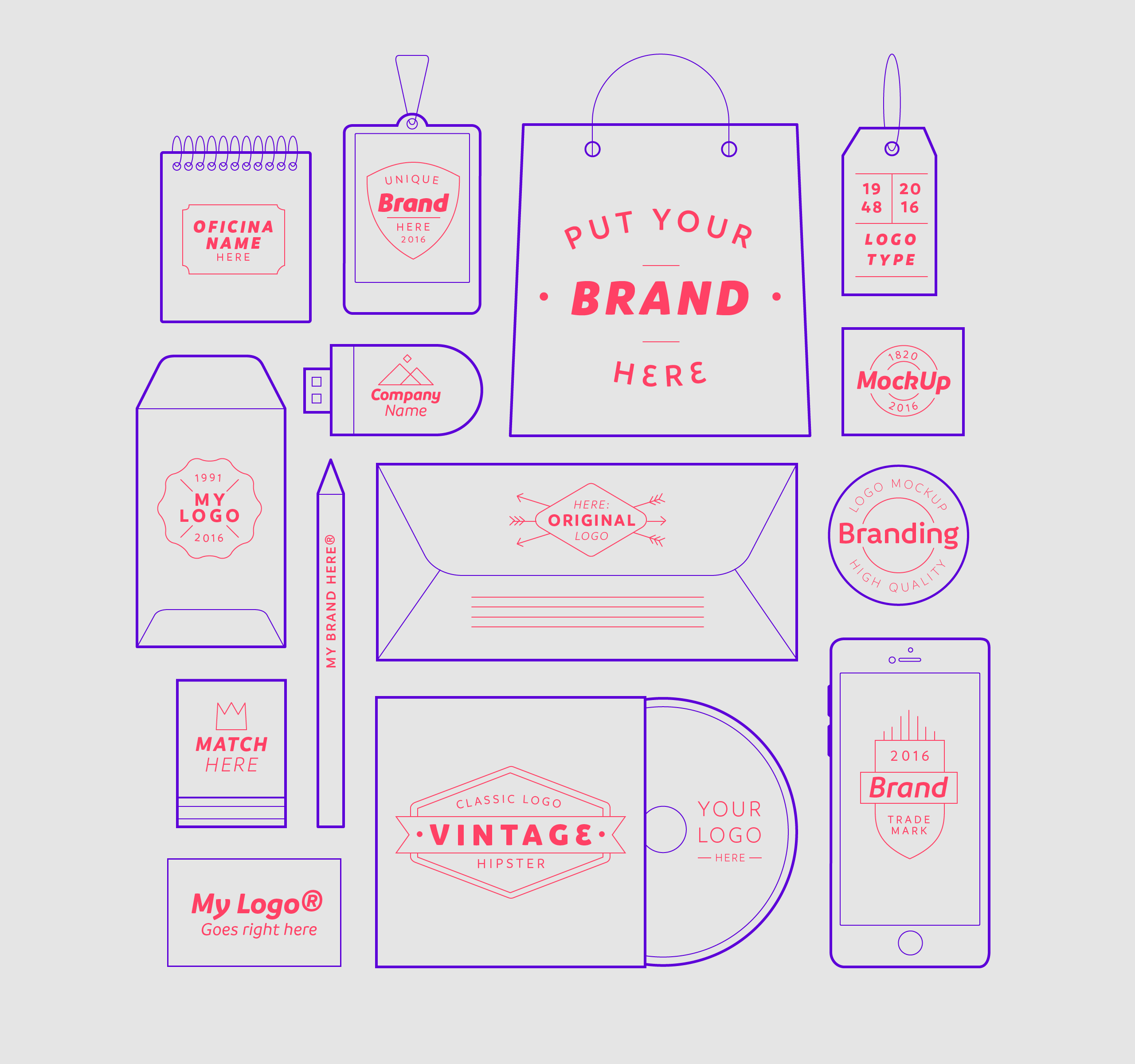
Branding Examples

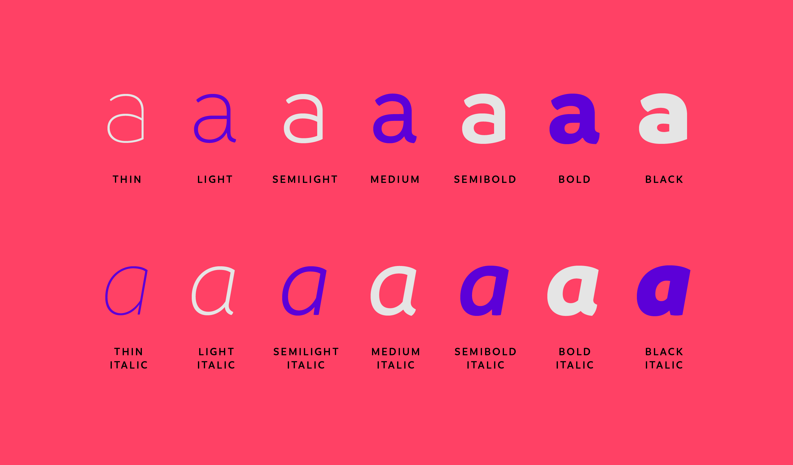
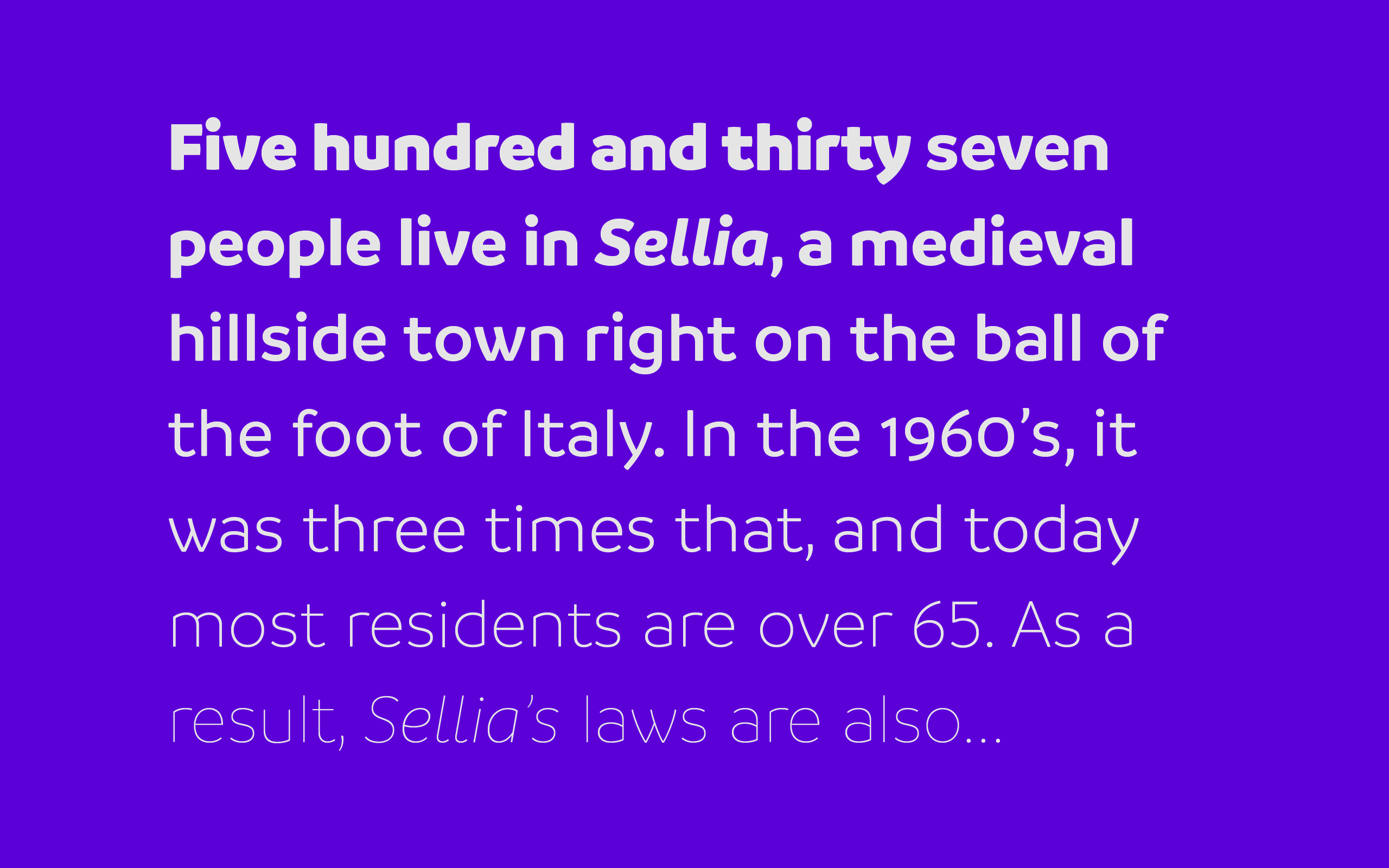
A very intriguing experiment from the talented folks at Latinotype: until 25 May, you can buy all fourteen styles of their new typeface, called Branding, for any price that you like—so long as it’s least US$1. I hope the company will be forthcoming with the data, or at least the macro-trends, from this sale, as I will be very interested to hear how people value this opportunity. It helps too that Branding is friendly and attractive—a terrific design. Kudos to the team for this adventurous trial.

Learn more at latinotype.com.

Branding Font Styles
Branding by Latinotype
+

Patterns in Adobe Capture

Pattern Created with Adobe Capture

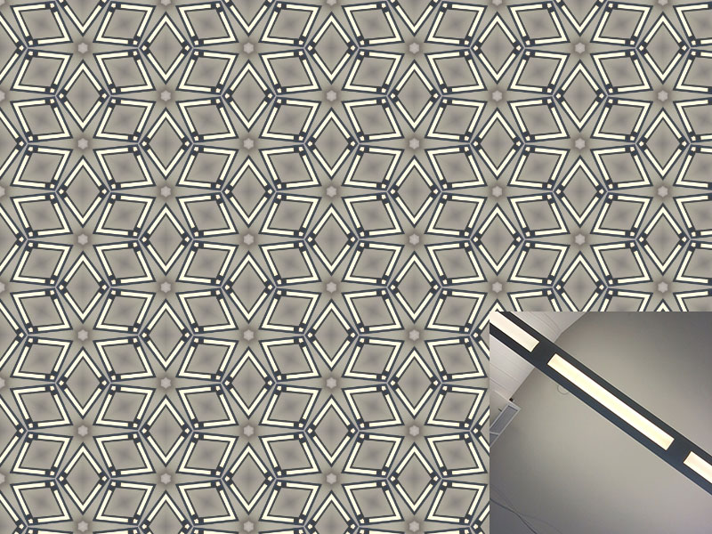
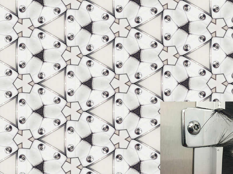
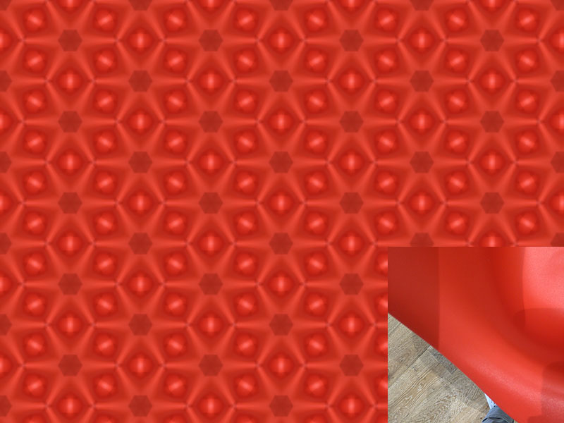
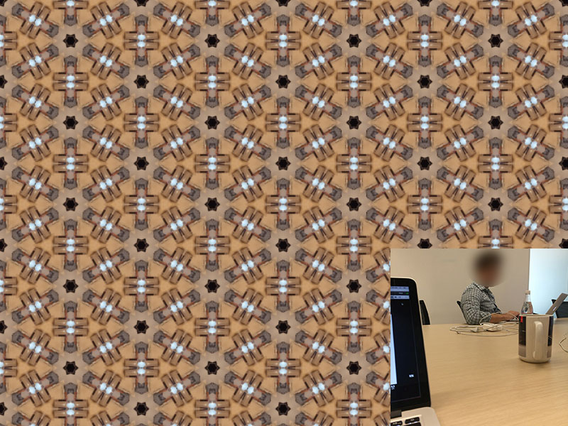
I’ve been having tons of fun with this new pattern making feature in the latest release of Adobe Capture, an iOS app that lets you take photos of design inspirations in the world around you and turn them into usable assets like brushes, color palettes, vector shapes and more.

These are a few examples of the patterns I’ve created recently, with their source photos in the lower right hand corner (I blurred out a co-worker’s face in the last one). Each took literally seconds—not even minutes—to make. You just open up the app, switch to pattern mode and aim your phone’s camera at something interesting. As you move the camera around, the pattern you’re capturing shifts—when you see the design you like you hit the camera button and it’s saved. The pattern is then instantly added to your Creative Cloud library and available for immediate use in Photoshop. It’s pretty close to magical.

Pattern Created in Adobe Capture
Pattern Made with Adobe Capture
+

Yet Another New DC Comics Logo

New DC Comics Logo

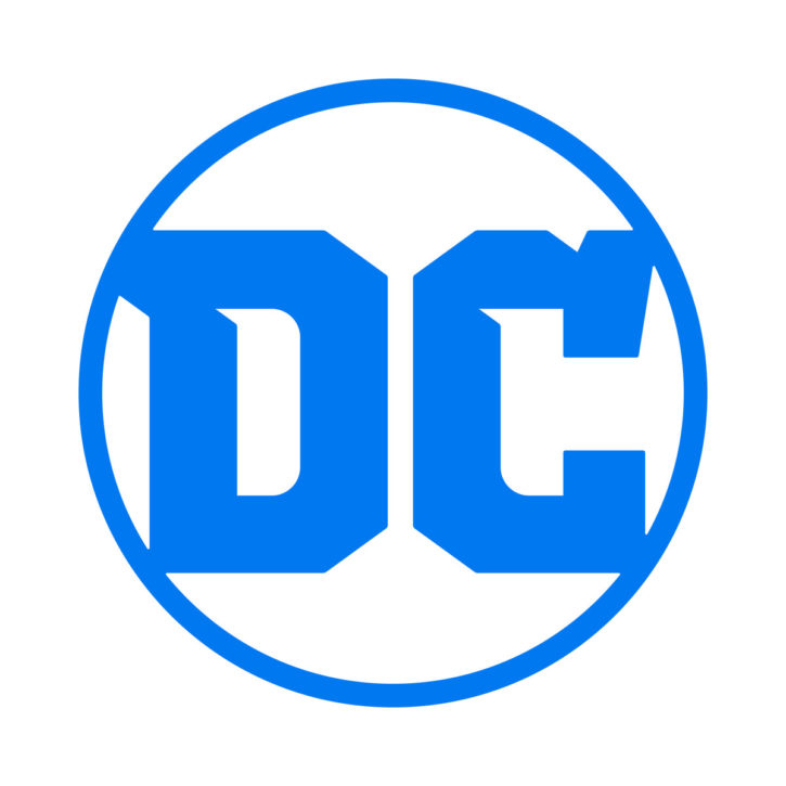
This new logo for DC Comics was “developed in partnership” with the world renowned design studio Pentagram, which probably means that the studio got paid a lot of money but that the company ultimately rejected their work in favor of work done in-house (to be clear: I’m totally guessing here). Whatever the actual process, the result seems inelegant and poorly balanced, and the odd serifs and unconventionally cut counters and bowls of the two letterforms seem less inspired than awkwardly unresolved.

The circular shape also explicitly references DC’s older logos, but not in a particularly thoughtful way. Mostly the mark looks like a sadly accurate reflection of the continued confusion from which DC Comics seems to be suffering. The company is perennially in second place after industry leader Marvel, both on newsstands and in movie theaters (though to be fair, DC is winning the race for bland TV shows that you’ll be no poorer for missing) and, absent any clear strategy for making its iconic characters relevant to contemporary audiences, it spends too much time dwelling on its history.

In situations like these, it’s almost unsurprising to see companies launch new logos. A refreshed brand can provide an opportunity to turn the page, refocus the mission, and communicate new approaches in emphatic terms. Of course, there’s also the “rearranging deck chairs on the Titanic” argument, which basically interprets strategies like these as distractions from the harder work of addressing a company’s true problems—fixing its products so that more customers want them.

DC Logos Through History

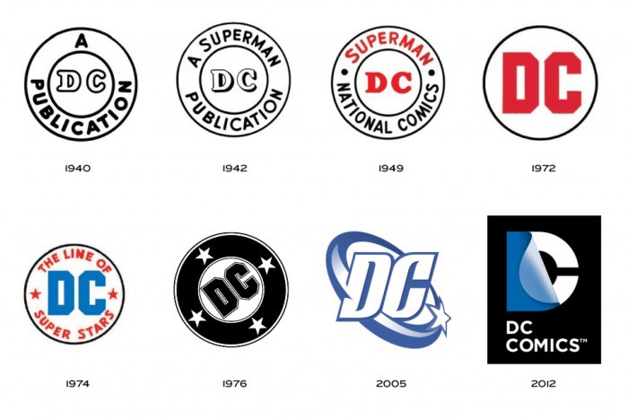
For my part, I had actually become somewhat fond of the previous logo, in which a capital “D” peeled back to reveal a “C.” It was certainly an improvement over its short-lived predecessor, and none of them are as uniformly well executed, effective and timeless as Milton Glaser’s 1976 version.

Regardless of the actual aesthetic merits of these logos, though, this relatively rapid pace for rebranding is probably in and of itself the biggest sin. Launching a third logo in less than a dozen years is very poor brand management. It runs directly counter to what I’ve come to believe is the most important rule of branding: whatever your logo is, use it often and use it consistently. There’s simply too much noise out there for customers to learn what your logo is over and over again, and each time they have to do that, they get progressively less confident in the stability of your business.

+

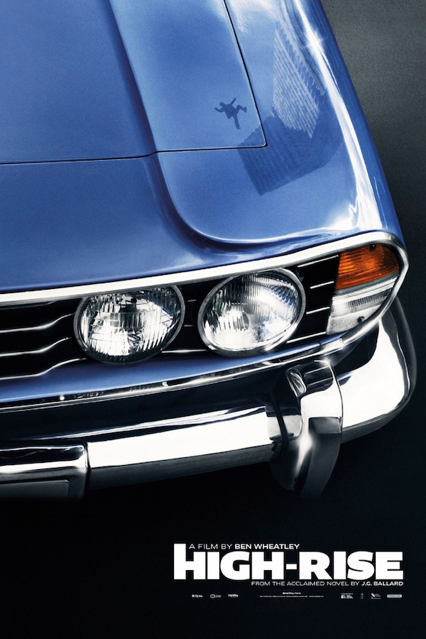
High-Rise

“High-Rise” Poster

High-Rise,” the new black comedy from director Ben Wheatley based on a book by J.G. Ballard, is a totally bonkers story of an apartment building on the outskirts of London in the 1970s. As basic services start to degrade inside the tower, civil society collapses in on itself in apocalyptic fashion, and the movie follows along, not always coherently, as the building’s various social castes go to war with one another. Though I enjoyed it immensely I recognize that not everyone with good taste will like it—Wheatley is less interested in telling a moral tale than exploring how easily social strife can unleash depravity. Even if this is not your cup of tea, you might still be able to appreciate the image above, an alternative poster, that, in my opinion, is one of the most subtle and richly comic designs that I can remember seeing for a film in a long time. Instant classic.

“High Rise” is in limited release now but also available for rent via iTunes.

https://youtu.be/qYEawT-xw2A

+

KV on the Radio

New Instagram Logo

Yesterday I was interviewed on the radio by host Josie Huang of KPCC’s Take Two program about the meaning and implications of Instagram’s new logo and app design. This follows an article at Gizmodo last week that looked at the apparent new trend of black and white app interfaces. If you’re interested, you can find the former at scpr.org and the latter at gizmodo.com, but mostly I just wanted to write this post so I could use this awesome headline, suggested to me by my wife.

+

Is Netflix Still Worth It?

If you’re a Spotify subscriber, imagine how you’d feel if over the course of several years the service pared back its catalog. At first, maybe some of the best albums might remain while only the back catalog starts to thin, but over time newer, higher profiles go away while the long tail of older albums gets shorter, too.

And then imagine if Spotify got into the original content business. Starting at first with a few high profile, chart-topping artists and then expanding into many more artists from a variety of genres, over time the service spends more and more of its energy on music that’s exclusive to Spotify, all the while continuing to let its back catalog whither.

For some people, the trade-off might be interesting, I’m sure. But for people who enjoy Spotify’s current diverse and eclectic catalog, that could be incredibly frustrating. What they signed up for—access to virtually all the music out there—transforms into something they didn’t bargain for—a branded subset of exclusive content.

Luckily Spotify shows no sign of pursuing this strategy, but this hypothetical scenario is fairly close to how I feel about what’s become of Netflix. When I first signed up for its streaming service several years back, there was a rich catalog of tons of movies that I wanted to watch. I loaded many dozens of them into my queue, and happily started to make my way through them.

And then, starting with “House of Cards,” “Arrested Development” and some other high profile series, Netflix started rolling out an impressive string of original content. At first, I was delighted; not everything Netflix produced was to my taste, but getting access to all of it, and being able to binge watch each new series, alongside the service’s then still robust movie catalog, seemed like a great deal.

Today, though, with reports that Netflix has a third fewer movies today than it did in 2014, the situation has gotten almost ridiculous. If you’re a lover of movies, Netflix is no longer a particularly interesting place to go. It can take tons of extended browsing to find a movie that suits your interests, and movies that you’ve queued up might unceremoniously disappear. (Many sites have even found that warning customers of what’s about to leave the service has become reliable click-bait.)

For my part, I wonder with each passing week whether a Netflix subscription is actually worth its cost to me any longer. For one thing, I’ve consciously tried to stop watching TV shows in favor movies, and the service has become too TV-centric to make sense for me. Netflix’s CEO Reed Hastings has famously said that the service’s goal is “to become HBO faster than HBO can become [Netflix].” They’ve done a commendable job of working towards that ambition, but as much as I’m a fan of many HBO shows, I’ve never felt that that service was worth the price of a subscription either.

All of this will come to a head for me later in the year when Turner Classic Movies and the Criterion Collection launch FilmStruck, their new streaming service. FilmStruck will focus on “independent, art-house, and international cinema,” the kind of fare that’s not likely to persuade a lot of Netflix subscribers to cancel, but that feels right in my wheelhouse. The cost of subscribing to two streaming services would not be exorbitant, of course. The more important question is how much time do I really have to get any value at all from these huge catalogs of content? Given the choice of one service that’s getting thinner and thinner and another that will hold some of the most interesting films ever made, for me it’s hard to argue that Netflix is the better option.

+
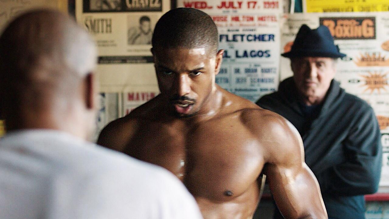
Movies Watched, April 2016

Still from “Creed”

Here’s a list of all the movies I watched in April. It was not a great month for seeing new movies. First, I wasn’t able to get out to theaters at all; partly that was because there was nothing good playing (I was tempted by “Batman v. Superman” but couldn’t bring myself to do it after reading all the bad reviews). The best stuff I watched was Steven Soderbergh’s “Che: Part One” and “Che: Part Two,” which, gulp, were eight years ago already.

April 2016

If you’re interested, here’s my list from March and my list for January and February. And you can follow along with my film diary on Letterboxd, too.

+

a16z on Switching to Tablets

This is a superb article written by Steven Sinofsky of venture capital firm Andreessen Horowitz about making the switch to a 9.7-inch iPad Pro and leaving his laptops and other desktop OS-based computers behind. Sinofsky details many of the tactical aspects of moving to a new platform, but the heart of the piece is really an incisively articulated argument for why and how these kinds of technological changes happen.

…In times of platform shifts there are two types of people. There are people that embrace the shift, perhaps out of enthusiasm, fandom, or maybe just because they don’t know any better. Then there are people that do know better, but just see the challenges in changing and use those challenges to anchor criticism.

While I am optimistic about change, I am realistic about the pace that change can really permeate through the broad range of people, organizations, cultures, use cases, and more. The fact that change takes time should not cause those of us that know the limitations of something new to dig our heels in. Importantly, if you are a maker then by definition you have to get ahead of the change or you will soon find yourself behind.

It should be noted that Sinofsky is a veteran of Microsoft, having worked on several of the company’s biggest franchises, including Windows 7. His openness to an iOS laptop replacement is remarkable.

If you’re at all interested in the future of productivity computing, this post is really a must read. The full article is at medium.com. There’s also a sort of “companion” episode of a16z’s podcast called “Finally, A Tablet That Replaces Your Laptop” that’s similarly essential.

+

Obama at 2016 White House Correspondent’s Dinner

https://youtu.be/wYB-NuW_SRo?t=7m41s

If you haven’t watched President Obama’s speech at the 2016 White House Correspondent’s Dinner last Saturday, it’s hilarious—and almost shockingly so in how consistently funny it is throughout. You can find a good roundup of some of the best zingers here, but watching it is worthwhile entertainment in itself. I particularly liked the joke about GOP chairman Reince Priebus that Obama makes at the 20:15 mark.

+