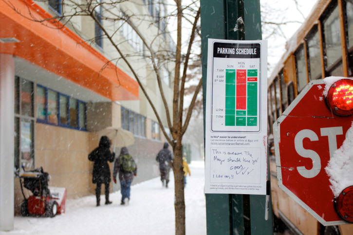
It wasn’t that long ago when New York City’s parking signs were famously redesigned by Michael Bierut at Pentagram, but that apparently didn’t satisfy designer Nikki Sylianteng. She took it upon herself to craft an altogether new design that eschews Pentagram’s textual approach and opts for a visual representation of parking schedules.

On her portfolio page for the project, she explains:
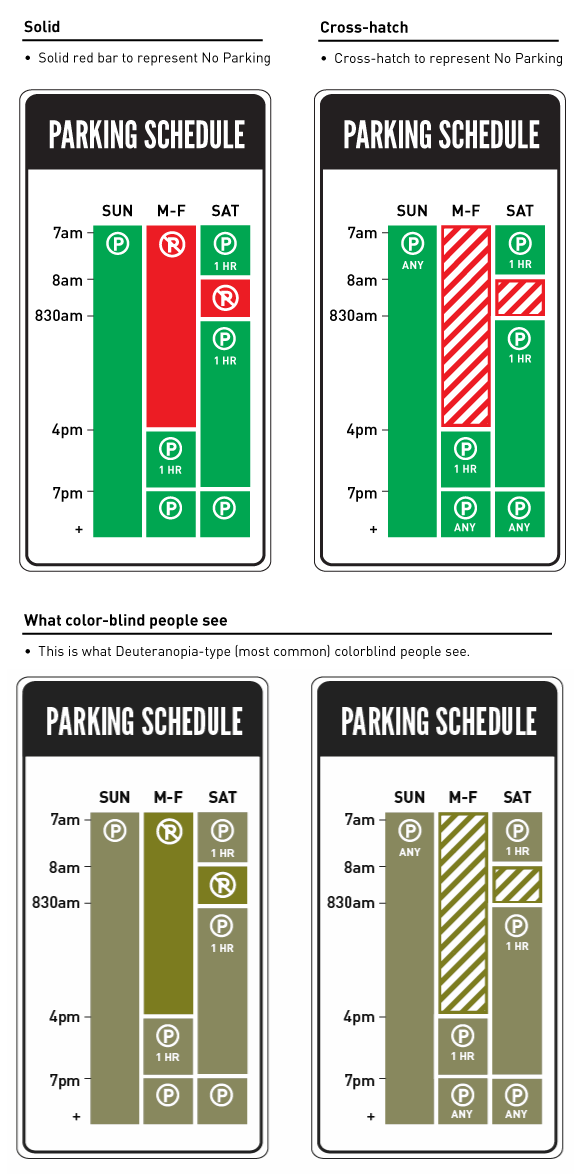
My strategy was to visualize the blocks of time when parking is allowed and not allowed. I kept everything else the same — the colors and the form factor — as my intention with this redesign is to show how big a difference a thoughtful, though conservative and low budget, approach can make in terms of time and stress saved for the driver. I tried to stay mindful of the constraints that a large organization like the Department of Transportation must face for a seemingly small change such as this.
Sylianteng has also been documenting incremental changes and improvements to the concept on this Tumblr blog, which includes these thoughtful optimizations for the color-blind.

Read about the project on Sylianteng’s site. It also appeared in a recent issue of The Atlantic.
+