is a blog about design, technology and culture written by Khoi Vinh, and has been more or less continuously published since December 2000 in New York City. Khoi is currently Principal Designer at Adobe. Previously, Khoi was co-founder and CEO of Mixel (acquired in 2013), Design Director of The New York Times Online, and co-founder of the design studio Behavior, LLC. He is the author of “How They Got There: Interviews with Digital Designers About Their Careers”and “Ordering Disorder: Grid Principles for Web Design,” and was named one of Fast Company’s “fifty most influential designers in America.” Khoi lives in Crown Heights, Brooklyn with his wife and three children.
Google’s endeavors in typography are the subject of an article this week at New York Magazine’s Web site called “Google Is Designing the Font of the Future.” Writer Kevin Roose details the company’s recent history of crafting a proprietary typeface for its Android platform, starting with the little-loved Droid typeface, then the moderately more successful Roboto typeface. Now, Roboto is seeing some major improvements in a new revision (the company feels that typefaces no longer have to be issued in the monolithic manner of metal type, and can instead be continually updated like any other software) as part of Google’s new “material design” aesthetic initiative.
New York is obviously not a magazine for a type-savvy audience, so the article naturally starts off with the kind of disclaimers that designers have had to grin and bear whenever general news outlets write about our craft, e.g., “Among the thousands of features on your smartphone, one you’ve probably never thought about is which fonts it uses.” This is standard stuff; not original but forgivable. But when Roose delves into the specifics of Roboto’s enhancements, things get a bit fishy:
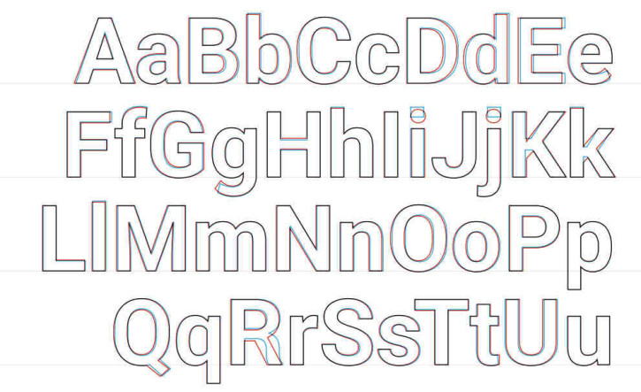
For starters, the whole Roboto font family has been ‘rounded out,’ as designer Christian Robertson told me, with differences visible in letters including uppercase B, C, and D. The rectangular dots above the lowercase i and j have been turned into circles—an attempt, Robertson says, to make them look ‘friendlier.’ The spacing of certain letter combinations has been tweaked. And some of the more unorthodox details—the curved leg of the uppercase R, for example—have been replaced with straighter, less ornate versions. The overall effect is that the new Roboto looks a bit more casual and less angular than the old one, more like a friend’s handwriting than a professional designer’s efforts.
These changes sound like legitimate improvements, but they seem to be about par for the course in the refinement of any typeface. They’re just presented in this article in a hocus pocus manner intended to wow uninitiated audiences with the dark witchcraft of type design. There’s nothing remarkable here at all, and certainly nothing to suggest that Roboto deserves to be thought of as “the font of the future.” Even the mention that this new iteration of Roboto has been tested “on a ‘big pile of devices,’ ranging from tiny smartwatches up to huge flat-screen TVs, to make sure it looked good at every size and from every angle” is a paper-thin claim. While commendable, that kind of testing is de rigueur for any font that hopes to be an operating system default in this day and age.
I don’t point this out to mock or criticize the author’s errors or misconceptions about what goes into designing typefaces, but rather in fact to marvel at how well Google is selling the story of its design efforts.
There’s essentially no news in this article other than, “Google has revised Roboto using some recent best practices of type design.” And yet the Mountain View company has been able to spin that non-story into a story that claims that the company is fundamentally reinventing typography. I’ve seen the same publicity gears at work again and again over the past year, whether it’s about material design, Google’s card metaphor usage, their maps redesign, or even the narrative of how the company is integrating design itself.
Last month I wrote that Google “is writing a fascinating case study for how to retrofit design into a tech giant’s DNA.” Part of that case study is this very tactic of the company touting its newfound religion of design far and wide, early and often. Even if some of the coverage, like this New York article, is not particularly substantive, the company has nevertheless been successful in portraying design as integral to virtually every new consumer-facing product it’s released over the past few years. This is in marked contrast to its legacy of creating products so lacking in aesthetic élan that, well, you could describe them as user interfaces that looked great on the radio.
Though I have my quibbles with many of Google’s initiatives, tactics and products, I can’t deny that the commitment that they made several years ago to design has been resolute. Lots of companies talk about design, but Google has really doubled down and fully invested its energies in making design work within its corporate walls. What’s more, the commitment has been productive; it’s resulted in real, tangible results. Roboto is not my favorite typeface and I seriously doubt whether it accurately previses the future very much, but as a symbol of a company that has fundamentally transformed its relation to design, it’s very impressive.